
LIGHT AND CONTRAST
by Michiel Faro
Time to get some of my own work out there, to be commented on and be criticized, instead of it all going the other way.
A bit about myself: I’m 62, Dutch and live in Holland, married, a stepson of 18 and two lovely two-year old girls. I work as a lawyer in Amsterdam. I have two potentially time-consuming hobbies: riding racing bicycles (I rode competitively for 25 years) and photography. I’ve been photographing since I was 14 or so.
My late father taught me everything, darkroom work included, though we never progressed to colour. I started with a Werra, which is more or less the most simple and wellmade camera one can think of. A Zenit slr was next, then a Yashica TL Electro (great camera), until a Nikon FM2n followed in 1990; a body I still have and use with great pleasure. FE2, an FM3a, a Contax RTSIII and a collection of used Nikkor and Zeiss primes round-up my analogue stuff. Digital started in 2008 with a D200, then a D700, then a D800 and now a D800E (both the 800 and the E can be underexposed routinely by almost up to a stop without any noticeable loss in image quality; a real bonus) with the 24, 35, 58 and 85 1.4G’s. I like the SLR form factor, prefer OVF’s over EVF’s and displays, dislike tiny camera bodies that may be light but have infuriating ergonomics and no viewfinder, and once you’ve gone full frame there’s no going back to a smaller sensor. Oh, and I don’t buy the next best thing every time it comes out, which can be quite frequent. Learn the stuff you have thoroughly, and that’s complicated enough in itself.
My photography can be divided roughly into three main categories: portraits (close, and possibly intrusive), situations/geometry/shapes, and emptiness. That last category is even more frustrating than the others and might be suitable for another post in the future. For this submission it’s situations/geometry/shapes and portraits.
Near the place I work in Amsterdam are two photo museums: FOAM and Huis Marseille. I try to go there on my lunchbreak every month or so. There’s always something to see. I may not like a particular exhibition or image, but it always sets your mind working: what is it I don’t like, what is it I do like, could I emulate it, could I approach that level of perception and technique, what sort of gear was used (ha!), etc etc. On the net, apart from the usual gear sites it’s AmericansuburbX and Lensculture I have a look at quite frequently; always something interesting to see.
Foremost in my mind (subconsciously no doubt) when taking photographs is light and contrast. Light because of what the infinite varieties of light can do to what the human eye (and film or sensor) sees. Contrast because of the inherent, subdued or loud, tension I wish to see in the images I take. Interest, tension, something that makes you wonder, makes you ask questions, is what I’m looking for. Always.
So here is a selection of B&W film images, made with cameras like the Contax RTSIII, Contax RTS, Contax S2, Nikon F2AS and Nikon FE2 and a variety of primes, usually Tri-X and HP-5, and colour images, made with the D800 and D800E. Two of the three portraits were made with the Nikkor 58/1.4G, an amazing (and sometimes frustrating) lens; the third one with the 85/1.4G, another gem.
The 58, to dwell on that subject briefly, is attractive as an everyday walkabout lens (I have a camera with me always; 1.4/35 this week) for its (comparatively) low weight, but you have to account for the almost “short tele” like focal length. It really shines as a portrait lens in ambient light. I think it is, for all it’s failings, a classic in the making that has to be used frequently to be fully appreciated.
Captions for the images are as follows:
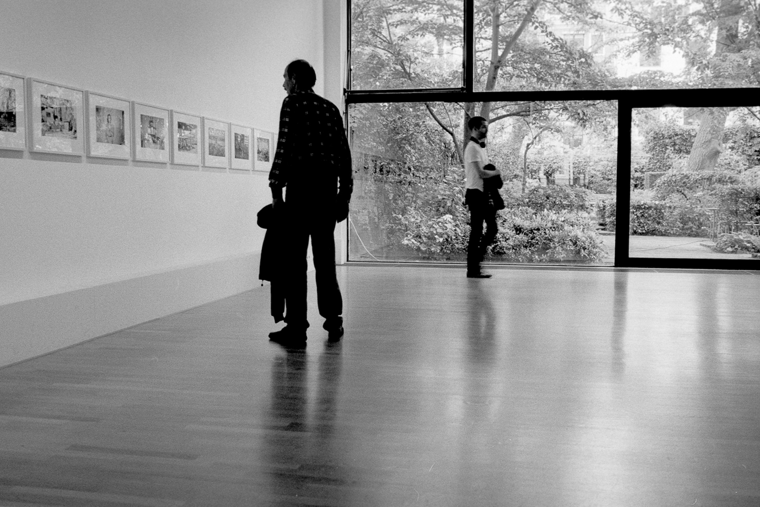
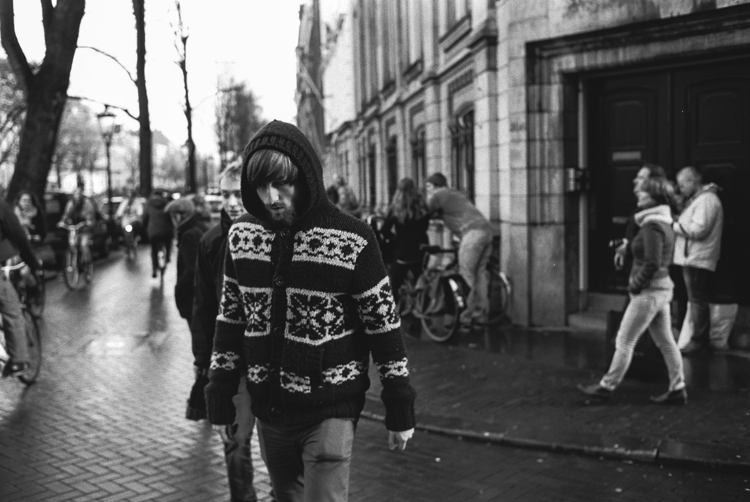
B&W Situations
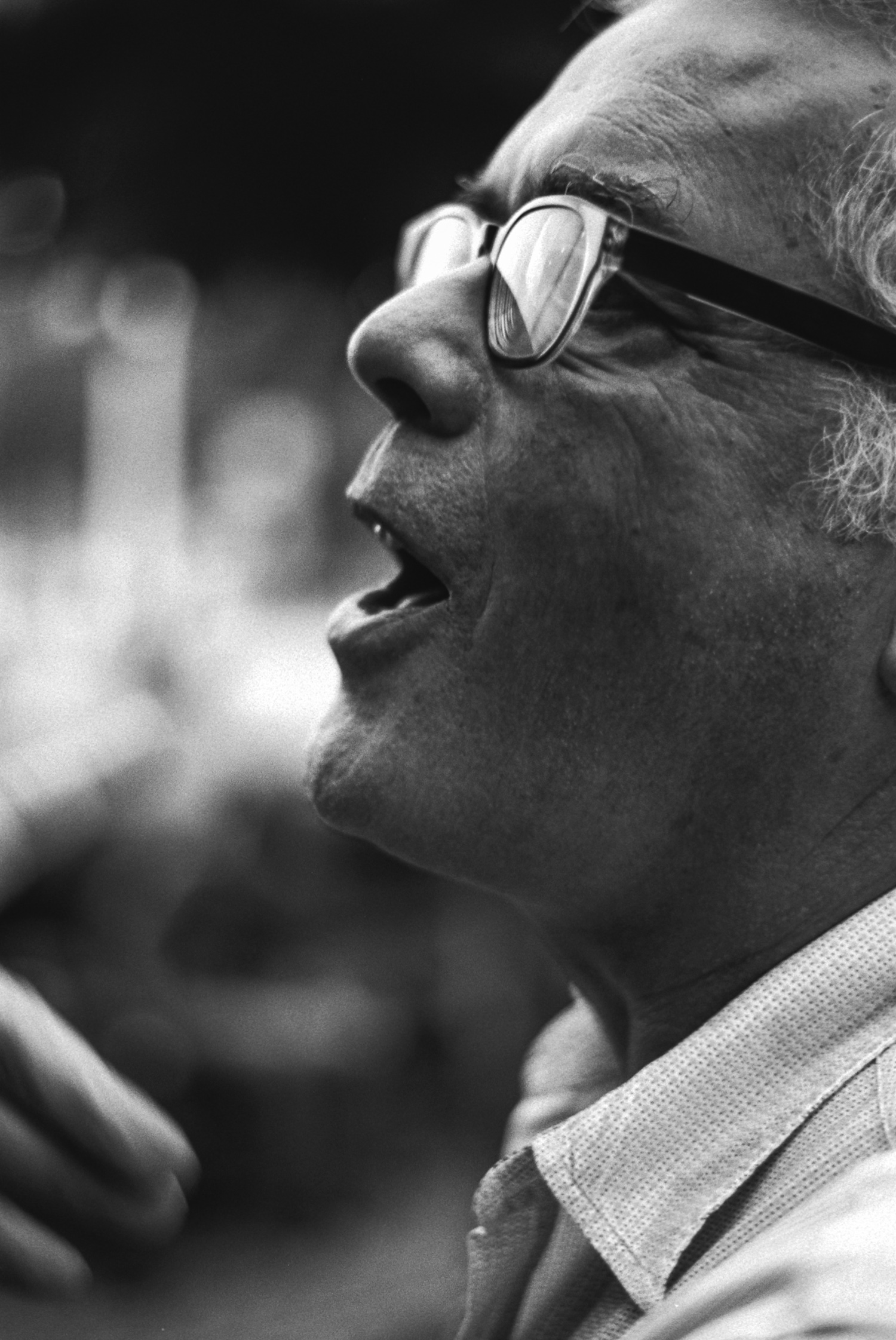
1 Man in FOAM museum: camera and lens unknown, TRI-X
2 Man with hoodie: Nikon F2AS, Nikkor 2.0/35 AiS, TRI-X
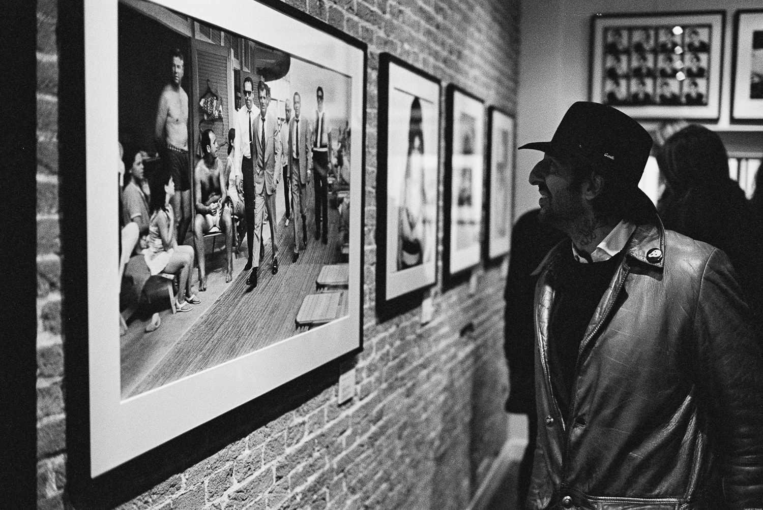
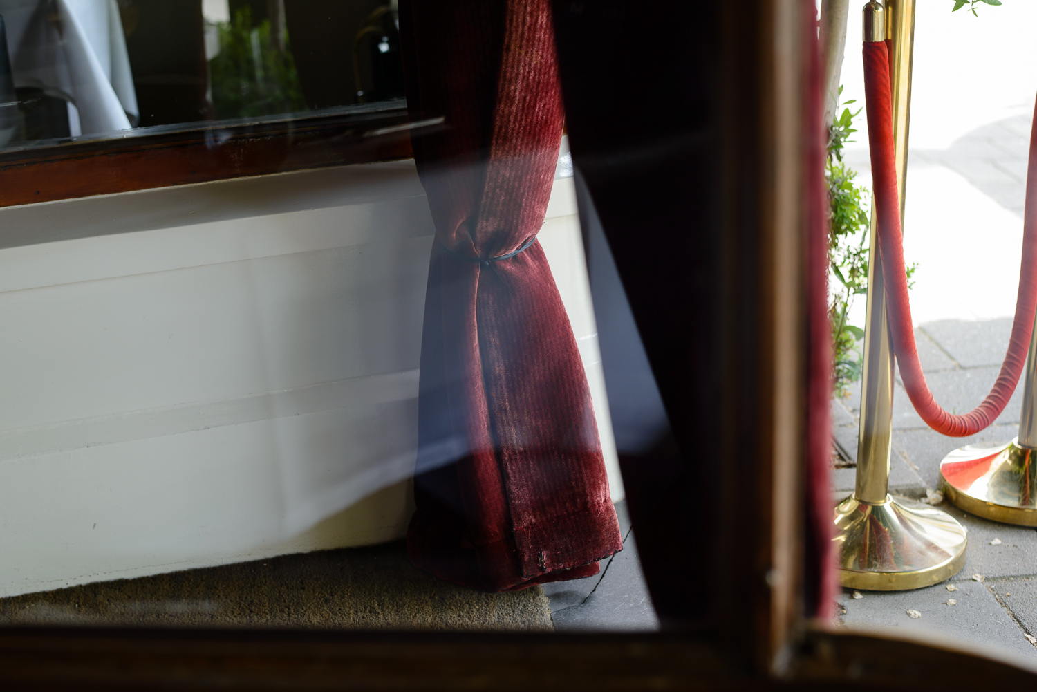
3 Man at Terry O’Neill exhibition: Contax RTSIII, 1.4/35 Distagon, TRI-X
———-
B&W Portraits
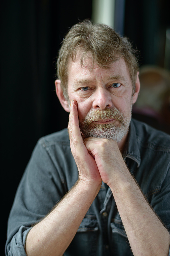
4 Cor: Contax RTS, 2.8/85 Sonnar, HP5
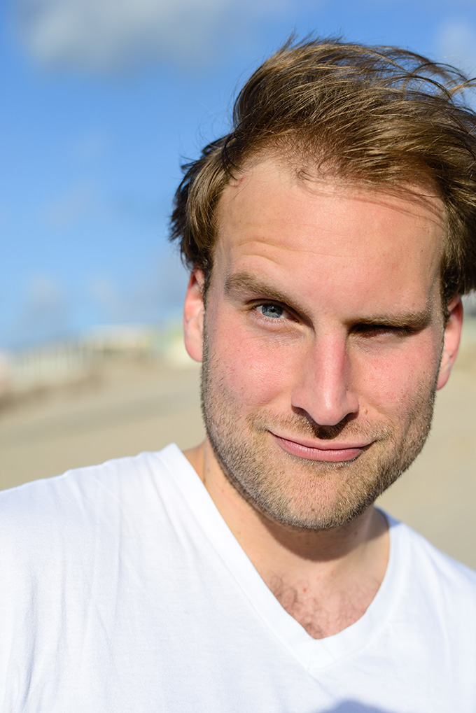
5 Olivier: Contax S2, 1.7/50 Planar, TRI-X

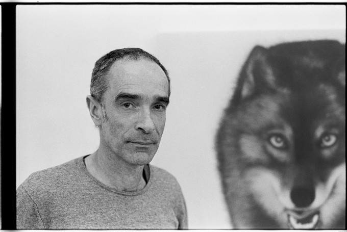
6 Rob Regeer, the artist and his art: Nikon FE2, Nikkort 1.8/50 AiS, TRI-X
———-
Color Shapes
7 Nikon D800E, Nikkor 1.4/58G
8 Nikon D800E, Nikkor 1.4/58G
9 Nikon D800E, Nikkor 1.4/58G
———-
Color Portraits
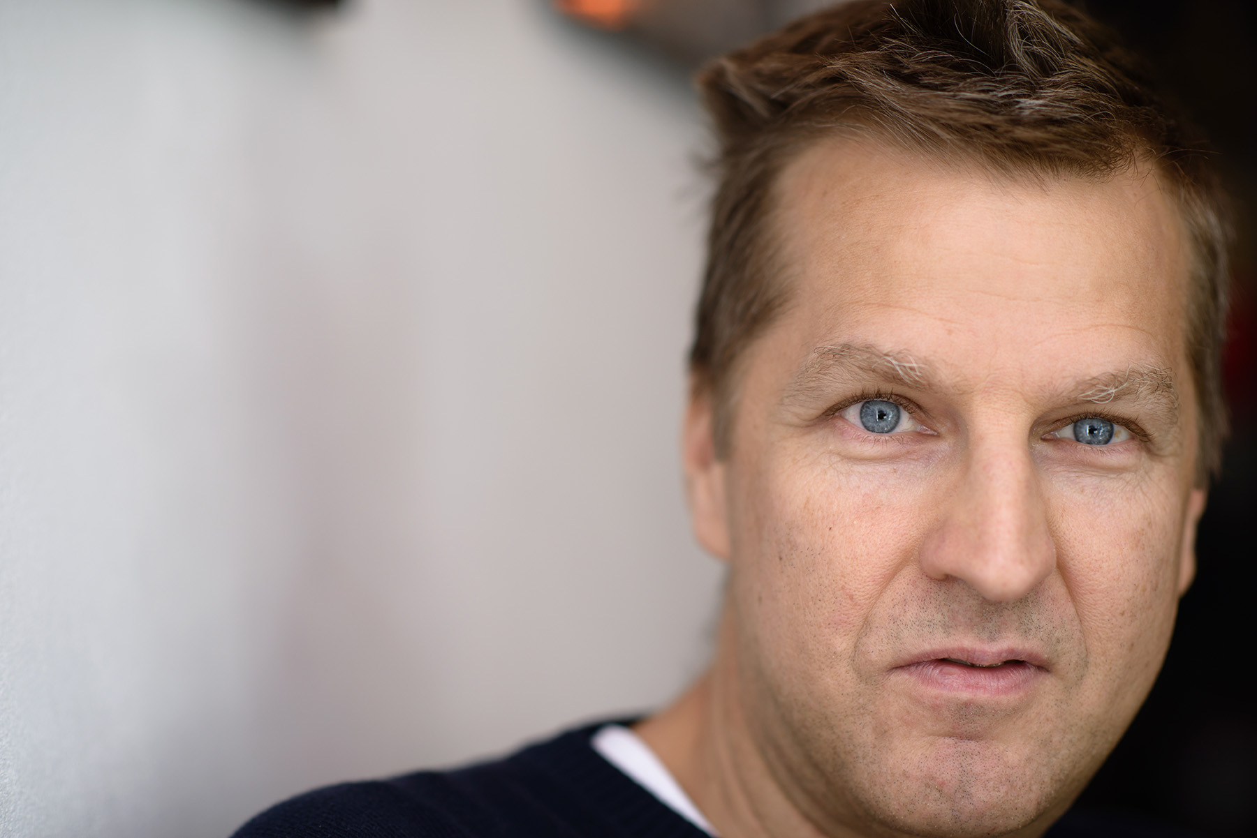
10 Ed de Jong, photographer, with waitress held napkin reflector at his insistence: Nikon D800, Nikkor 1.4/58G
11 Jan Maaso, friend, Nikon D800, Nikkor 1.4/85G
12 Wessel, colleague, Nikon D800E, Nikkor 1.4/58G
Thanks to Steve and Brandon for posting this and, more importantly, for keeping this podium alive for many to post on and for even more to comment.
Best regards,
Michiel Faro
Hi Clint: I can see what you mean.
I don’t believe in “spontaneous” portraiture (let alone the “stolen”, “hidden” variety), so I try to take some time to get the subject at ease, and see what sort of image that would result in. Then, after a few shots (not shown here), I ask the subject to do something, usually with his or her hands, or whatever seems fitting to me or to the subject, which will result in some sort of expression. In this case it resulted in a waitress being asked to hold up a napkin, and the placement of the hands you commented on.
Whether that’s awkward or natural is really up to the viewer. As it should be.
Funny, all I can see when I look at that photo is the awkward placement of his hands…yet all he was worried about was the light.
Thanks to all who commented! I’ll send in some more and hope Steve and Brandon will post them.
Many possible themes cross my mind. Two that are foremost in my mind right now are Emptiness (“Vogelwaarde: a shrinking community”) and and one that centers around the framebuilding business in Croydon (Roberts Cycles; googel him) that I was a customer of for almost thirty years, and that closed down a few weeks ago after nearly fifty years at the top of their business.
Both are thoroughly thought through and pre-visualised reportages, that came out a lot less satisfying than I intended. Not really a success story then, but I welcome all comments if and when they get published.
Thanks Jan; I’ll email you!
Cheers
Michiel
Very nice set of images. Love to hear your love of photography and the different equipment along the way. I’m also 100% in agreement with you regarding EVF’s. Hope to see more of your work here in the future.
Keep it up. I especially like the portraits.
Michiel, great work! Thanks for sharing, and let us meet up again real soon.
Ciao.
Jan
The picture that calls to you article is really the best one. Also like the light on the exhibition.
Thanks James, you’re too kind!
Picking up on your “saturations” comment, a bit about my technique or lack thereof.
My post processing approach is pretty basic; if it’s not in the raw file I lack the sophistication to insert it, whatever is missing. So, in LR4.4 (tried a free trial LR5, didn’t really see the advantage) it’s import the raw file, apply Camera Standard (or Portrait, if appropriate for portraits of wife and kids), try Automatic Tint to see what it does, usually not a lot of adjustment necessary then, look at WB, usually “as shot” is sufficient, adjust Contrast from Linear to Normal to see what it does, usually not an improvement but sometimes it is, then Sharpening; Sharpness at 60, Radius vary from 1.0 to 0.7 according to subject, Detail 40, Mask 10, apply some Luminosity Noise reduction at ISO’s over 800, adjust leveling where desired (a sign of sloppy framing that), correct colour aberrations, that’s it.
The rich colour of the three colour shapes were all there, visible to the/my naked eye, and the 58 really has a wonderful rendering style. Once you’ve seen that, certain subjects become more interesting.
Oh, and Cor is Olivier, and the other way around… 😉
The posters that usually object to my critical approach (“Where’s your own work then!!!”) are now noteable for their absence. I still welcome their observations though.
Excellent images, Michiel. The mastery of both colour and b&w is evident. I particularly liked the colour saturations of the shapes pics.
And keep up the constructive criticisms; a blog becomes a fading entity if it is only inhabited by the cheer squad for anything-goes; soon they have run out of vocab and when something really good arrives there is no longer any differentiation possible.
Thnx !
Thnx
Thanks Thorkil, good to see you here again!
Best
Michiel
It was the sign of a true professional; cooperating and participating. I think I actually liked the unreflected version better because of the higher contrast, but thought I’d post this one because of the subject’s intervention, which I think always adds to the image.
Enjoyed your article and your photos. I am 72 loved photography all my life and had many of the same cameras.
Hi Michiel!
Very nice work!!! Keep on !
Best
Thorkil
Great photos especially 2,5,and 6
I enjoyed them very much. #5 is a favorite, and the look on the man’s face in #10 is wonderful
So many good pictures!
I normally tend to gravitate towards the black and white but, your color portraits caught my attention. Especially #10.
Well done!!
João Vieira.
Well said.
Had to laugh at #10 caption. Isn’t that like us to want to control the light and situation to preserve our dignity and vanity?
Nice work…Thanks for sharing.
Very accomplished,
Well executed.
Well done.
Paul Hagan