
Hi Steve,
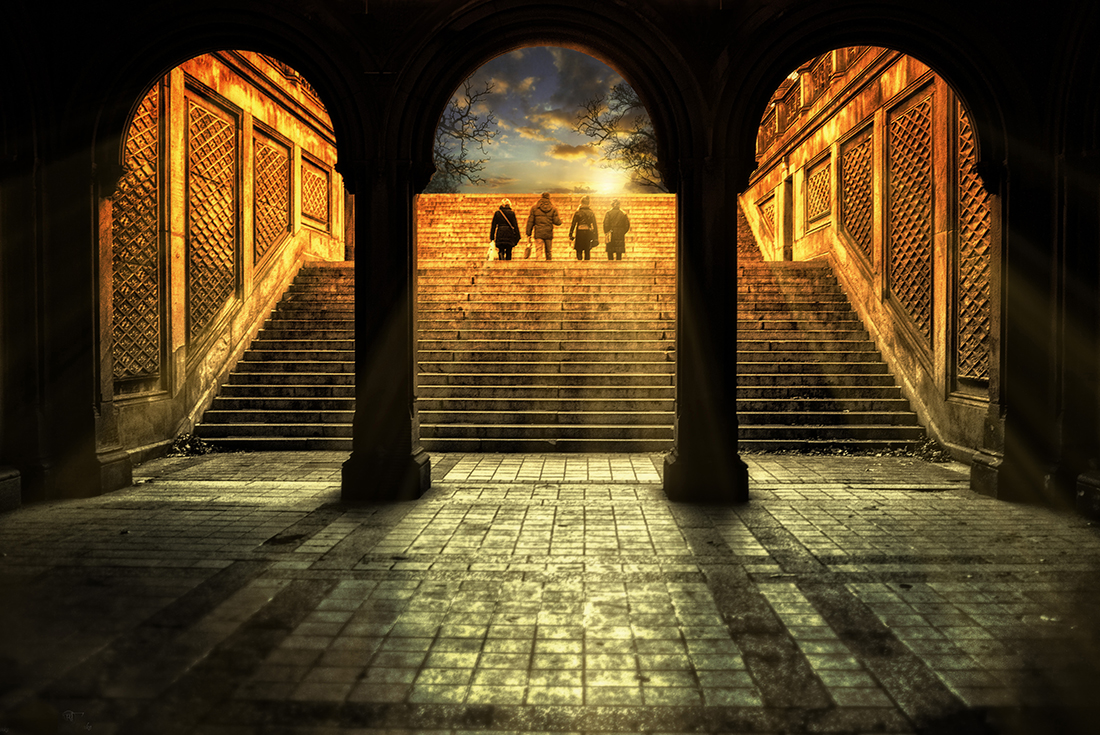
Please find attached a photo I took using a Leica X1 (image #1) at Bethesda Terrace , Central Park, NY. Hopefully it meets your expectations, and worthy enough for you to feature in your “Daily Inspiration”.
Thank you for taking the time to review my picture, and your continued efforts to bring stevehuffphoto.com to everyone. Thanks to your website, I have been able to make very informed purchases of camera gear from large purchases like the Sony NEX-7 to smaller purchases such as the Heliopan Orange 22 filter.
All the best,
Paul Brake
http://paulbrake.photoshelter.com/
–
two more of my images

So love the rain it makes that picture magical. Awesome shots- Great Job.
Love, love, love these <3
Interesting take on #2 Reminds me a lot of the last Matrix movie at the end with the big fight scene. Wish the lightening and rain were real though:( Love #1, and can really appreciate the work you must have put in to it. Converting to B&W then using selective color in CEP is something I’ve never tried before.. works pretty well IMO, if not a wee bit too cooked, perhaps? Where is the B&W version? And great timing on #3!
Doug
Really great work! How did you keep your Sony dry in the rain? I’ve had trouble with my NEX 7 getting dumped in the snow. It recovered, thankfully, but for a few hours the EVF wouldn’t go on. Got a bogus message that it had “overheated”.
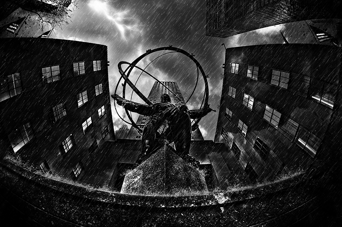
Fortunately I have managed to keep my cameras dry by shooting either under an umbrella, or in a ziplock bag with the lens sticking out. Didn’t have to worry in the second picture as it was taken on a bright sunny day – the darkness, drama, rain, and splashes were all created during post processing 🙂
I have heard people say their NEX 7 had an overheating problem, especially since the talk of the new NEX 7 model coming out soon; however, I have not personally experienced any problems with my NEX 7.
Hope your camera is okay now.
I agree with Joseph—the first frame is extraordinary.I keep going back to it.I also don’t like heavily processed shots—-bur he is masterful–making such a natural look here.
Interesting lighting! Thanks for sharing your images!
A wonderful demonstration of what is possible in this digital age. Great stuff
i really like all of them. Can you tell me please did you adjust the light at all?
I really like the post processing on these such great Rembrantian God light .
Thanks in advance for the answer and for the post of course
All the light was from just the sun at the time. The only adjustments made with respect to brightness, etc. was in Lightroom.
Thanks for your question.
Interesting stuff for sure. Apparently proof that the same lightning bolt strikes thrice…well it does in his black and white gallery!
No secret there John 😀
Every image is telling me a story or I can imagine one. Bravo. All guidelines of photography: time, place, moment, light, lines are all telling a story about every image. Each one has a symbol and a meaning. Wonderful. These could have been taken with any camera but coming out of X1 just an added bonus plus considering the slow focusing of X1 shows that you sir have talent, passion, and patience!
Thanks for your kind words Leonard. The X1 was only used for the first photo. The other 2 were taken with a Sony NEX-5N.
Sorry for the confusion.
Picture number 1 covers the essence of photography..Its about the light.
I love them all! Thanks for the inspiration! Now if only it weren’t so cold out! Lol. Don’t laugh at me because I’m in Texas. Cold is relative! 😉
Don’t know where my comment went – I wanted to say that I particularly like the first picture, especially in B&W! Somehow the colour, though good, is a bit distracting imo. Either straight B&W or done with a lot more light let in are both good. The lightened version plays more with the rays of light, the darker with the shapes. There is often more than one good picture in a picture! Thanks for these.
Thanks John. I initially wanted a black and white picture but remember being not too happy with the result. Perhaps I will re-visit the picture and see what I can do with it with respect to the contrast, lighting, and structure.
Actually I like the first picture best – especially in black and white! The colour is a bit distracting. B&W as it comes and B&W with more light let in to lift the shadows and emphasise the light rays are both superb.
Thanks for sharing.
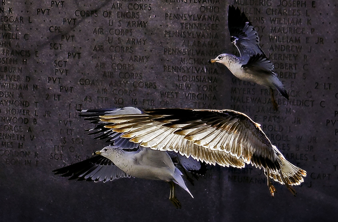
My eyes are drawn to the birds picture, but at first, without the names, I did not notice that it was a memorial. I assume you photoshopped out the names for privacy?
Also, are the birds from separate images? At 55mm, it seems you would have had to get pretty close, and the background would not have stayed in focus? (or even all the birds?) I like the effect of shooting fast to “still-life” the birds in front of a shadow, but when I do it, the background is a dark blurry mess.
Did you pre-focus and wait for the birds, or is the 5N fast enough to focus on BIF? For that matter, did you really use the 5N, or is that just EXIF data from the background picture?
In any case, thanks for the inspiration. I like the three different moods, and suspect you can eventually save a lot of time by just showing these to your psychiatrist to depict how you are feeling on any given day.
Thanks for the feedback Dave. Just to clarify, the image is one complete picture taken as the EXIF data states. The 5N is easily fast enough to freeze birds in flight, especially on a bright sunny day. The birds were quite close to the memorial which was not altered in PS – you can make out names on the far left and right of the image. The impression of two images may be due to the sunlight that was captured in the wings of the birds juxtaposed against the darker background. There was no set up or pre-focusing, just a few quick snaps at 9 frames per second as the birds took flight
Hope that helps answer your questions, and i’m glad you liked it.
The first one has great architecture, but the sky is too much. A bit too “precious”. A simple, blue sky would emphasize even more the texture of the architecture (which seems the focus of the photo).
In the second one, I have the same comment about the lightning bolt. Too artificial and small looking. The focus is the rain and the statue, and those are fantastic, there is no reason to break the gritty feel with a somewhat cartonish lightning bolt.
The last one I do not get, the seagulls are weird on top of the other picture.
Thanks for the “constructive” feedback Victor. The seagulls were captured as they flew past a war memorial at Battery Park in Manhattan. They are there all the time because of the tourists so it’s easy to get them at they take flight – Not sure if they felt “weird” though 🙂
that is soo bizarre, I was sure is was a composite image! The wings of the big one are really nice, but the one in the right top corner has an odd halo that made me think it was added on, but it must just be the sun interacting with the feathers. I am usually not a fan of composite images, and I think that was my knee-jerk reaction to it.
Were the other 2 composite?
This is a great example of graphical art that starts with a photograph. I do not like over processed photographs, but these are really great!
Obviously a lot of post processing in these…but awesome none-the-less….especially the second shot.
I just love these shots, the two latter taken with NEX-5N (EXIF is a wonderful invention), but the first, what did you use?!
Thanks Tord. The first image was taken with a Leica X1 using a Heliopan orange 22 filter. For post processing, the image was first run through Silver Efex to create a B&W, then finally thorough Color Efex for selective re-colorization.
All the images are fantastic. I like the third one in particular.
Looking at his website these are probably the 3 best images by quite a margin. He does go in for overcooked HDR. Still good to see these 3.
All fantastic but none seem to be candid but somehow worked or composed or photoshopped. Not that it really matters. Can’t believe #2 is a single shot. The last seems as if the birds are the souls of the soldiers flying off. But the HDR seems to freeze them in flight as is they are statues. The first is a group on an adventure to a dreamlike world and the 2nd is like the powerful forces of nature verses man and the Gods in between keeping us from harm (maybe?). All in all one of the more interesting and artful daily inspirations from a skilled artist. Nice one Steve and a great counterpoint to the previous post that drew flack for being poor quality snaps.
Of course these photos are great, they were taken with a Leica.
😉
cool photo that second one.
Amazing images! The second one is spectacular. The first one looks like HDR, but are #2 and #3 perfectly timed single image captures – or layered-in lightning strikes and doves? Doesn’t matter either way, just wondering if you got that lucky with timing.
Doves?! Seagulls!
Thanks Glen. No luck involved on the second image, just a lot of work as (here’s the kicker) the picture was initially taken on a bright sunny afternoon – Blue skies, no rain 🙂
One arm of my work involves providing the viewer with the complete opposite of what the reality was while retaining a sense of realism.
All three are dreamlike. Excellent.
I love all three of them, but the second one I like the most.
Beautiful pictures. Thanks for sharing.
Great work! The first shot is incredible.
JT
Martin, can you enlarge on the “irony” content? I’m missing something, they look sincerely celebratory to me.
He means the images are incredible. The irony is asking if they are “worthy enough,” when obviously they are.
Yes that was my first thought ….but the content displays irony ( as a positive element) to me … I looked at the doves as a symbol of peace flying past a war memorial, Atlas with the world on his shoulders with the ‘gods’ sending down lightening and rain and on the first image they look like explorers, or time travellers just arrived back etc but it looks like they are carrying shopping bags. I think Paul has been clever and powerful in both his subject matter and his images which to me show irony and speak of more than the immediate visible content. If you check his website out you will see statues photographed as models and pastoral countryside images that are almost like c19 painters which is actually Central Park! How he has achieved this is his secret…. But the end result is amazing.
Not to rain on your parade, but I think those are seagulls, not doves.
Nevertheless, I really like these photos, the composition, color and general feeling I get looking at them.
Paul ‘ Worthy enough’ – they are great images to be proud of! I love the irony implied in them. The last one makes you stop and think…. Beautiful… You’ve seen the possibilities in all the images really well. Thanks for showing them.
Super stuff, Paul!
The compositions of 1 and 2 are just great, and the treatments are superbly done.
I particularly like number 2. The way you have positioned the statue against the building behind. The overall composition and PP is very dramatic, and atmospheric (as is number 1).
Was this an “inspiration”? Where’s my camera!!! 🙂
Awesome! I’ve been there and yet never seen these places this way.
Very nice images.
Nice! Absolutely love the second one, very “epic” !!