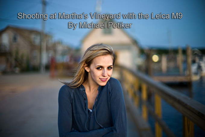
Shooting at Marthas Vineyard by Michael Potiker
I was able to spend a few weeks of August photographing the amazingly picturesque island of Martha’s Vineyard with my M9, and am very happy with the variety of images I captured there. I feel that as a long time SLR user, the M system isn’t necessarily as ideal for the traditional landscape type images due to the inherent inaccuracy of the bright-line system, but that this weakness is far made up for by the fact that I will actually carry this camera around, which gives me the ability to capture scenes I wouldn’t have before.
The size of the M9 and it’s ironically low key appearance) were some of the things that drove me towards the system, as well as my complete inability to discreetly photograph on the street with an SLR and a prime lens. I feel that while the M9 is really a phenomenal camera, a large part of the beauty of the system are the compact high quality optics. While a Nikon D3s may be a far superior camera for working in high ISO values, I feel that parents noticing photographs being taken of them and their children would react quite differently seeing a beast like the D3 pointed at them. I know this for a fact, as when I was working in Montreal & NYC the reactions to my M3 were quite a bit different than how people felt about me photographing them with my D7000 or F4s (with battery grip, no logos, and a 50mm 1.8).
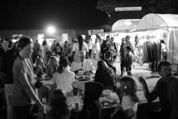
The reason I truly love the M system is that it gives me the ability to focus in almost no light, and then capture my image without anyone noticing it is happening (all of the fair photos were shot at F1.1 at 2500ISO, it’s the only time I shoot .jpg as I like the high ISO b&w that comes out of the camera, and they have no noise reduction done). It’s the only camera I’ve used (and I’ve been through quite a few different camera bodies recently) that truly gets out of my way and becomes an extension of my personal vision when I use it. I attribute this to the bright and straight through viewfinder that allows me to see outside my actual frame, and the fact that the camera creates the impression of literally carving a picture out of the world in front of you using those amazing bright-lines.
CLICK ON ANY IMAGE TO SEE THE LARGER AND BETTER VERSION!
[ad#Adsense Blog Sq Embed Image]



Mr.Potiker, I didnt know you were quite the photographer!
Well done! Nice photos. And I agree: there is simply no better camera then the M9. Wish I had one as well.
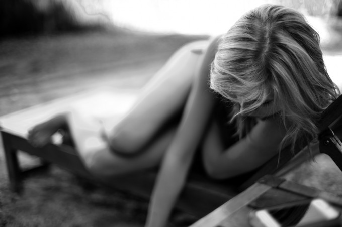
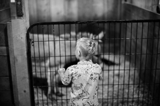
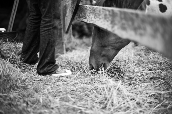
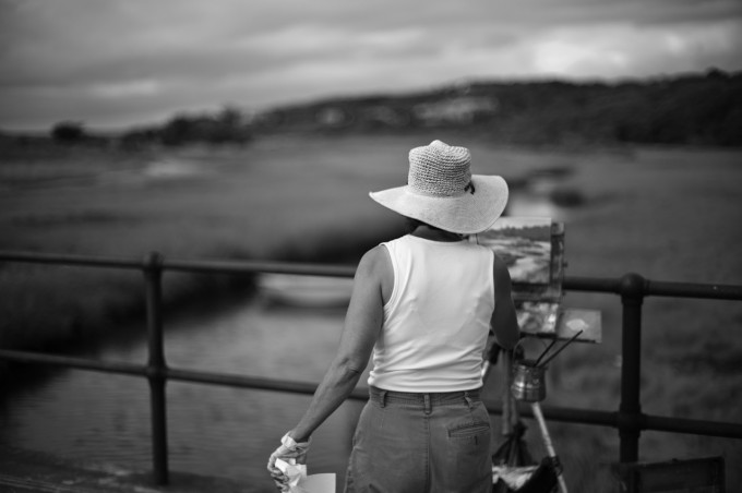
Hi David. I’m not good with words so I apologize for that in advance. I love the first one, composition especially because it reminds me of a fine art painting, genre of “reclining figures”. It’s refreshing to see the body in terms of just arms and legs. I think too much attention is paid to “torsos”. I love the painter because of the tiny gesture he makes with his left hand holding the rag. Yes, you can see this type of scene often but I think that tiny gesture lens energy to the photo and makes it differet from others. I love the horse and the kid because it’s simply charming. He composed so we see only the feet and horse eating and that’s all that’s needed. If I may make a suggestion, I’m not an expert in photography or a pro, Mr Potiker perhaps should choose carefully what he wants to show. There may be too many photos in this set.
.
Thanks! ..Hmm, but it’s not just “arms and legs” in that first photo ..the arms and legs are out of focus, and what IS sharp is the hair on the top of her head ..but her gaze is turned down, away from us, and one of her hands is cut off ..the result is that I don’t know where to look: I can’t clearly see her fuzzy arms and legs (..is she lying on a table? ..what’s she looking at?..) and what I can see clearly is just the parting in her hair. I don’t know what to make of it. ..The impression I get is one of her, or the photographer’s, intention to purposely dis-engage the viewer ..like so many of Madonna’s appearances in films, in which she creates UN-sympathetic characters (‘A League Of Their Own’, ‘Shanghai Surprise’, ‘Swept Away’, etc).
And the horse picture: we-ell, it might be something if I could see the horse’s eye. People, or creatures, in these pics seem to be always ‘disengaged’ from the viewer, as their eyes never meet mine, or are just not visible – apart from that very top one in colour ..but even there, she doesn’t look comfortable. It’s as if Michael’s not comfortable engaging with people himself, or as if he feels that he doesn’t really know why he’s taking these pictures.
The painter: why just the hat and the shoulder in sharp focus? If the painter and the painting on the easel had been in sharp focus, then we could compare the “artificial” or human-made painting with the scenery all around the painter ..that would have pointed up the difference between the painter – who’s creating a copy of their surroundings – and the rest of the ‘real’ world around them. Doesn’t work for me: seems to be shallow depth-of-field for the sake of shallow d-o-f, but without that having any relevance to what the picture’s supposed to be of, or about.
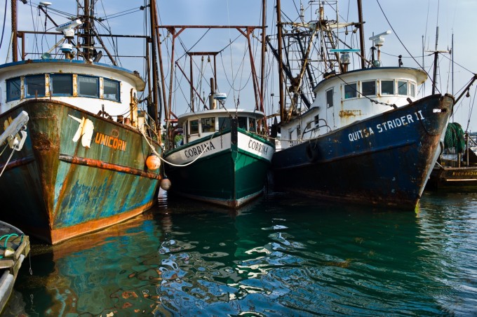
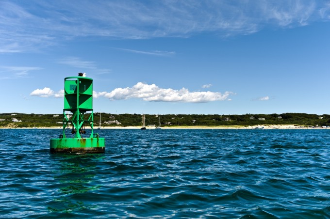
So thanks for your insight and explanations! ..But these pictures still don’t work for me. Maybe if shallow d-o-f had been applied to the buoy, to make it stand apart from the shore, enhancing its isolation in the water, that might have been a use of shallow d-o-f ..But the boats? ..Maybe that should have been a picture of just the intermingled rigging, or of three complete boats, with all of their rigging (and without the intrusive bit of another boat at the bottom-left).
Still, those are just my thoughts. As other people thought they were great and wonderful, stunning and perfect, then I’m glad for Michael and for everyone who did appreciate these photos so much.
Just not my cup of tea, but thanks for likening the first b-&-w one to a fine art reclining figure. They generally seem to be more relaxed or dynamic, though. (I’d have cropped off that bit of table at far left, beyond her toes; it’s too distracting.)
Many thanks again for replying,
David.
Thanks David for bringing us your very much needed cold blod to this sometimes too praising corner of the web.
This photos are mainly “look what a shallow DOF I can get with my expensive toy” to me.
I had much the same reaction (although I confess I really do like the girl on the lounge image, a wonderful fluid and relaxed pose/comp). I’m going to cut Michael a little slack here and say that us photogs have a very difficult time separating our images from the experience of making them.
Those of us looking at this web page for the first time evaluate the image and it has to stand on its own. Not many photogs can do that, they feel the wind or sun, the smell, the promise of the night to come. So images that don’t do much for others may do a lot for the shooter. Selecting our own images such that they “stand on their own” is probably a skill we all need to work on.
And thanks for putting yourself and work out there Michael.
.
Y’know: thinking further about it; some of Michael’s pictures in his Flickr set are terrific ..others are just, well, ordinary. Perhaps he’s not good at simply choosing which ones of his are great, and which ones aren’t. So maybe he put the ‘wrong’ ones here.
These are the ones I think are great on his Flickr site, mainly because of the textures and shapes, angles or situations, or the use there of shallow d-o-f (emboldened ones are, I think, terrific! ..italic one, I’m not sure about..)
3009, 3010, 3080, 3298, 3340, 3581, 3640, 3842 ‘Emergency Exit’, 3879, 4285, 4320.
..What d’you think?
Hi David,
In the photos for the post I was trying to kind of find a wide range of the stuff I had shot. I’m glad you like my work and took the time to go through my Flickr feed.
.
Well, I’m stumped. (..Perhaps that’s a cricketing term, but it means “I just don’t understand”.)
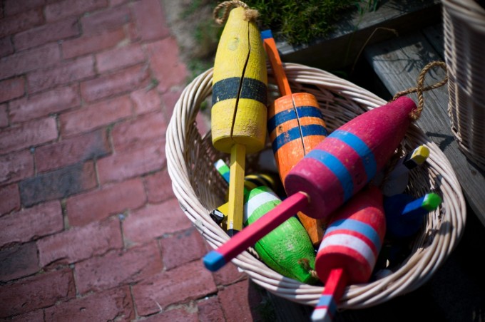
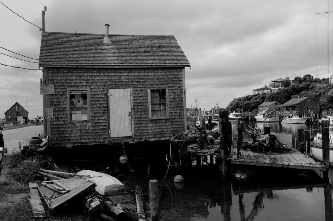
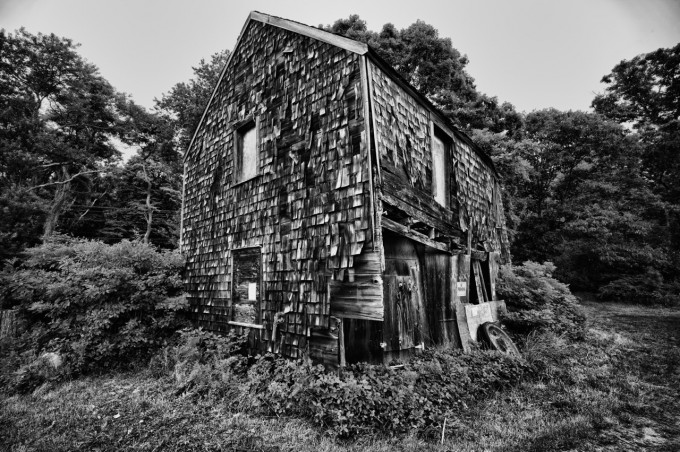
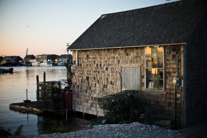
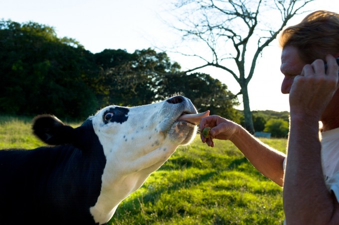
Can someone, ChickyDuck maybe, explain in what way the pictures are “stunning”, “perfect”, “beautiful”, “great” or, er, “fantastic” please? What am I missing? ..I see a cow licking an out-of-focus man obscured by an arm; a buoy; two-and-two-thirds fishing boats, with a bit of the back end of another; three wood-shingled barns, with a bit of something else intruding into the edge of one of them; the back of a woman(?) painting, but I can’t see how the painting compares with her(?) surroundings as the picture’s in black-and-white; some bobbin things; some people eating outdoors ..etc, etc.
I’m trying to learn, here. So ..is it the colours, it can’t be the composition, is it the shallow depth-of-field (but anyone can do that: just choose a wide aperture), is it the focus (but anyone can do that, as just mentioned), so what, exactly, is “great” here ..anyone ..please?
Many thanks in advance ..David.
I saw these great shots of Martha’s Vineyard on your blog the other day. I’m really glad you posted them here.
I must visit that island one day.
Bravo! Shot #1 and #9 are particularly stunning. #1 is very, very beautiful…great depth.
Love #1. Those limbs are amazing, composition is perfect, and love the painter and the horse too. As for Leica being stealthy, I’ve gotten more attention with my M9 than I’ve ever got with my Canon 5d II. More than a few strangers have walked up to talk to me because of the camera. One even posed for me because of the camera. Though, most of the time, I look like a tourist.
Michael Potiker’s observations of the M9 and its “invisibility” compared to larger SLRs resonates so loudly with me I’m going deaf. Great images incidentally.
Whilst I haven’t yet taken the plunge into the Leica world, it is only a matter of time – especially with articles like these.
i like the one of the kid at the gate who looks as if he got sheared in defense of the animals. just a great feel to it, and i could care less where the kid is in the frame.
for me, i think some of the images might work better if the depth of field wasn’t so shallow. like the first two b&w shots. nice pictures, but i’d like to see a bit more form and texture. just my opinion, but sometimes in trying to ‘blur’ out what could potentially be distracting, i think that the bokeh itself becomes distracting, which it does to me in some of these… but again, thats just me and i honestly don’t really know much about anything.
enjoy your camera, trust your instincts, and take the pictures that you make you happy. cuz, just learning to be happy with what you have and the world as you see it, is probably the one true art that not many master.
Fantastic shots Michiel – I was very impressed with the subjects / composition and the distinctive Leica feel to the images
Stunning pictures. The last one with the cow is my favorite…the story, the color, the dof.
I enjoyed these much more than comicon…Lovely photos. All of them.
I very much enjoyed these images! I dream of the day I can use fast Leica glass, myself. (I am blessed to have some really sweet, fast Canon L glass, which of course must be mounted on comparatively large DSLRs.) Martha’s Vineyard is one of those places I must see for myself, someday.
Regarding the rule of thirds, well, candid shots of live subjects cannot be expected to always be perfectly composed to some artificial artistic standard. Moreover, when I view a series of images, and all of them are slavishy composed according to the rule of thirds, that can appear rather unimaginative, and therefore inartistic, in itself. I like to see a nice mix!
I don’t know I see some use of 1/3rds throughout this post. It is up to the viewer, but I’ve never felt more keen to shoot dead center with a RF vs. SLR. I think I may recompose too often!
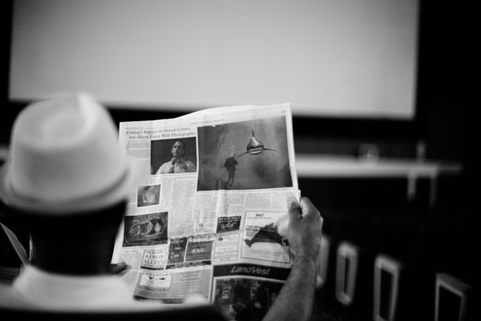
Some Examples: The Buoy, the man reading the paper, while the paper is in the background (in focus) the man takes up the first third of the frame, and the first shot.
Nice feel.
What’s 1/3rds?
2/3rds? http://www.facebook.com/photo.php?fbid=2177471349215&set=o.2345858051&type=1&theater
it means placing main subjects on intersections of lines 1/3 from top / bottom and 1/3 from left / right of frame. A classic compositional “rule” and one that is slavishly followed too often in my opinion. Shots which “break the rules” are often more interesting. Too many people place a rock in the foreground and have leading lines etc….yawn. If I want a postcard image I can buy a postcard. What I want is the “feeling” of a subject. A perfectly sharp eagle in flight is not what an eagle is to me. I would prefer to see a blurred flash with some recognizable feature…much more of the experience of an eagle.
Here endeth…..
Thnx Mark! I knew that, particularly the “slavish” part… 😉
.
But no-one’s looking towards the camera (..except the woman in the colour shot at the top). They’re so UN-involving, and seemingly random, compared with Dmitri’s.
You’re right David, but that need not be a problem. Dmitri’s images were simply amazing, because of the interaction between subject and photographer, and the overall excellent technical quality and composition, and that with a small camera, but used to achieve wonderful results.
Of these I like the b&w ones, #1 and #7 in particular, best, and then mainly because of the lovely b&w tones. The rest? Well.
Nice photos. My only critique (of this set and the comic-con photos) is you have too many subjects dead center in the frame (the main photo of the woman is a good example of what I’m talking about). I see this a lot with rangefinder users since the focusing patch is dead center there’s a tendency to not focus and recompose.
+1. I’ve noticed this before (on this blog) with rf images. It’s understandable, but does not always produce the best image.
Does it matter? Up to the viewer to decide.
I notice this too and its always bothered me to see faces dead center with a lack of framing, A lot of RF users do this. It doesnt ruin the pictures but its just like any other form of poor framing imho. Shortly after getting my M9 I relearned the instinct to focus then dip when shooting living subjects. Inanimate objects its not an issue though and those pictures turned out great.
Err….the green buoy is not dead centre.
Nor is the house on the water.
Nor is the artist.
Nor is are the fishing floaters…….
And nor is your argument.
I use a Leica X1, and I really envy you when you can get that lovely DOF with those lenses. I am pretty much stuck at 2.8 :/
Great pictures!
Great photos, really love the first two!
Simply stunning, Michael. The shot of people eating outside tents really shows how depth of field control can be used to make a seemingly ordinary subject interesting; I want to know the stories of the people. The woman painting seems like she is part of a painting herself. Fantastic work. I only hope that my efforts with my new voigtlander r2a and 40mm f1.4 come anywhere close to these beautiful pictures. Will consider selling extraneous body parts to own an M9.
Thanks Mark! The 40 1.4 is a sweet little chunk of glass and you should be be able to do some good stuff with it. The 50 1.1 actually has a lot of problems, but it’s a sacrifice I made to be able to shoot in light where I wouldn’t have been able to even use my camera before.
Good luck with your R2a, I have an R2 with a trigger winder coming in the mail and can’t wait to see how the voigtlander body is (I’ve been really happy with their glass).