

Scotland in Medium Format with a Phase One DF+
By Andrew Paquette
For my autumn holiday this year I had wanted to do a fashion shoot at a nearby ruined castle. However, I wasn’t able to find the right models or styling for it, so I opted to go to Scotland instead. This is something I’d wanted to do since seeing Skyfall when it came out, and my interest was only enhanced when I saw Albert Watson’s photographs at the Isle of Skye. I mentioned this to a photographer I knew in Edinburgh, Laurence Winram, who helped me find a good assistant (a great assistant—Stuart McMillan) and loaned me a lightstand and incidental gear for the trip.
I shot all of my serious shots with a Phase One DF+, an IQ250 back, and an SK 80mm LS lens. In addition, I brought a Sony A7R, Leica 35mm Summilux, and a Zeiss Alpha 135mm lens. The Sony was there to take video of the excursion, though it did get used for some incidental shots. Everything was shot tethered. This made things a bit more complicated in the rain, but some of these shots wouldn’t have been possible any other way so I’m glad we went to the extra trouble of bringing a laptop, tray, and stand for the computer. All photos were processed in Phase One’s Capture One Pro v. 8.2.
It rained off and on throughout the trip, at times quite heavily, but for hours on the second day it was clear. A surprise to me was how important my new waterproof hiking boots would be. I didn’t know anything about Scottish bogs until I got there, but after walking through a few, am grateful to my wife for insisting I get a new pair of boots. It was like walking on wet sponges—and this was true almost everywhere we went.
Because the monumental rock formations of the Isle of Skye have been extensively covered by other photographers, I tried to avoid them (though I was curious to see them). Instead, we focused on the inner portion of Skye Isle, and the less obvious places around Glen Coe valley. As Stuart said at one point, almost at our last stop ‘Look! That’s the first tripod we’ve seen so far—we’ve done well’. He explained that if we’d gone to some of the more famous landmarks, we would have seen dozens of photographers with tripods.
On my first shot I managed to snag my trousers on a thorn bush, which tore out a huge section of the backside. I didn’t notice, but apparently it was pretty obvious to Stuart:
‘Looks like you’ve torn your trousers there’
‘Is it bad?’ I asked.
‘Yep, it’s pretty bad.’
I took a look and was surprised at the extent of the damage. Luckily I was able to obtain a sewing kit at the hotel to sew them up. It looked like I’d been the victim of a shark attack, but under my rain gear, it was invisible. Apart from that mishap, everything went pretty well.
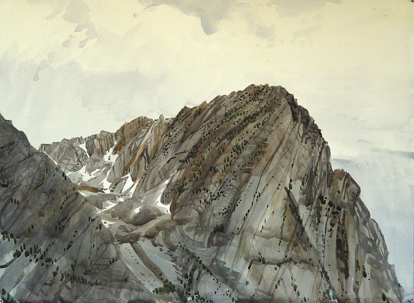
My primary goal was to make photos that resembled some of my watercolour paintings that have a strong Chinese influence, as seen in this example I made at Yosemite:
Figure 1 Lee Vining, watercolour on paper, 37″ x 54″ 2002
Here are some of the shots, along with comments:
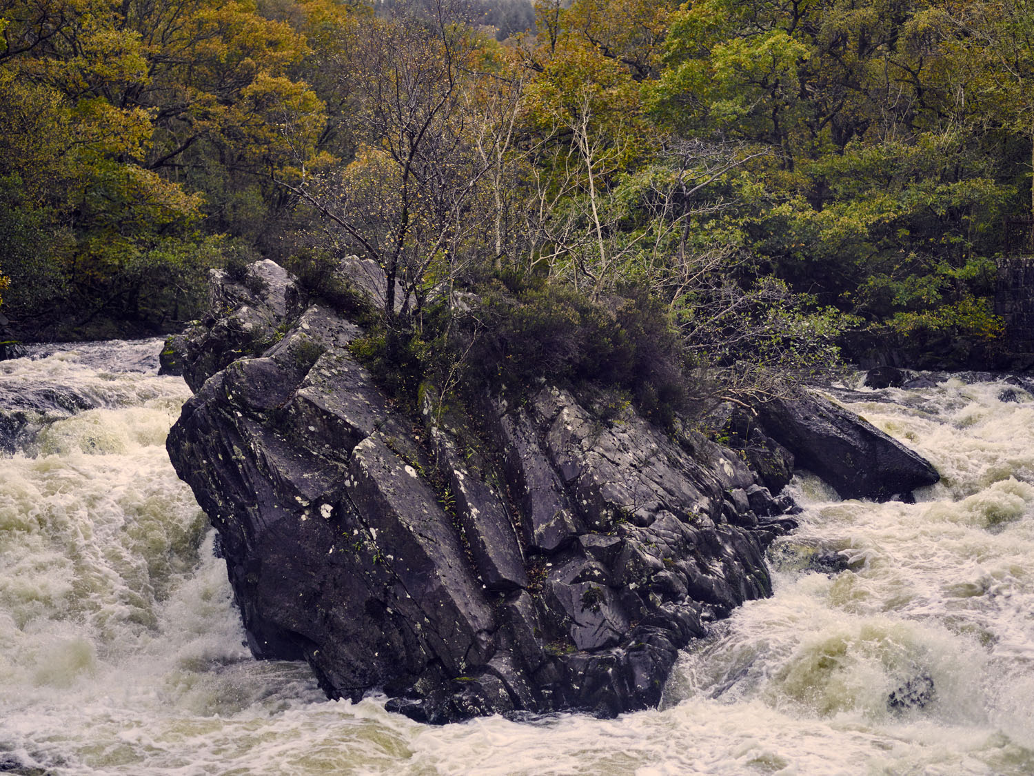
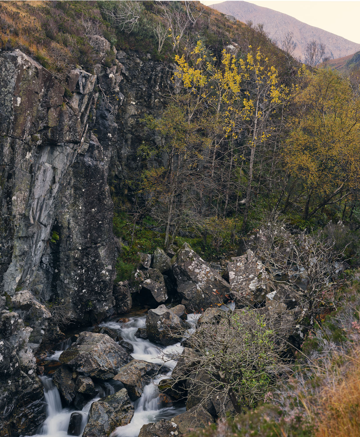
Figure 2 Waterfall near the town of Calender ISO 800 f/2.8 1/1000
This was the first major shot I took, on the way up to Glen Coe. It is also the shot I ripped my trousers to get. The goal was to get something that would resemble Chinese paintings from the Song dynasty of big dark boulders in rivers or fast moving water. To get that effect, I wanted the water sharp, so we spent most of our time balancing ISO, f-stop, and exposure to get what I wanted.
–
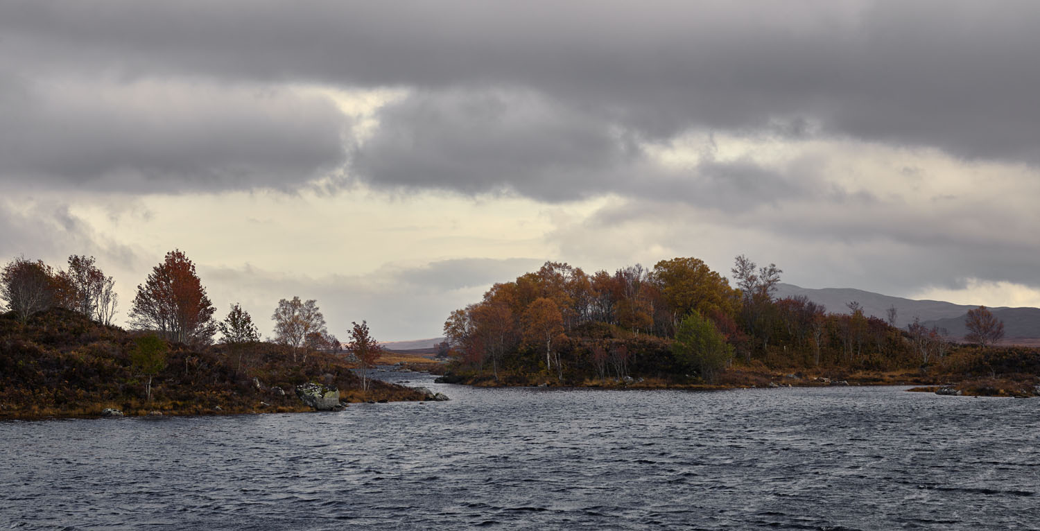
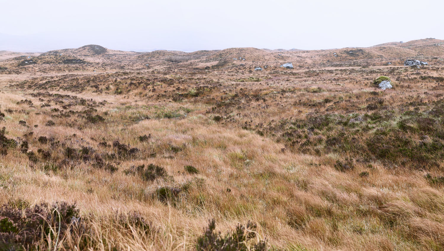
Figure 3 Mini bogs ISO 100, f/10, 1/200
On the way to Glen Coe, we passed a big lake that had a number of small islands topped by small trees. I wanted to shoot them, but didn’t have the time at that moment, so we came back and got this on the way back to the airport at the end of the trip. I wish I’d had a longer lens for this, but I didn’t have one, so this is a crop, making it one of the smaller images from this excursion. Because the IQ250 produces such large images though, it is still larger than most full frame DSLR images.
–
Figure 4 Cuilnacnoc Gate ISO 100, f/16, 1/80th
Stuart and I spent at least an hour at the top of this hillside, engaged in an effort to capture the vastness of it. However, none of the pictures were able to do the job, so we hiked down. Not wanting to get trapped at the wrong spot, I took note of this location and then we continued to the bottom before deciding to come back up and get this shot. It is about four images stitched together in Photoshop, one of the largest of the stitched images I made on the trip.

–
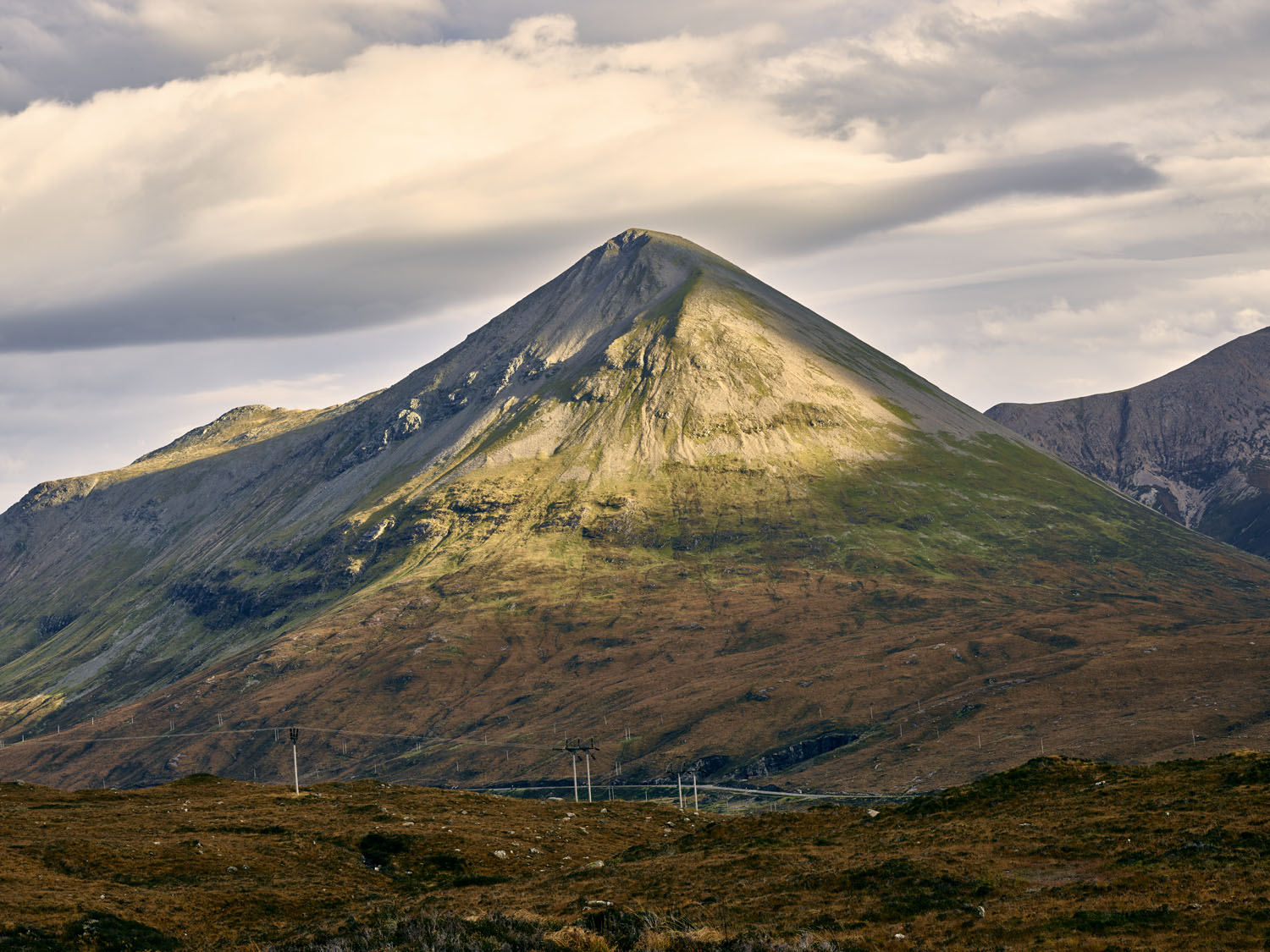
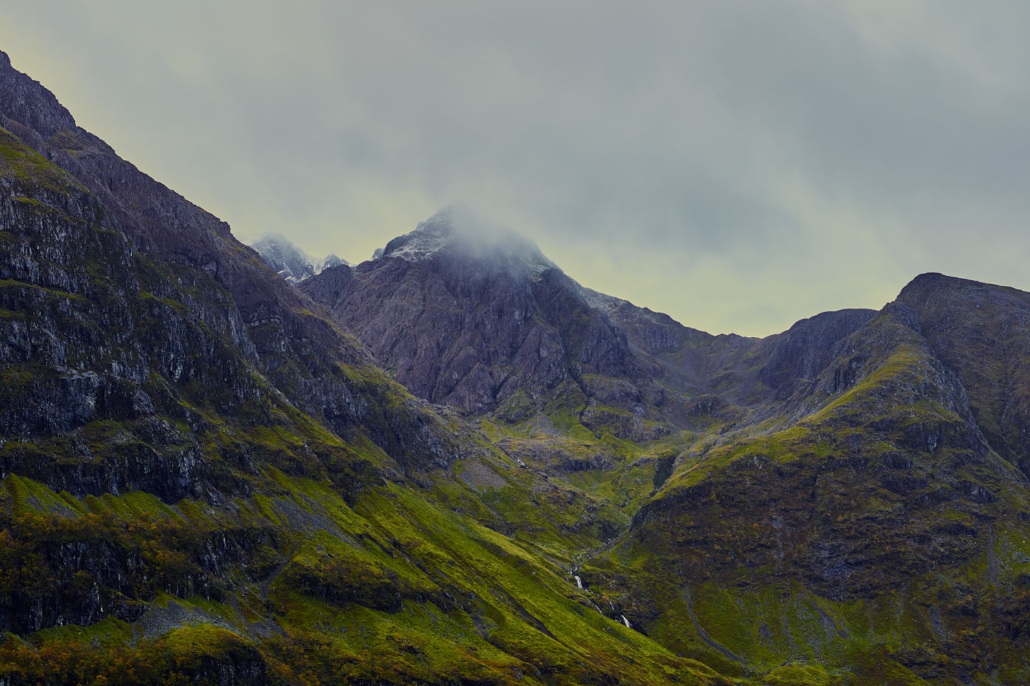
Figure 5 Glas Bheinn Mhor ISO 100, f/20, 1/25th
We stood on a huge spongy mass to get this. The primary difficulty was waiting for the light to peek through the clouds and hit this mountain. We waited about a half hour or more after this was taken, hoping it would get better but it didn’t so I finished with this. It is one of the few images that is inspired by a British rather than a Chinese painting. In this case, I recognized the mountain as one painted by the British watercolourist Francis Towne (one of my favourite artists), so I was quite keen to get it.
–
Figure 6 Glen Coe Valley ISO 100, f/14, 1/8th
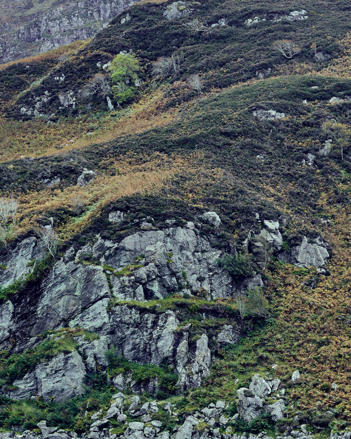
This is one of the first shots taken at Glen Coe. It was a tough hike (for me) to get up the slippery moss and rocks while carrying about 15 kg of camera gear, but we made it up and were rewarded with beautiful views in every direction. It rained quite hard at times, but all of the equipment performed without malfunction. That said, by the end of the day, everything in my bag was covered with condensation moisture and needed drying off.
–
Figure 7 Glen Coe Bog ISO 100, f/12, 1/20th
When I first saw this it looked like a field of lumpy grass like what I frequently saw around Phoenix. When I suggested going out for a photo, Stuart warned me that “it will be wet”. It turned out this was a bog and it was very wet, just as he said. All of the plants you see here are growing straight out of water, and beneath that, soil. The mystery question is “how deep is the soil?” In most cases the water was only an inch deep, but in others your whole foot could get swallowed by one of the red spongy growing things they had all over out there.
–
Figure 8 Glen Coe 2 ISO 100, f/8, 2.5s
This image is one of the few that really looks like a Song dynasty painting to me. It is shot straight across the Glen Coe to catch the lowering clouds.
–
Figure 9 Loch Long Cliffs ISO 100 f/11, 8s
Another of the ‘Chinese’ images. We were headed to Loch Anna, but couldn’t find access, so we stopped at Loch Long instead to shoot this at the end of the day, at sunset or a little after. It was a real surprise to me how Chinese the landscape looked because I hadn’t expected it at all.
–
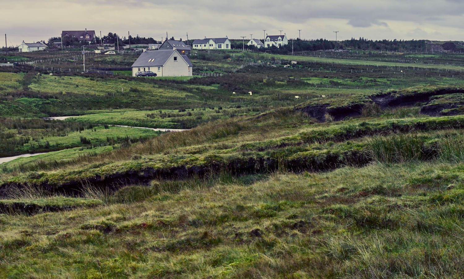
Figure 10 Maligar homes ISO 100, f/20, 2.5s
This was shot in the early morning of the first full day of shooting. It was quite windy, which led to quite a lot of motion blur in the grasses—and in almost all of the photos I took on the 3 days of shooting that we had. This scene reminded me of Edward Hopper’s watercolours of New England homes in the U.S. The way it is shot here though, it looks more like watercolours by Winslow Homer from his time in England and then later near Boston.
–
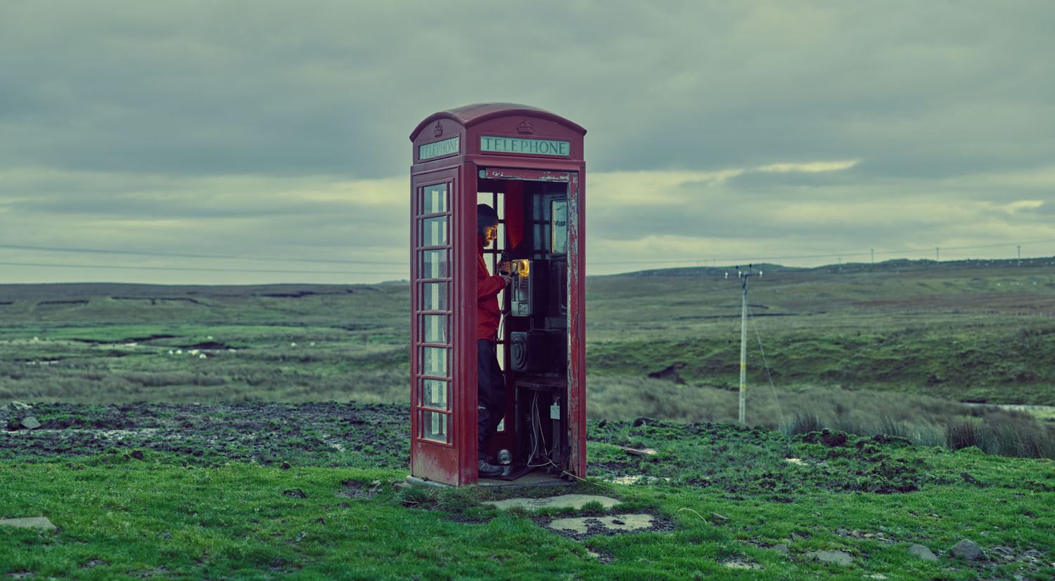
Figure 11 Maligar Phone Booth ISO 400, f/4, 1/6th
I had just finished telling Stuart about a shot I didn’t get in Thailand—of a phone booth in the middle of nowhere—when we ran into this phone booth in the middle of nowhere. Stuart was kind enough to be the model for this, using the reflected light of his pocket torch to illuminate his face.
–
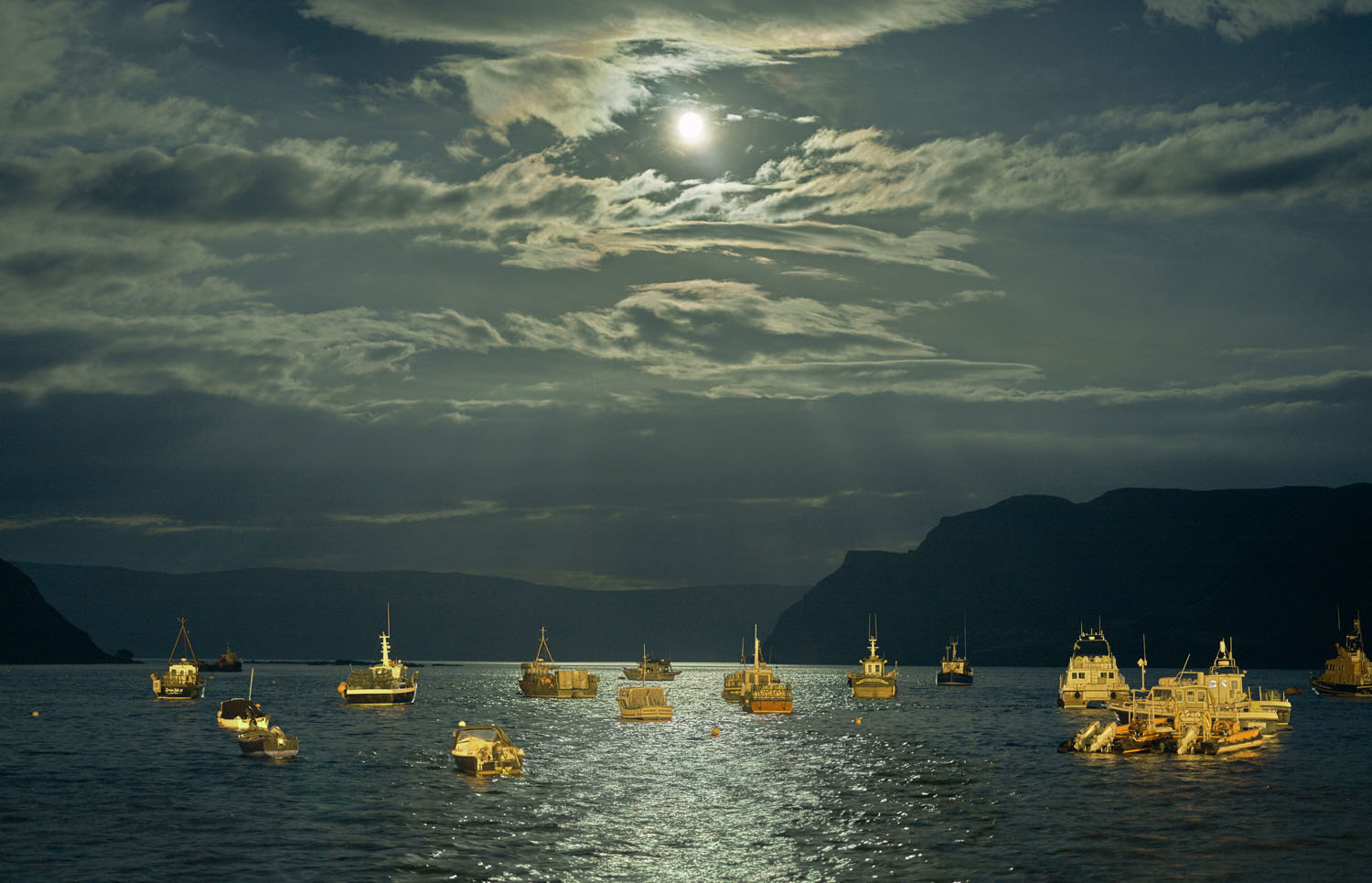
Figure 12 Portree Harbor, ISO 800, f/2.8, 1/3s
This is easily the most difficult shot I got on the trip. We were driving back to Maligar for a second look at the houses, when I thought it might do just as well to stop in the town of Portree and shoot a church I’d seen there when we stopped for lunch earlier in the day. After getting out of the car with the equipment, we discovered that we didn’t have a good angle on the church. However, the harbour looked interesting, so we walked down there. As soon as I saw these boats, they reminded me of the watercolours of Paul Klee in the way they were arranged with very little overlap and simple colours. The boats were moving quite a lot as they bobbed on the water and there was very little light—less than it seems here because when we started the moon was not visible. We started by shooting at ISO 6400 to get the focus. The viewfinder was useless for this because it was almost pitch black, but the tethered computer allowed us to check focus there. Once we had the focus, we walked back the ISO until the graininess wasn’t an issue. After that, we did the same thing with aperture and f-stop. Then, the moon came out and we had the picture, complete with rays of light.
–
Figure 13 Sligachan Waterfall ISO 100, f/8, 1/3s
This is another of the Chinese compositions, near some of the most famous landmark rock formations on the Isle of Skye. Naturally, we didn’t see those or photograph them. To get this, we mounted the camera looking down a steep rocky defile. The terrain was quite spongy—giving me the feeling that I’d slide over any moment, but we got the shot okay and then headed back toward Portree.
–
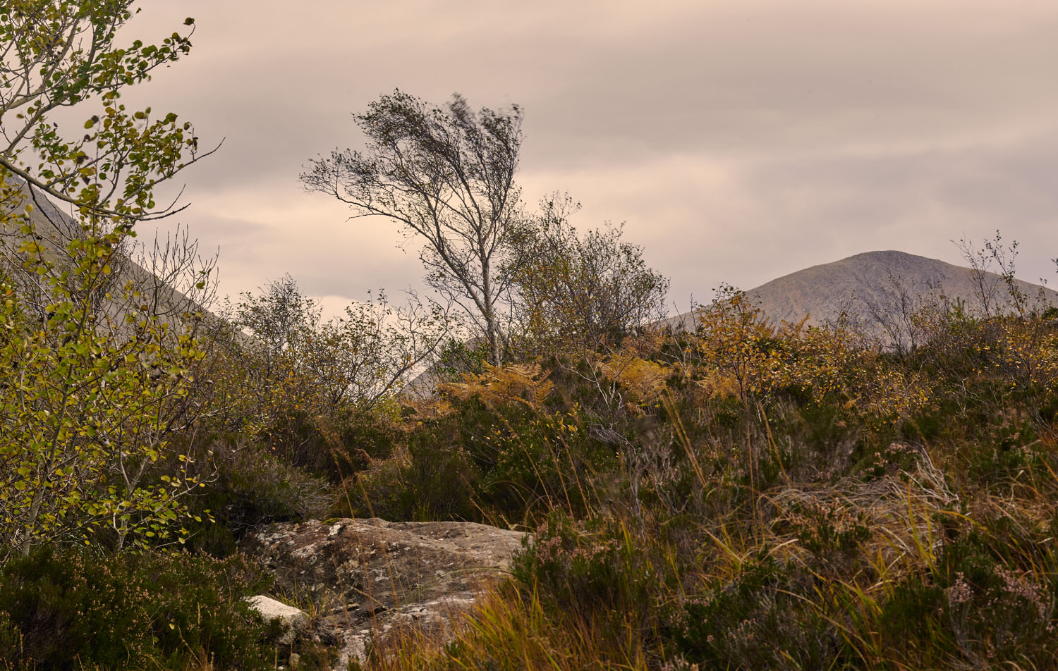
Figure 14 Upper Ollach ISO 100, f/18, 1/6s
The original vertical composition for this image had a very Chinese feel to it, but I thought it looked better as a horizontal composition and cropped it. Now, it reminds me a bit of a van Gogh painting of windswept rocks that I saw in a catalogue for a show of his work in New York City.

The photos are lovely , but don’t you hate , looking at them, that probably, if you position yourself correctly, and a little bit of post editing. That you could take the exact photos with an iphone . Again not taking anything from the photographs but it kills me that we buy expensive gear , that could be duplicated with a mobile phone camera . dont you think?
I don’t know mhmdmahdi–does it bother you to use a comparatively expensive computer to write quick notes when a post-it and a pencil would do? Seriously, your question is ridiculous. A cell phone–at best–can replicate a composition. It will not capture the same color or resolution.
AP
True. Dont take it personally. the photos are gorgeous. Just statitng the obvious cell phones on social media can duplicate most expensive equipment and gear. Peace
Simon, incorrect but welcome regardless.
Andrew, I fear to write anything else here because you will obviously feel the need to write another few hundred words… and that is quite unnecessary on my account I assure you. I reiterate my initial view that compositionally I think most of photographs you posted here are poor. I have explained to you why this is my view. Over and out.
Hello Simon,
Please don’t feel like you have to rude on my account, it is quite unnecessary I assure you. The basis for my claims regarding Chinese compositions is the late Wang Jiqian (C.C. Wang), one of the world’s foremost authorities on classical Chinese painting before he died. You may disagree with him, but it is not unusual for even experts to disagree with each other. The fact that a disagreement exists (and that hasn’t been established here) is insufficient to justify a claim that one position or another is “utter nonsense” as you have carelessly stated. The fact that a Chinese painting can be appreciated from a western point of view does not mean it was made to be appreciated in that way. Sketches by Chinese artists (album paintings) tend to resemble western compositions more than hanging scrolls or hand scrolls. This may have led to your confusion, because I did use a couple album paintings as examples of certain artist’s work. Hand scrolls do not compare well to western compositions because they cannot be viewed all at once, even when the scroll is fully unrolled due to its length. Wall hangings, even if a reproduction on a computer screen makes it resemble somewhat a western composition, are meant to be viewed close up–too close to see the entire painting at once. This is emphasized by the size of the strokes, which is often small enough that they cannot be seen if standing far enough away to see the entire painting at once.
As an aside, I will note that the difference between the way westerners and Chinese collectors value paintings has led to impressive profits to those collectors that can tell the difference. This is because, the two value things not just differently, but almost the opposite of each other. The result is that work that has little value in one culture is considered to be highly valuable in the other, and vice versa. One example of this (apart from composition) is that Chinese collectors tend to care more about the quality of brushwork than the original authorship of a composition. For this reason, there are copies of paintings that are worth more than the original, and paintings by masters that are less highly valued than well-executed work by lesser known artists. Of course, this is relative to which market the work is sold in. From a Chinese perspective, at least until the recent spike in auction prices, it is better to sell weak paintings by well-known artists in New York, New York is a good place to get a deal on excellent paintings by less well-known artists, and quality brushwork will get the highest price in Hong Kong.
AP
Andrew, I did read through your blog. I do not see that any of the Chinese pictures you posted disobey the ‘normal rules’ of composition, be it in photography or any other formal of image making. By extension, I reiterate my point that your suggestion that “the way these pictures are ‘composed’, the boundary of the image and how the elements fit into that image are almost irrelevant” can politely be described as ‘utter nonsense’.
Since your own watercolours seem to follow these rules it is a mystery to me why your photographs do not. Were you trying too hard for a particular look? I would think stepping back a bit and thinking about basic composition would be a good next step.
Finally, I will take your mentioning a need for a telephoto lens, the rendering of water and Hokusai – all things I mentioned above – as compliments!
Cheers
@ those who have said nice things about my watercolor: you can see more of my paintings and drawings at my other website, http://www.paqart.com
@Keiron, I don’t know if your suggestion regarding sensor size is the answer because other posts of mine on the A7r and D800 have also provoked the same kind of posts you mention. I do think it is related to high end gear though, regardless of sensor size. One group of gear-related comments tend to be along the lines of “you could have done that with less”, and the rest are technical quibbles of some kind.
What I will say is this, regardless what the subject is, regardless of composition, lighting, model, styling, retouching, etc, a 36MP camera cannot produce 50MP of data. Also, a 12 bit sensor isn’t going to produce 14, 15, or 16 bit color. A sensor that has pixels that are 150% the size of pixels on a DSLR sensor will yield better quality color. Therefore, regardless of any subjective impressions of image quality, the images produced by a 50MP medium format camera are qualitatively different from anything produced by a DSLR. This means that a DSLR, camera phone, or any other variation of that theme promoted by other posters (not you) is wrong. I’ll also add that because of color depth and accuracy, MF images are distinctive even at lower resolutions. I discovered this when, on separate occasions, I was looking through the portfolios of different photographers and found that while most of the images were not appealing to me, a handful were much stronger than the rest. I found out later that those images and only those images were shot with an MF system and the rest were shot with DSLRs. These were all website images, so resolution was not high. Artistic considerations aside, MF photos are different from DSLR images and this difference is usually visible, thus undercutting the credibility of any claims to the contrary (again, not that you have written anything like that).
If you want to see more example of high quality color in MF photography, the websites of Tim Kemple, Howard Shooter, and Jason Bell are well worth a look.
Best regards,
AP
Simon, there were comments on composition and there were also comments on gear. I find it really interesting that gear is discussed on other posts but the comments “this could have been done on an xyz camera” rarely come up. I have been following this site a bit and you will always get fan boys of brands and series but I have never really seen it to this degree. It seems no one is a fan of Phase One except for Andrew 🙂
I hypothesized that this could be due to many photographers (not all) seeing full frame as the gold standard and anything bigger is just too much sacrifice weight and finance wise and thus people cannot justify it. The debate rages about crop vs full frame sensors and there are many people standing in each corner with very valid comments but the debate with the inclusion of a medium format sensor is really taken up.
Composition wise you guys seem to have a nice debate going on and on a personal note, and using a very untrained eye, I find a lot of those classic Chinese art compositions a little accidental in nature. This tends to lead to a lot of debate on why the artist chose that composition and many people have different ideas on how a piece should be painted. This seems to be happening here and all I can say is debate is one of the best things about Art.
Figure 1 is the first not by chance, it is really the best one.
Keiron, I thought most of the real discussion here was about composition.
I have to agree with Simon’s initial comment that we can’t appreciate these subtle tones online with traditional monitors. If needing 50MB files is important, I would also hope that finding subjects to exploit that data is equally important. Aside form the Portree light, which is elegant, I find many of the other files to just be recorded information of bland scenes. And yes, there are people who love that so feel free to ignore me. But I do believe in visual excitement. And it drives me. I don’t personally ask what gear people use because it won’t change my opinion if I don’t like the image. I see many images on this site and I always ask myself are people choosing their subjects based on what the camera can yield or are they selecting their subjects and then grabbing the appropriate tool. I wouldn’t shoot reportage with an 8 x 10″ Deardorff, and since I enjoy reportage, I don’t want to bring along a Deardorff. I also have a mamiya and Leaf back but I do bring that on the street with me. My basic point is this: Which came first, the chicken or the egg, the inspiration or the need to show the gear. Less is more, less is more.
Cheers from Dakar, Senegal.
Hi Andrew
I cannot believe how much discussion your camera has started. When people use their 10$K+ Leicas no one says “you could have done that with an iPhone” so it must all be due to the sensor size more than the cost? Who knows… but I really like your images.
The one thing that really wowed me was that you hiked up Glen Coe with all your gear, including a monopod for your Laptop! Holy moly! If you can do that then there is no reason to worry about gear size 🙂
I did a very similar trip to Scotland and I was graced with the most amazing weather. There was one day where there were clouds and fog and that was only for 2 hours and that paints a completely different scene than clear and warm days. My pictures are bright and somewhat over saturated but I had different inspiration, you nailed yours and I love your work.
Here is my version of Scotland: https://www.flickr.com/photos/52451955@N07/albums/72157661068581561
Hello Subroto, no, the sky wasn’t magenta there. I added it to the shadows purely because I like the look. The colors straight out of the camera are very neutral, as you would expect. Then I monkey with them because that’s one of the things I like to do. That said, I am trying to force myself to be more subtle going forward. Best regards,
AP
Very sporting reply, Andrew…thanks ! For all I know, that day in Scotland may well have had a lot of magenta in the lighting; can’t say, I ‘ve never been been to Bonnie Scotland. Perhaps, it’s just my eyes, used as they are to the harsh, vivid light of India. In any case, taking a white balance reading doesn’t necessarily produce a particular effect; quite the contrary, as a matter of fact. In retrospect, I think the colours do add to the (somewhat subdued, generally) atmosphere. You just keep doing it your way, Andrew, and all the very best of luck to you.
To Simon and Tony,
I decided to write a blog post on my blog to respond to the image as art comments. You can find it here: http://paqphoto.blogspot.nl/2015/11/china-in-scotland-and-few-extras.html
Please click on images to enlarge them so that you can see them as more sharp than the native resolution of the blog. A couple images from this post aren’t present in the blog post, and others are eliminated. One that I want to comment on here is the blog shot that I mentioned as being like a ‘field painting’ and which Tony rightly pointed out does not in any way resemble a Rothko. I used Rothko as an example of the type of composition found in a field painting, not as an example of a painting that resembled my photo. There are quite a few artists who divide their compositions into two horizontal bands, then fill each with a constant color or pattern. That is all I meant by it. Rothko was the first name to come to mind, but there are others.
As for gear, since you mention it as important to this site, a gear site, I would like to add a few gear-specific comments.
First, I love shooting with a Phase One camera, particularly when it is tethered and even more when I have lights. regardless of any other factor that might be of interest here, the equipment is literally more fun to use than the other cameras I have. Therefore, if I was only looking at gear from the fun factor perspective, just like a colleague of mine that bought a fancy Corvette to drive around town in, the Phase One is more fun to use than other systems I’ve used. The reasons I can think of to explain this are:
1) It is better balanced than the D800 or A7r (with a big lens), thus making it more comfortable to hold. If compared to an A7r with a compact lens like the 35mm Summilux, it is still nicer to hold because all the buttons and switches on the A7r are so tiny. The P1 DF+ and IQ250 can easily be used with gloves and has a solid grip.
2) The live view screen is bigger than my other cameras, has better color, and is touch screen sensitive, making it very easy to zoom in on the image.
3) Shooting tethered can be done with any of my cameras, so the Phase One has no real advantage here as far as ‘fun’ is concerned, but the images are bigger and that makes it easier to check my work when shooting tethered because I can zoom in more.
4) It is slower than the Nikon or the Sony, but that makes me more careful when taking pictures. That said, I have used it at sporting events and am surprised that I can fire a burst and get several (as opposed to a dozen) full res shots of the same action–though more widely spaced than with the Nikon or Sony.
I should also mention that my Induro CF tripod also contributes to the fun factor. I don’t know how it does, but I find that using it is somehow fun, but other tripods I’ve used are not. Not a particularly scientific observation, but there it is.
As for what really counts, IQ, the Phase is in most ways better than anything else I’ve ever used. The sensor alone is responsible for most of that image quality, at least as far as I can tell. Based on lens tests I’ve seen on DXO labs and elsewhere, the Zeiss Otus lenses are better than anything available for medium format. Whether that is true or not, when I compare shots made with my D800 with the 55 mm Otus to the shots I get from the Phase One, the Otus shots look soft in comparison. They are sharp images to be sure, but the D800 resolution is so much lower that the Phase One’s superior sensor quality yields a higher resolution image with better color rendition. The Otus almost never displays any hint of CA or LOCA where the SK lenses on the Phase One system will, but this is not something that cannot be controlled or is so serious a problem that it would warrant switching to a lower resolution sensor to use an Otus.
AP
@AP: Since I was one of those who raised the issue of cost of gear, let me say that I think it IS of interest. For $40,000, what is the difference in image quality vs. a $4000 camera or a $400 camera? Some comparison IS useful, and it’s not about pitting one photographer against another, but comparing photographs. This is, after all, a website that highlights gear, so perfectly legitimate to discuss it, IMO. That’s also not to criticize the use of such gear, but there must be some difference that is visible. I accept that the image resolution of my computer monitor is way below 50 MPix, and so much of the difference will be lost on me the way I am viewing your photos, even if you posted 50 MPix images. If you print really large, I’m sure they will look great.
Your own stylistic allusions to Chinese art, van Gogh, Rothko and Hokusai are interesting, if rather diverse, and maybe it would be better to develop one style that is “your’s”, something we probably all strive for. As a small point, I find the typical creamy water flow from long exposures to be totally artificial, and I prefer your approach to showing the movement of water around the rock, which actually looks like it’s real, churning water, not gooey ice cream flowing.
Apart from that, I agree with other comments that the magenta cast on so many of these looks odd, regardless of whether it appeared in 1970s magazines. Compositionally, others have made points I generally agree with (mainly the principal subject appearing dead center, or lack of points of interest in some shots). On the last point, I do not see #7 as being like a Rothko painting. Rothko paintings have a lot of depth that can only be appreciated by standing right in front of them and they create a strange, some would say emotionally-moving, space that envelops the viewer. With all respect, #7 isn’t that, and I don’t think that any photograph could achieve the effect that Rothko achieves with paint on a large canvas. Most photographic reproductions I’ve seen don’t capture the extraordinarily subtle tonal variations that characterize much of his work, especially the tonal variations in the darker values.
I hope you don’t see these comments as unseemly or personally attacking you. There has been a lot of interesting discussion (at least for me) from considering your photos.
Hi Andrew
Thanks for writing… I also spent a fair portion of the weekend thinking about your images again.
One of the things with paintings, and perhaps this is especially true with some Chinese and Japanese art, is that the painter gets to leave out non-essential elements. A painting might consist of a mountain, and a stream and nothing else. Or the artist might paint just the tops of mountains, leaving the impression that the bottom is shrouded in mist. Space is key I think; it focuses the viewer on the main elements, and it helps provides a sense of scale.
As you say, these elements are an arrangement of brush strokes; I disagree that how the elements fit into an image is almost irrelevant – I think it is very important, more so if you want your images to also work as photographs in their own right.
Another thing, and this might sound odd, is that many traditional painters, to my eye at least painted “with a telephoto lens”; I always feel that while I could be drawn into an image, the main elements are far away, that it would be a journey to reach them. Imagining that journey is an emotional and perhaps mystical aspect of enjoying the image, at least for me.
Image 9: Looking again at this image I think it lacks this sense of scale. I find it hard to tell whether the bush/tree like items sticking out from the rocks are one foot tall or 100 feet tall. As a result I’m not sure if I am looking at some mountainside ‘macro’ view or a massive swathe of space. Is this a view I could stand next to, or one I could walk into? I have the same issue looking at images of icebergs (another photography review site is sometimes littered with them); I’m never sure if the iceberg would fit in my bathtub or whether it would sink the titanic! I appreciate that you cannot magic a red deer out of nowhere to pose elegantly one third from the left and one-third from the bottom of your image, but some sense of scale would make me a more satisfied viewer. I can definitely see what you are trying to achieve here; I wish I could see the image 6 feet high to be able to delve into it.
Image 2: My sense is that water in Chinese paintings is either raging torrents (I know this is Japanese but think of Katsushika Hokusai’s Mount Fuji image Beneath the Wave off Kanagawa) or it is calm and peaceful. Calm and peaceful flowing water provides a sense of serenity in Chinese culture. On the basis that the water in the photo is not that scary, I thought the calm and peaceful look would have worked better. You obviously thought of a different painting to me!
Incidentally if you do see Hokusai’s image you will notice that despite the frightening scale of the main wave, a large portion of it is plain white – details left out for effect. (There is also a boat in the foreground, providing a sense of scale).
Image 7: As a photograph, for me this image lacks foreground elements that draw me into it. I think if you wanted to emulate a Rothko painting you could have achieved this with maximum “out-of-focus-ness” to eliminate all details!! I’ve tried this myself… yellowy cornfield on bottom, blue sky on top; even on the windiest days, I’ve never been satisfied with the results.
Image 4: Yes, my mum would say “that’s nice dear”. It is nice.
As for kit descriptions, personally I don’t think they are necessary at all. It is a great weight off one’s shoulders when one graduates to the point of discussing images rather than cameras. That said, you did post the images to a gear review site (and admittedly I do rather frequent this site).
Finally, let me say, you were right to criticize my ‘not fab’ comment. It was arrogant and unhelpful. Forgive me. I hope my further comments have made amends.
Best, always
Simon
@Simon, more detailed reaction here (primarily for benefit of others who might enjoy reading a back and forth like this)
Image 2: I had already modified the composition of this (it is on my website) and it does improve the composition, so we are in agreement there. I agree with the comment about the vegetation and that narrower depth of field would have helped, but I was already at maximum aperture for that lens (f/2.8). I did take a shot with my 35mm Summilux at f/1.4, so now I’ll have to look at that (I haven’t processed those images yet). In this case I purposely used a fast shutter because I wanted to get the effect you see in some Chinese paintings of water frozen in motion. For me, that was a fixed requirement of the shot, so if it is a problem here, I would be inclined to alter something else rather than change that.
Image 3: For me this image is a stand-in for another shot to be taken the next time I’m out there, but I still like the scene. Have to agree with you though.
Image 4: In this case we disagree. It is a flat blue light but it is also a powerful large patch of solid intense green. That was what was interesting to me and it is there in the picture. I wasn’t going for romance here, but a sense of height and space.
Image 6: Cropping the bottom 25% of the image would probably have the same effect as lowering the vantage point (which I wasn’t about to do on the slippery side of this mountain).
Image 7: This one really needs to seen at full resolution. The composition is like what in the 1950’s was called ‘field paintings’. This does not refer to paintings of fields, but abstract compositions of large planes of color such as the images of Mark Rothko. They are less about composition than about color. In this case, it is more about texture–that of the grasses covering the ground.
Image 9: Since is the third composition disagreement, and because the reason is consistent, I’ll describe the rationale here. I also talk about this on my video. The way Chinese paintings are made, the word ‘composition’ doesn’t mean the same thing that it does in the west–at least not the older Chinese paintings that are my reference point. This particular image is probably more evocative of the style than any other photo here and reminds me very much of a beautiful Song dynasty painting in the collection of one of my in-laws. The way these pictures are ‘composed’, the boundary of the image and how the elements fit into that image are almost irrelevant. Instead, they are arrangements of brushstrokes, each of which is unique. When you look at one of these paintings, you are invited (by the painting) to enjoy the way the artist has created brushstrokes unique to each species of element in the scene (a yew tree vs. a pine tree for example). The nearest equivalent to that in a photo would be to emphasize texture, and that is what this image does.
Image 14: Agree with major points on this one (and have already put a different version of this on my website). However, the use of the word ‘windswept’ was unfortunate. It describes the Van Gogh painting I referenced, but not this scene, and I wasn’t going for that look here.
I always describe the kit because everyone else seems to do it so I thought it was a requirement of some kind for posts here. If it isn’t required, I’d just as soon not because the most irritating comments always have to do with cost of gear, an issue that I don’t find all that relevant to the issues that matter to me.
Best regards,
AP
@Simon, thanks for the critique, it is appreciated. I’ll take the day to revisit the images and see what happens. One thing I’m beginning to understand about photography is that, while it is nice to get a perfect capture, more often than not the capture is just the start of the process.
AP
@Fergus: I think the reason for the “good and bad” comments, or at least the negative ones, is that I am using all pro gear. If the cameras were more modest, I don’t think it would offend anyone’s sensibilities whether they liked the images or not. Because it is good gear though, it seems to be held to a different standard–at least if comments on other articles are anything to go by.
As far as posting here is concerned, I recently took a look at all of the articles and can see a progression of learning as I go through all these comments, get more practice, and put more effort into the images. It was interesting to see the progression in the images, but also in the comments. Just as when I entered other artistic professions, I am starting to feel like I am on track for getting into this one, even if the early comments a couple years ago rightly pointed out amateur mistakes.
When I did the Phase One test I thought that my Otus was much sharper than the SK lens on the Phase. Now I know I wasn’t using it right and that the SK lens is perfectly capable of very sharp pictures. The best I ever got from the Otus on a D800 was images that still looked sharp at 200%, but with the Phase, even blown up to 400% they sometimes look sharp. Resolution and distance to subject play a role there also, but still, images just don’t break down above 100% as they do with other lenses I have (or 200% with the Otus). This is as much about how the gear is used as the gear itself. One thing I will say about the comparison of the DSLR and MF formats is that I have taken out the A7r and D800 after getting the P1 and will do so again next week. The first two occasions were cycling events (the Tour de France and a local cycling event) and next week I will be shooting some corporate stuff in a dark building. The cycling shoots came out just fine for the web or even reproductions up to about A4, but I cannot look at DSLR images anymore without thinking they are blurry–no matter how sharp they are–because the Phase is that much sharper (probably due to resolution and color depth).
AP
@Subroto, re: magenta, maybe you are right but I’ll have to do some tests to see. I do put it in there on purpose because it reminds me of magazine reproductions of the 1970’s and I’ve always liked those colors. That said, I’ll reprocess them and see how I like them with plainer color.
AP
Hi Andrew
Seems I touched bit of a raw nerve…. Sorry for that. I did hint at what I thought was serious critique in my note; not sure whether you read it properly or just stopped at the ‘not fab’ bit and took offence? I’m not sure it’s accurate to say I provided ‘no explanation’, but I certainly did not spell it out.
Here are some additional comments on some of the images. They are only my opinions and you are at liberty, of course, to say that I should eat my hat!
Image 2: I find it hard to know what exactly I’m look for… where are my eyes supposed to be going? There’s a lack of leading lines. The vegetation on top of the rock seems to merge into the background; might a narrower depth of field have provided some separation? The rock looks interesting; would perhaps using a longer shutter speed to smooth the water around it have brought it out more? Would having the rock more towards one edge of the image have helped the viewers’ eyes travel (hopefully downstream) through the image? Perhaps a wider view would have provided a bit more perspective.
Image 3: I agree that a longer lens (or a closer boat) focusing on the water between the two islets with the land features to either side would have made a stronger image. I think about a quarter of the image you posted cropped slightly left of center would work. As it stands the image is essentially grey stripes at the top and bottom with a brown stripe in the middle. Squinting, I can tell there could be some interesting stuff going on in there, somewhere, but I can’t see it!
Image 4: The light is just really flat. The bright light on the fence and the deep shadow above it are distracting. This shot would work better at dawn/dusk/with different light. It doesn’t matter what camera you have if the light is this boring.
Image 6: I just wonder whether a lower vantage point would have created a stronger leading line (road) drawing me more into the image. I feel that the down-to-the-right sloping hills on the left of the image compete somewhat with the road going from right to left.
Image 7: There’s just no focus point to the image. Is there? I search around the image looking for what I’m supposed to be looking at, and I don’t see whatever that is.
Image 9: Same… not sure what I’m looking for. The stronger leading line of the greener vegetation leads me from the left of the image (just above center), straight out the other side.
Image 14: Windswept rock? The rock is not a strong feature of the image, the multitude of different shrubs is distracting and the shutter speed was too fast to capture much/any sense of ‘windswept’. The line of the mountains in the background is distracting. I wonder whether a higher vantage point and a narrower depth of field could have focused attention on a particular plant/group of plants, and created two separate horizontal-ish lines, one being the row of plants, the other the line of the mountains in the background. As it is, those lines overlap, which somehow bothers me looking at it.
Hey, like I said, these are all just my own views… others will appreciate other aspects of the images and completely disagree with what I have said. That’s fine. That’s life.
I do agree with others who have said that the stuff on your website is better than the stuff posted here; but only you know why you posted what you did.
I also agree with you on gear, but you did invite gear comments by spending your second paragraph spelling out exactly what ‘kit’ you used.
Wish you all the best.
Simon
Hi Andrew,first can I say I really love your images and yes of course they would be better represented in print form or at high res on an appropriate monitor. That is not the point however,they are painterly and beautiful and that’s what counts.
You have often taken on interesting challenges with top notch equipment and your results have often generated an interesting mix of opinions good and bad ?
I remember commenting before that your landscape images were excellent -so please continue to shoot landscape -with whatever equipment as this is obviously your forte.
Thanks for posting
Andrew, I really liked the Portee Harbour and the Upper Ollach shots. I think these two have an artistic look of a painting to them. Brett Price shared a shot of a Scottish house with a scenic background in his posting on this site that looks like a painting to me.
Thanks for Sharing.
Howard
Liked the harbour shot with the incredible (literally) lighting…indeed, a scene very hard to capture. Well done, Mr. Pasquette. However, IMHO, most of the images seem to have a bit too much magenta in them, from where I’m standing. But maybe that’s because you feel it was necessary in order to achieve the effect you were after.
Not joking: I’d have loved to attempt these shots with my trusty GX1 or E-PL5 – I’m certain they’d have given the Phase One a run for the money, at base ISO…but that’s the magic of digital.
In fact, I’m fairly certain that had this been been 1976 and I was shooting next to you, my then new Minolta XE-1 and 58mm f1.2 MC Rokkor would have tackled the P1 / Rollei/ Leica / whatever, head on. And come out on top, with Kodachrome 64 / Panatomic X. No kidding 🙂
My absolute favorite is your watercolour painting, it has a lightness and freedom of movements, makes me think in a kind of Atlas seeing the sky. In my opinion figure 5 has the closest to your goal, besides watercolour is better expressed when there are highlights.
In my opinion I think the rest of your landscapes don’t have the spontaneous or dynamic rendering of your watercolour, they are a bit static in their composition. Perhaps a previous shot with a lighter camera (even a cell phone) could give you more freedom towards the end composition with your serious camera, for example: in figure 11 your goal was to show something extraordinary, a phone booth in middle of the nothing, but sadly there is the concrete pole of electricty speaking against your goal and the “nothing” is so little, a glimpse, we don´t know if it´s in middle of the nothing or in a rural suburb, it could need a wide angle view (wider lens, or stitching), with a lighter camera you could have sketched quickly low angles, or changes of perspective.
Said that photography is just a hobby I have, also I like to draw, for what I see in your link you are professional so it’s just my opinion from my little experience.
Thanks for the kind comments BTW, and the informal voting that seems to indicate that image 5 and 12 are the strongest. My favorites are 2, 8, and 9.
AP
On the subject of the merits of medium format, image number 7 probably loses more than any other image in this group when viewed as a low res JPEG. On a high res monitor or a print, that image is quite amazing because of the high quantity of tight focus detail of all the thousands of blades of grass and other plant matter in that shot.
As for color, the color is better at high res because shrinking and then compressing the images causes 1) multiple pixels to be averaged together, causing color loss, 2) hue shifts of individual pixels into JPEG compression pattern of green, orange, and violet. That said, the compositions don’t change at all.
AP
@Damian and Ivan: I have manipulated the colors in Capture One Pro. It is on purpose and I do like the effect, though I am still getting used to the kind of color ‘recipes’ that work best. In shot 12, the color is strange, but that is much less the fault of manipulating colors in Capture One than the lighting in the scene itself. The actual color was much weirder before I adjusted it. As shot, the image was completely unbelievable because the sodium lamps on shore were lighting the boats in the near distance, making them all a strong deep yellow color, while the background was lit by the moon, which had a strong blue color. I reduced the saturation of the yellow to something like 20-30% to make it look more correct, then added a bit of yellow to the blue in the BG so the two wouldn’t have such strong hue contrast.
AP
@Simon; it would have been quite easy to take dramatic shots of the famous rocks all over Skye, but they are so over-photographed that I went for more modest subjects. It isn’t clear to me if your ‘not fab’ comment refers to subject choice or to execution, which is why I mention it. I will also point out, as I did with an earlier poster, that comments about gear cost are completely irrelevant so they may as well be left unsaid.
I get the impression sometimes that there are people who think that the gear used for any given shot was purchased specifically for that shot, as opposed to being the most appropriate equipment that happened to be on hand. When I read comments like that, it just brings to mind images of TV villains who claim that someone else doesn’t ‘deserve’ their fancy car (because they are better drivers), their money (because they know better how to spend it), their art collection (because they understand it better), their house (because they would take better care of it), their racing bicycle (because they are faster), their food (because they are more hungry), etc and ad infinitum. Any legitimate commentary is quite effectively hidden by the fog created by comments of this nature.
A funny thing about critical comments: I rather like them because they help me improve my craft–as I imagine many other creative professionals feel. Whenever I have entered a new industry, I have always sought out feedback from those in a position to give it. It isn’t always easy to find this though. Some people know what to say but cannot say it. Others don’t know what to say but say whatever comes to mind. When I was getting started in the comic book industry, I sought out some critiques from a very prominent comic book artist. He obliged me but his comments were too over-the-top friendly to be useful “Ah, this is really well done. You’ll find an editor to hire you to do this work for sure. I don’t see any problems with this.” I gave up on him after the second batch of advice was the same as the first. A writer I found in the business, on the other hand, was very good at providing critical feedback. “Critical” in this case does not mean “antagonistic”, but “considered analysis”. He frequently told me all the reasons I couldn’t work in comics with the kind of material I was showing him at the time. Over the couple of years I regularly showed him my work, his complaints eventually died away and then he started sending me jobs at Marvel and DC Comics. The difference between his critical comments–all of which were useful and constructive, and your ‘not fab’ comment, is that you provide no explanation why you make the remark. This puts me and any reader curious enough to investigate in the awkward position of having to guess what you are thinking. If you want to provide serious feedback, I’d love to read it but please send to me through my website so the discussion can be taken off-line.
AP
I enjoyed 5 and 12 particularly, but there seems to be fairly strong colour casts on some of the others (viewing on a calibrated monitor) that detract from the images. Not sure if this was an intentional effect or maybe I just don’t get it?
Very strange colours…is it the conversion to jpeg much reduced for web viewing perhaps? It’s not meant as a criticism at all, I am just wondering? Of course I also realize that one is never going to see the full med format quality on the web…
Andrew, I enjoy these pictures. Pardon my ignorance, but is the advantage of medium format over full frame strictly on prints? I see no technical advantage of medium format over full frame on these images. But they are beautifully composed though.
FrankEag
I can’t believe the light and the delicate elements of Portree Harbour. It is magical and Im fully in agreement with the Klee reference. Im both jealous…and inspired
@Tony, it is not particularly useful or considerate to make the sort of comparison you’ve made here, particularly because it pits one photographer against another. Since you mentioned it, I went to the site you described, found the images in question, and had a look. The first point I’ll make is that gear cost is completely irrelevant–always. Should photographers spend more money on lower quality cameras than the ones they already own? Shooting with what you have makes more sense to me and is more economical besides. As for the image quality comparison, it is unseemly to have brought it up in the first place. Better to stick to a discussion of what is in front of you than to bring someone else into the conversation.
AP
karmyn sums up everything that is wrong with internet feedback… if you critique honestly, you’re a troll. People only want to hear slushy nonsense… “ooohhhh lovely”. Let’s face it, most of these images are well… not fab. No amount of dollars spent on gear is going to change mid-afternoon into dawn or dusk, or create that magic ray of light through the mist… and nor is it going to shift a telephone box from the centre of the image to one side, or do the same with a bloody heat rock, or smooth water to create the sense of flow, or change a bush into, well something else! I liked 5, 6,and 12.
Lovely images with beautiful composition. Ignore trolls.
As photos of Scotland they’re fine, but considering the kit costs at least $40,000, these results are underwhelming. Over at 35mmc.com, there are better photos recently taken of the Peak District shot with an old Minolta 35 mm film camera. Those have about 20-25 MP of information and at least the tonal range of the images displayed here.
I thought a number of these were really beautiful images. Well done.
I, personally, am not a landscape photographer – but find these quite beautiful. I particularly like the Song Dynasty photo, and think you were very successful in invoking the paintings.
It baffles me that Ibraar would suggest that you could achieve these with an iPhone. These photos are clearly meant to be printed and printed large — you don’t go to this trouble or shoot this format to display primarily on the web.
Nice work.
I’m honestly not crazy about these photos, but I think this website is the wrong place to show your work. Your website has much better work on it and the presentation is much better. But with medium format, I agree that the best way to look at them are on prints, or maybe on a high resolution 4k monitor.
As for the comments about the Sony or iPhone taking the same photos, maybe their photos can look that same at these low resolutions, but you’ll definitely be able to see the difference in prints or on a 4k monitor.
I realize I am viewing on a monitor, but I have to say i am not impressed with the color rendition at all…
@Bob: the A7r does a very good job, but it doesn’t take 50MP images that print out at high resolution, nor does the bit depth support the same tonal range. These are easier to see in prints or close-up crops.
AP
Nice compositions, but an iphone would get you the same.
Really like how you compare pics to paintings. Especially the fig 14 made your trip to what you wanted I suppose, the rest is brilliant gain! Shooting a Hopper is a dream anyway! I’m interested to know what you used for what: 80, 35, flash, postprocess etc!
Brilliant set and explanation – making photographs not taking pictures…. the difference between work and a casual image
For what it’s worth, I also made some video from these shoots. You can find it here: https://www.youtube.com/watch?v=bAhCvcj-UQE
You were shooting in very trying conditions where is it really hard to get a ‘good’ shot; #5 and #12 are great!
pictures are very nice,
but imo on screen monitor you can’t notice difference between this camera and e.g. Sony A7r….