Photos of my watches
by Christopher Chia
I’m a hobbyist from Singapore and I would like to share some photos of watches. It’s a bit different from what I usually read from your website.
At work, I’m the guy to approach if there is an event which requires a photographer. So, I do a lot of event photography, free of course, to my employer. Recently, I was invited to give a photography talk to my colleagues. While preparing for my photography talk, I realized that I have a specialty, which is watch photography. Collecting watches is my other hobby and taking photos of watches daily is what I do.
I usually shoot watches with an Olympus EM10 coupled with the 25mm f1.8 lens or a Nikon D700 with a 100mm Tokina macro lens.
Here are some photos of my watches, hope you like them.
Regards
Christopher Chia

I’d like to add that I totally agree with Tom Bishop’s advice.
If you disregard everything he says you are doing yourself a great disservice. He was only stating details that you seemed to have overlooked.
May I add, there are quite a few cardinal rules that were “broken”, inadvertently, of course.
1. The 10:10 rule. Placement of the hour and minute hand in the 10:10 position keeps the hands off the 3 (where the date slot normally resides), 6 (where the series title, country of manufacture, depth rating is placed), 9 and 12 (where the brand logo sits). And adds a slight symmetry to the face.
This rule is often broken on when chronograph watches have the sub-dials placed in position where 10:10 hand position would block any detail.
2. Multiple watches need to be ALL synchronised. If you are paying top dollar for genuine swiss movement you would expect to see all the watches that have been in place together showing the exact same time (at least to the minute). Batteries may have to be removed for a long shoot. Pulling out the crown to disable the movement may be look good if the pulled out crown is visible.
3. If it is being worn on the wrist and used in a close up, the watch face needs to be upright (or at least not upside down).
4. Watches are generally worn on the left wrist, as this is the common less dominant hand, so the crown faces the hand, not the elbow. This makes winding or time adjustment easier to handle.
But beyond all this, Chris, you are off to a great start.
Superb collection!
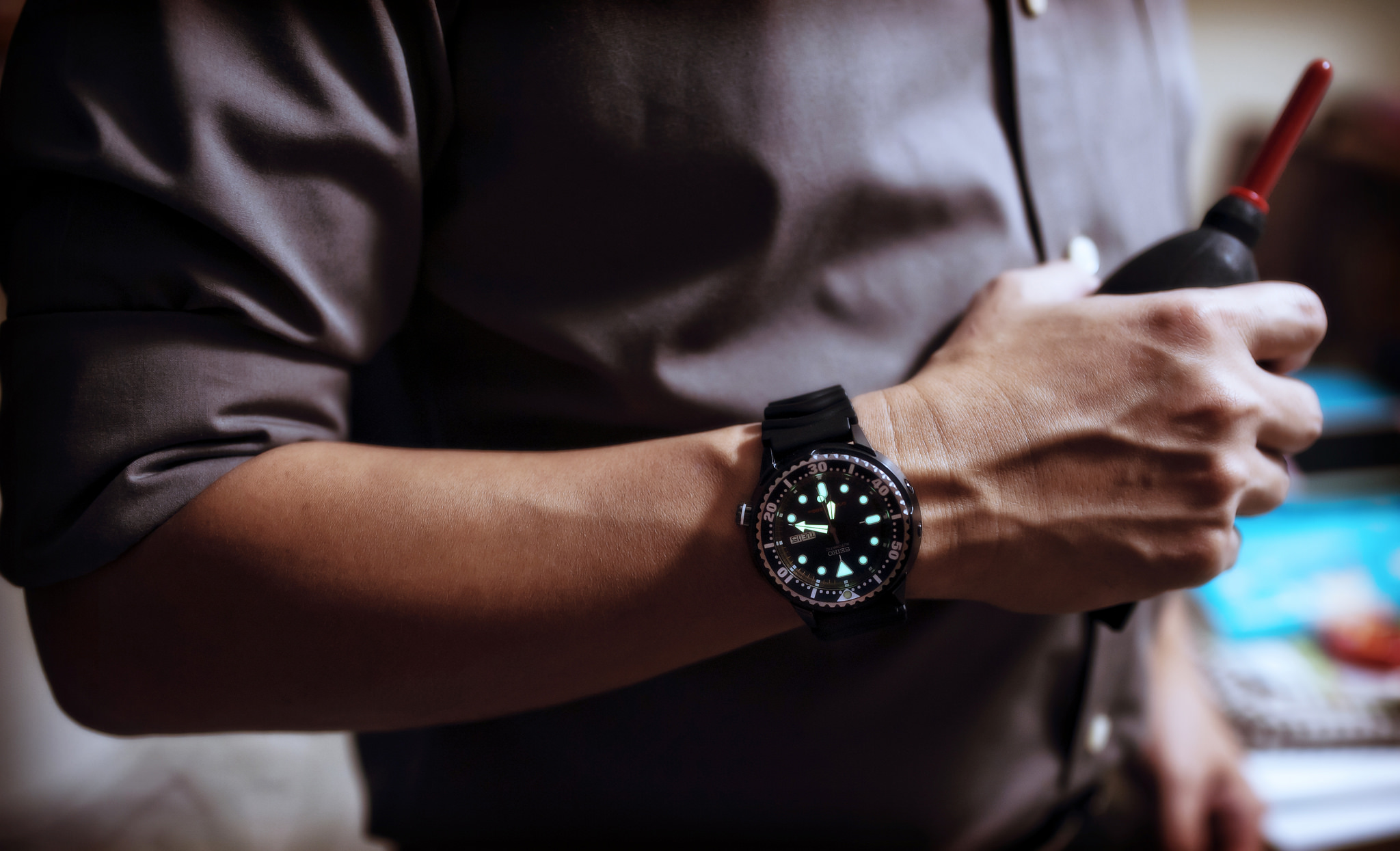
Love them! And I am a fan of Japanese dive watches.
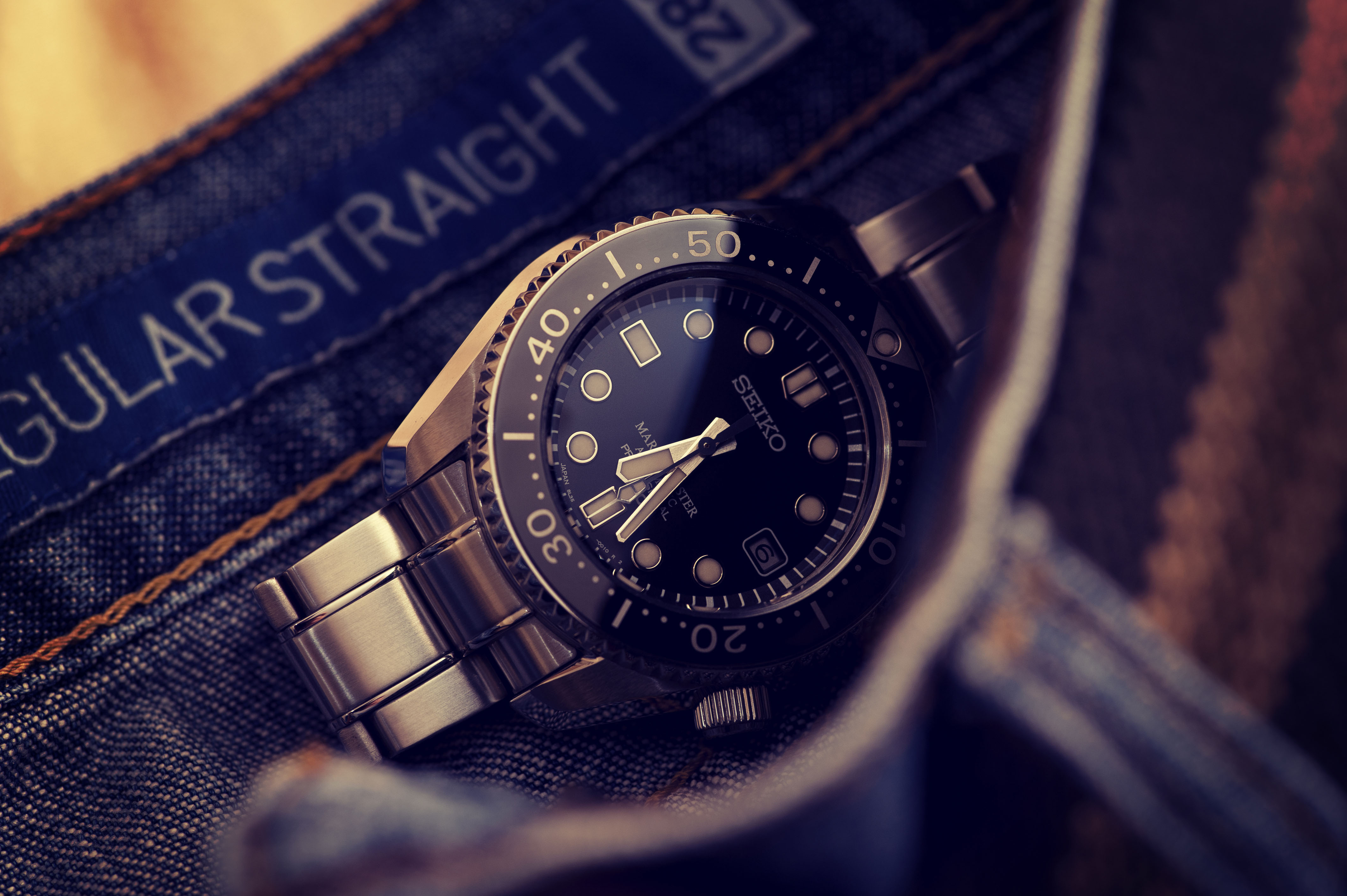
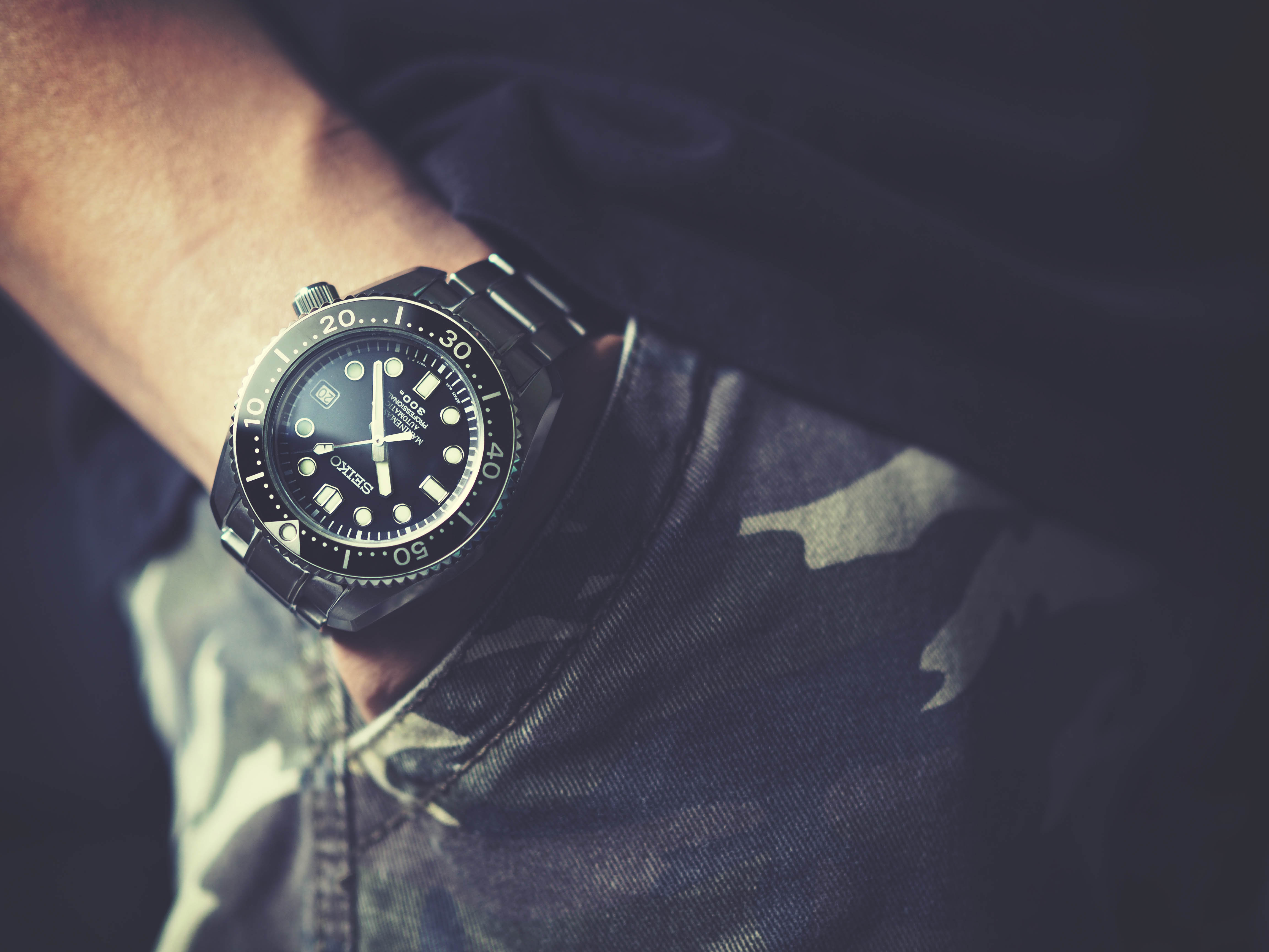
I have the MM300, Darth Tuna SBBN011, Spring Drive Tuna SBDB009, a black Orient 300m Saturation (Mk2) – the Darth and Orient are on Isofrane’s.
And forgot to add that the watch photography is top notch.
Forget about what Tom Bishop is saying, he’s talking crap.
Watch photography for enthusiasts is supposed to portray the watch and the sort of feeling it gives and the image it helps to convey to the enthusiast – this is what yours does and does so well.
Tom Bishop can go and fly a kite.
Oh man, I need a spring drive Tuna!
Christopher Chia is a self-admitted hobbyist sharing his pics like many of us do on a site which promotes a certain style of photography. What surprises me is the level of aggression and insistence some people like Mr. Bishop have in pronouncing Chia’s pics are not up to the level of professional marketing pictures of watches.
Others say watches should always be photographed with hands at 10 and 2. Has Chia somehow violated a sacred rule that is written somewhere? Is tradition being threatened by a non-conformist who sees things differently?
Photography is art and art is subject to interpretation. Can an artist not grow?
This is an amateur site frequented mainly by amateurs who share a love for photography. The pictures shared at stevehuff.com from street photography to scenics to personal snapshots breathe a certain intimacy. They are life as we see it. This is the reason many of us come here: to celebrate the joy of photography besides being a bit of a gearhead who enjoys reading about equipment.
Aggressive attempts to coerce a fellow photographer’s vision or to “teach” them the proper rules of watch photography miss the point. If you want to be recognized as a watch photography guru, find your expression elsewhere and I wish you well.
The rest of us just want to appreciate and encourage a person’s effort doing something they enjoy without needing to elevate ourselves at the expense of others.
A watch picture should always be taken with the hands at 10 to 2 … It mimics a smiling face , Check out most watch adverts
I didn’t know the Orient brand but your photos actually got me googling for it. Nice work. Realistic, retro, love them!
Christopher,
Thanks for sharing and very nicely done. I love watches too. So it was indeed great to see some of your time pieces wonderfully displayed/captured. I’ve only done a few shots of watches myself and know from the many viewer comments that it can be a challenge. Here are just two I’ve done using NEX camera with a manual focus vintage pentax super takumar 50mm f1.4. I also used a helicoid adapter so I could do a closer shot. https://www.flickr.com/photos/wessuzawa/9374975458/in/album-72157653302718783/ , https://www.flickr.com/photos/wessuzawa/9374981488/in/album-72157653302718783/
Thanks again for sharing,
Wes
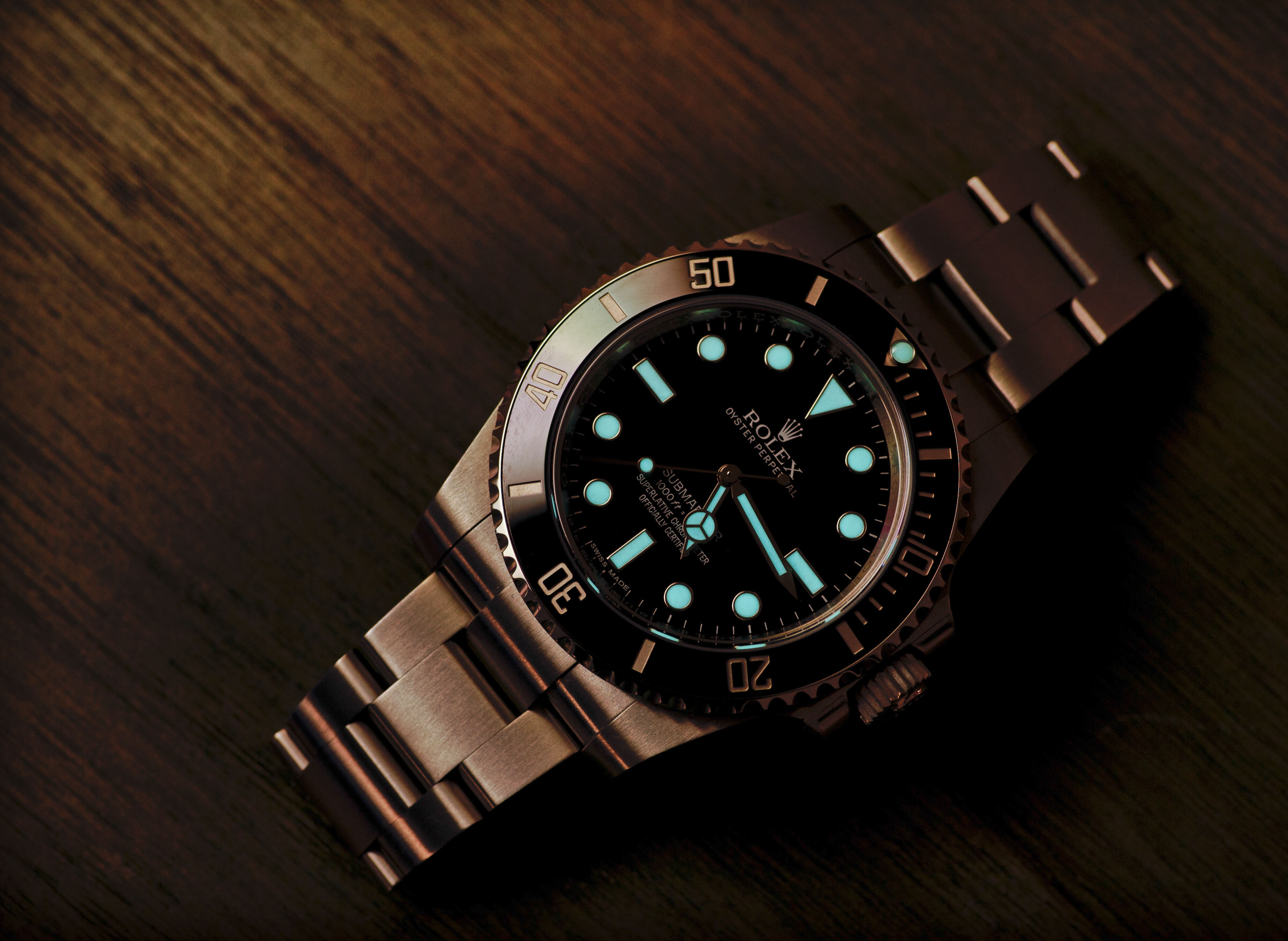
Some great shots of some lovely pieces. I share your love of dive watches, and I’ve owned (& still do) some of the same ones as you.
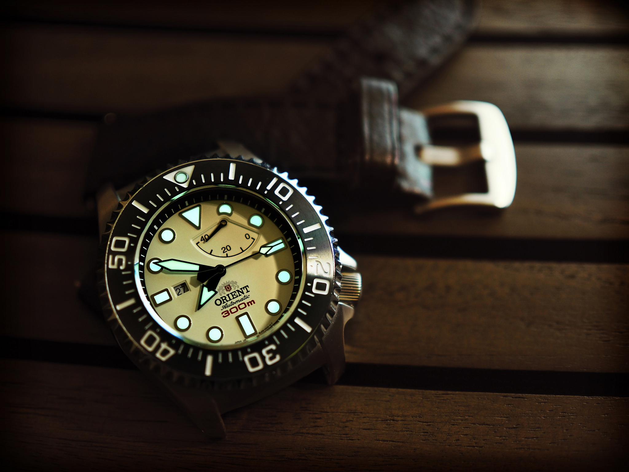
I like very much how your collection includes industry standards, like the 114060 but also true enthusiast pieces like the MM300 and the Orient Sat.
As many have noted, watch photography is hard! Not only are watches usually quite reflective but even stopped down its hard to get DOF deep enough to cover the bezel down too the text on the dial.
You’ve done a great job.
My only suggestion would be to set them all to ‘Rolex time’ before the shoot. Rolex time is 10:10 and 32 seconds. This leads to an orientation of the hands that looks balanced, like the Mercedes logo (upside down of course) and usually shows off the text on the dial without the hands obscuring it.
Sorry if that’s a bit nit picky and I must say I don’t usually bother myself, but it does look better though!
CND symbol too.
Actually you’d need a 4 hand watch (eg a GMT) to mimic the CND symbol
What’s your address? ;-]
Hi Chris,
Congratz on the blog entry! Nice introduction and great photos as usual 🙂
I don’t agree with most of the comments. These guys clearly expected advertisment style photos, which as you pointed is not your goal and I fully agree. Personally, I love your style and I try to imitate sometimes 😛
Btw, I would love to read your own blog with tips&tricks and tutorials on watch photography! 😀
Cheers,
Micheal
Thanks guys, for your comments and suggestions. Good to have feedback from fellow photographers 🙂
I love watches. I loved looking at your watch images. Fine work!
Christopher, I like this collection because it’s very different to what we normally see here. I am not a wristwatch fanatic, exactly, but I do appreciate them. I would never wear an Apple Watch, as that is not a real watch. 😉
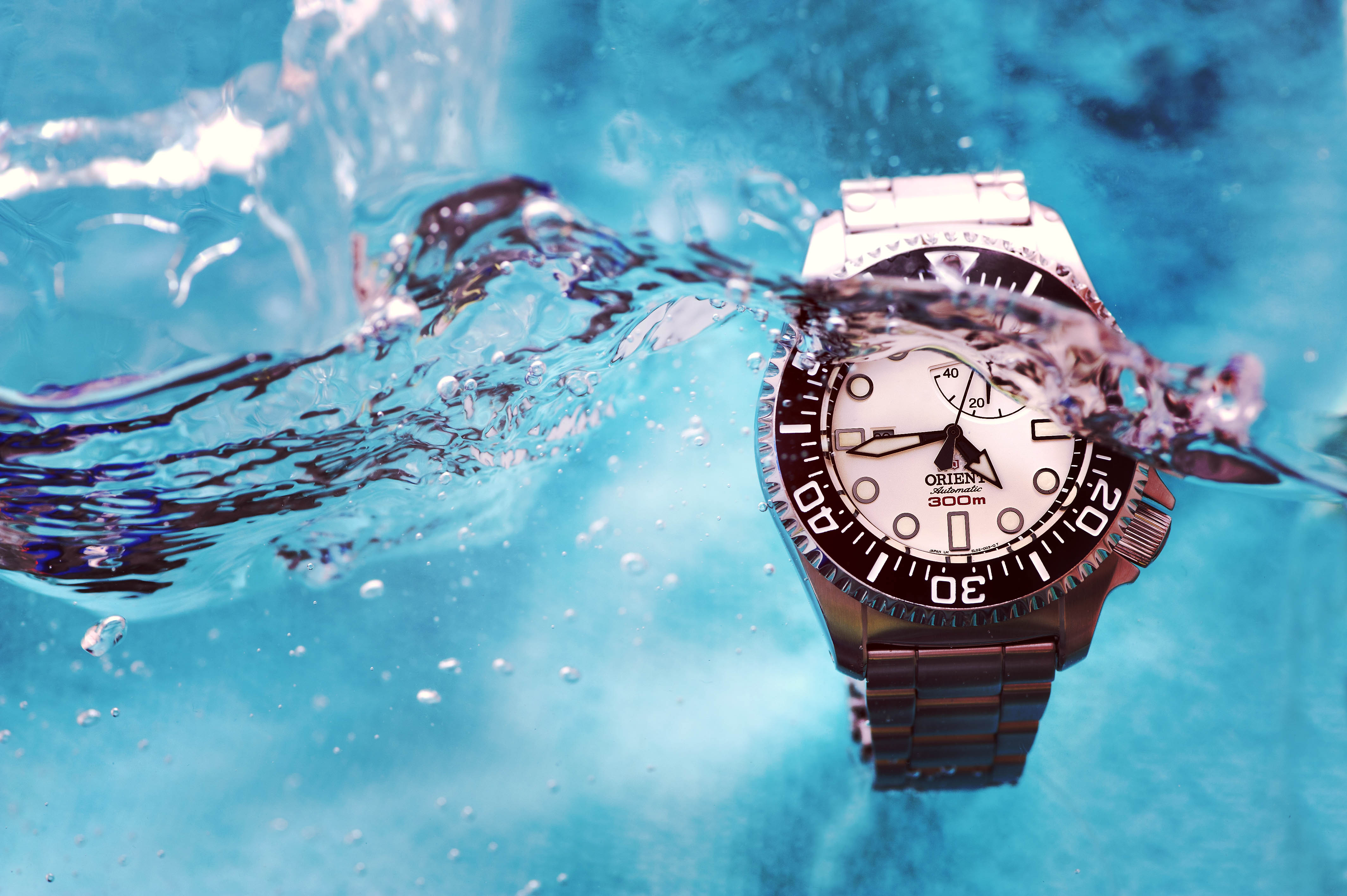
Some of the photos are striking. I am not sure if I could easily replicate what you did with the water shot (3278aa). I do agree with criticisms about exposure and light and background. The background could have easily been replaced with a clean white (or black) board.
2873aa is also a nice shot, let down a little bit by lighting and exposure. It goes to show how difficult it is to light these things properly.
I did not like the toning in 8047da and DAGAZ. That kind of thing may have been fun for the first few days of its life but it’s rather yucky. I don’t think that photography should become a computer game.
There is one theme that I keep noticing in all these images: you got close, to point, then stopped. I’d like to see some tighter close-ups. Yes, that introduces more technical challenges, but that’s where the fun is, right? I agree with you that natural lighting and placement is better than contrived approaches, but I think you can now take the next step in making the images a bit ‘crispier’. Some wide-area diffusion might help – it will pull down the highlights, make even reflections and lift up the shadows.
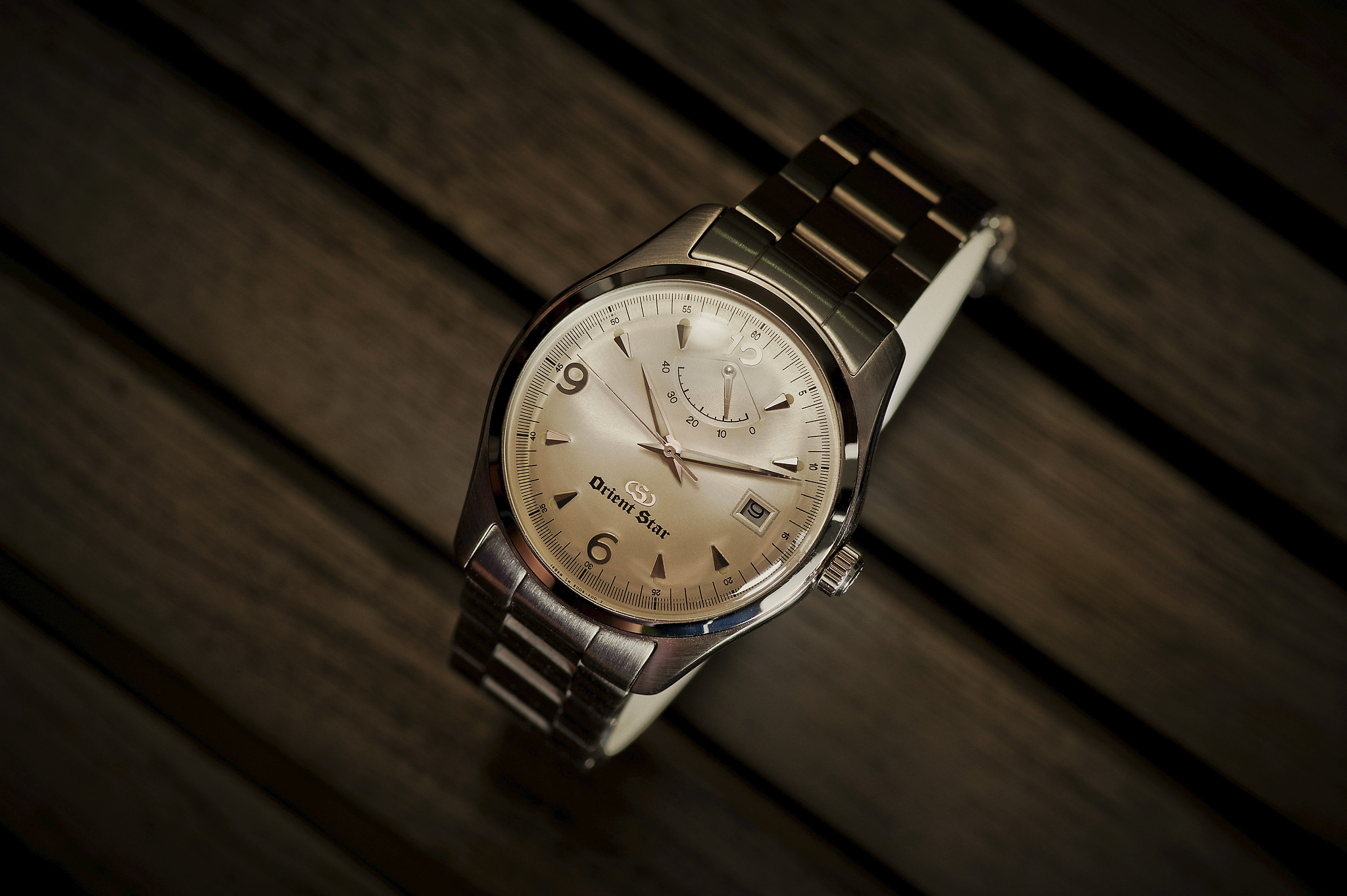
I think my favourite photo here is the one of the Orient Star. It’s also the nicest watch among all these. I do not like those ‘sports’ watches. They all look so cheap, like something you bought at a toy store back in 1990. I think if I had to choose between a sports watch and an Apple Watch, I think I might have to choose the Apple. 😉
These are great. I’ve been wanting this lens. I’m using the 12-40 and the 75… I haven’t been able to achieve these yet. I tried to shoot my new Shinola through a reflector. It didn’t work. Again, great watches and pictures!
Very good pictures. I just must state the obvious however you have a lot of nice watches. Not related to your body of work but worth noting. I like the water effects with the watches. Makes them come alive.
I think you’ve done a great job here, Christopher. Thanks for sharing!
Mark
Great work, Christopher.
Like you I am an Olympus user and a watch enthusiast.
One of my all-time favourite photographers is Ming Thien from Malaysia. You should see his horology photography. He’s on another level. You would enjoy this.
http://blog.mingthein.com/category/watches-horology/
Keep up the good work. 🙂
Very nice lighting and color work. So much detail. You really should click the images once to see them and click a second time to see them at best quality.
Thanks guys, for the kind comments!
Lovely photo’s. The Olympus Tough TG-4 (their underwater/freezeproof/drop-proof camera) has amazing macro facilities which may be of interest to you.
Lovely pics and a nice change from the ones we usually see here. Thank you.
I am a watch enthusiast and collector. Very impressive photos
Great photos – the photo of the watch in the water could easily be a product photo for a major watch company. I also like the themed post. Great!
The shot of the Seiko in the water doesn’t work for two reasons: 1) you are missing 20% of the watch face, 2) the bracelet is very badly over exposed.
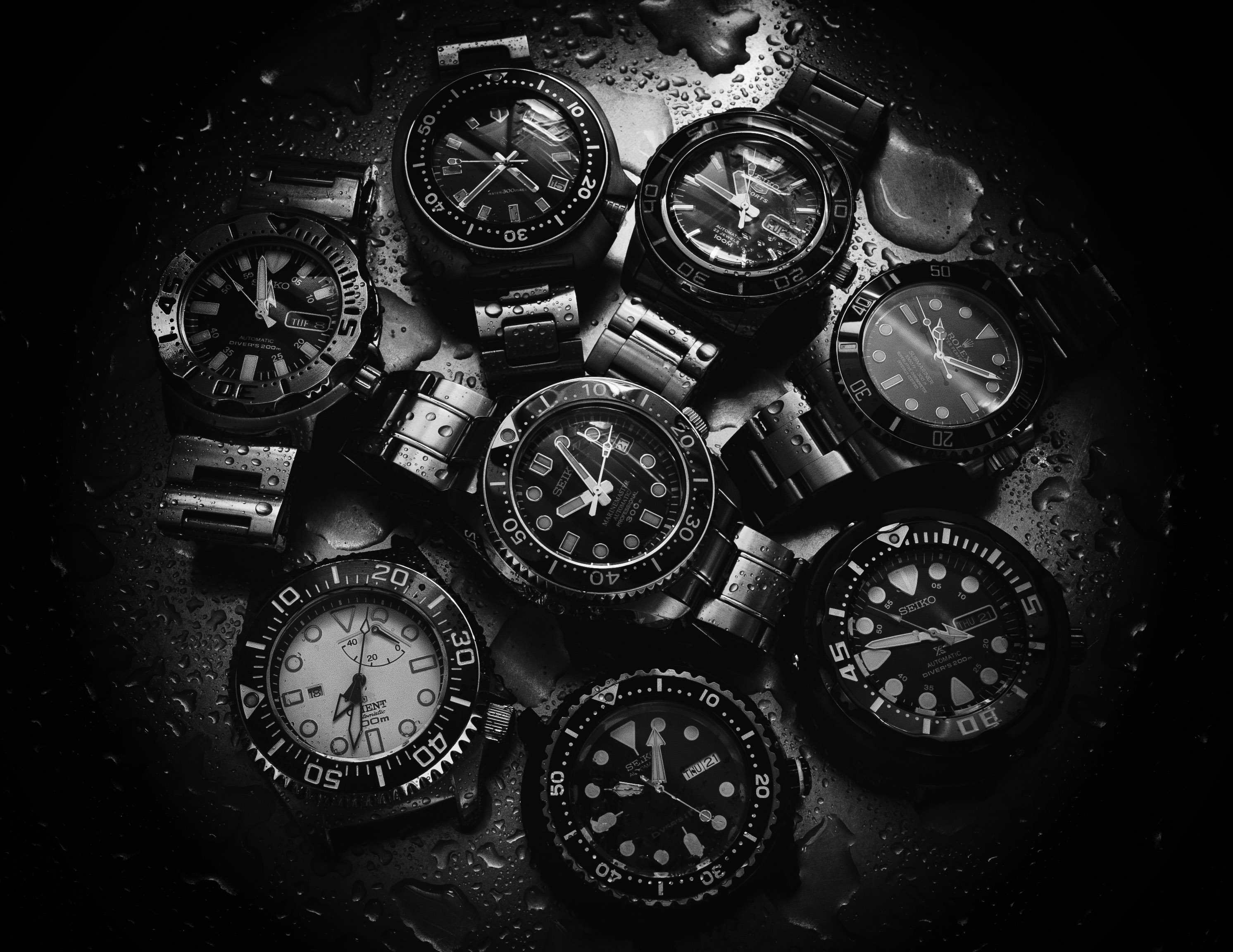
Consider the two shots above neither works because of the amount of reflections in so many watch faces (in the case of the 8 watches) and the solo watch with the titanium effect has a large portion of the face reflecting “stuff”, details not integral to the watch.
It’s the attention to details such as reflections and the lighting which either makes or breaks any watch images.
Yes, I do concede that shot with the watch in water is over-exposed on the bracelet. However, if the whole watch face is clearly shown, it will be boring and unnatural in that shot. You are probably thinking more like a professional photographer taking photos for your client. I’m thinking more like an artist.
And the difference is….?
When you work with / for a client, you oft’ get lots of input, it’s a two way street, not just “do this, do that”.
You stated you took them to advertise the watches, to sell.
Photography and art and working with a client are all perfectly contigious. Art, in whichever capacity you might view it, be it Renaissance painting, Pop Art, dance, poetry, other photographers’ work (for example), such that these influences enhance, inform, inspire your own work and the client benefits and you make a living from your art / photography.
Separating out art and working as a photographer (in this instance) is no way to approach what we do, beit for a living or otherwise, furthermore, this approach is a very odd, myopic view of art, of photography, and quite wrong in my view.
The best to you in your endeavours.
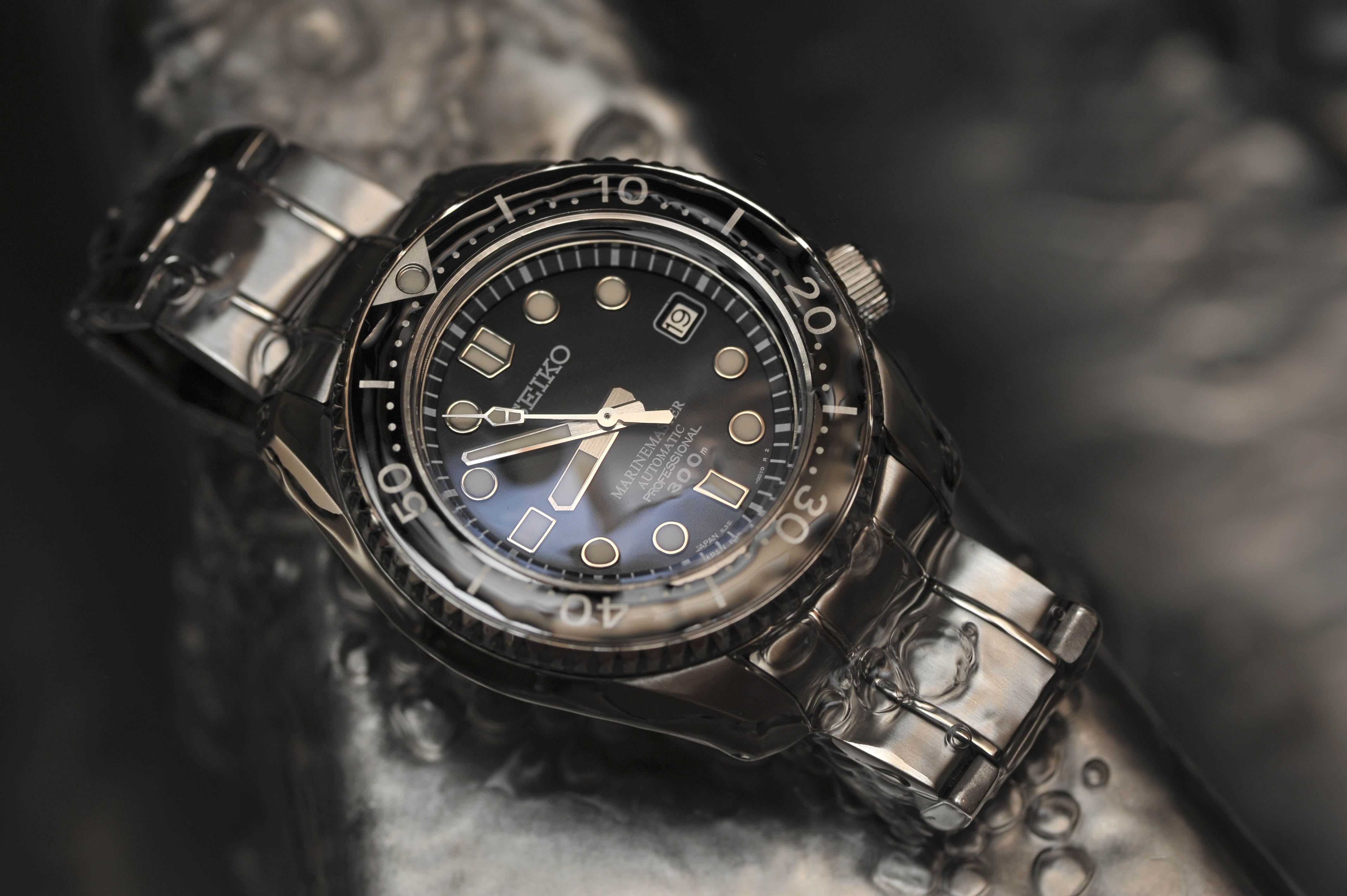
I think it does your composition and choice of editing a disservice to nit pick and discredit the quality of the image because there is the slightest highlight burn on the cufflink of the watch.
Some of the most technically perfect images are sterile and worse yet, boring. This is neither boring nor sterile.
As for the 20% watch face being covered by water – I actually think this really works. Were this a product shot, the composition affords the water resistant nature of the watch.
I stand by my last comment – this is a great shot Chris. Well done 🙂
Why don’t you look at Ming Thein’s early (several years ago) photographs of watches: he gets REALLY close up with a macro rig, and shows the INSIDES of them, at way more than life size?
They REVEAL something of the workmanship which goes into the making of watches, rather than just saying “..look, here are some shots of, er, watches..”
Think how much more interesting these would look at larger than 1:1 close-up size..
Yes, thanks, I like MIng Thein’s work too.
Very nice Photos ! 🙂
The bane of every watch photographers’ craft is the division between lit and not-lit areas, and the reflections from “stuff”.
I suspect the only true way to approach watch photography is in an infinity cove, either a large studio-style cove or you could jury-rig up something to that effect, with maybe huge fish fryer lighting systems, or at least large soft boxes, thus rendering any / all reflections null and void.
These images prove how difficult it is to render the whole watch face without any reflections nor hot-spots, since you need to see every detail of the 360 degree face in perfect detail, omitting nothing, having no reflections.
I wonder if there are any YouTube tutorials to that effect?
Hi Tom, I didn’t set out to take the perfect shot without reflections or clearly showing the watch brand, these ideals are for watch advertisement where the emphasis is on selling the brand. Have a look at Rolex and Omega’s dive watch advertisements, they look so fake because the water splashes and the watch photos were taken separately and then merged together in photoshop. No doubt, the watch looks so perfect without any reflections and the watch stayed dry despite being surrounded by water. It is also unnatural and boring. I prefer them more realistic and not stock photography perfect.
The photographer follow’s a client brief.
The client sets out with, amongst other aims, two criteria, promoting aspirations and ultimately, selling lots units.
All watches do is tell the time.
So you need to make the buyer want your product, to aspire to owning an Omega, a Rolex, a Cartier. Ultimately, they all do the same thing, tell the time.
So, how is this achieved?
The way to do that is partly remove the distractions, the reflections, the extraneous detail which detracts from product X. Look at the adverts for Breitling watches, or any of the watch manufacturers running double page adverts in the likes of Vogue, Harpers, Esquire et al, look at the spy plane and John Travolta.
If you are shooting products shots, you had better show all the watch. No reflections, nothing missing, no hot-spots.
If you’re shooting life-style shots, then life-style it is, but the watch better be prominent and wholly visible, a good example being Dicaprio and TAG Heurer.
That is why the attention to detail is vital. That is why photographing chronographs is such an art, it is specialist, it’s very targeted, it’s highly aspirational, it has specific criteria, and part of that is no distracting reflections, no burnt-out areas, the whole face must be visible, and it no doubt pays rather well.
You said: ” ideals are for watch advertisement where the emphasis is on selling the brand”. Sorry, but these shots do not do that at this rarified level.
You do not need to take any shots to make those billboard pictures, you only need Keyshot and a 3D model… also to sell a watch, you do not only sell the primary function (telling the time). Then we all would just wear a Casio.
“If you are shooting products shots, you had better show all the watch. No reflections, nothing missing, no hot-spots.” I am sorry, but this sounds really boring IMO.
“So you need to make the buyer want your product, to aspire to …”
because it just tells the time.
Ergo, my point is reiterated, reenforced, you need to make the Casio more than just a Casio, which tells the time (plus a few other odds-and-sods) and you do that with aspirational lifestyle images.
I provided examples of such images, adverts (not billboards) run in all the aspirational magazines, Vogue, Esquire, Harpers etc, and where in said magazines these adverts appear, and typically they’re run over double-page formats.
As for being boring, that’s the role of the advertising agency, the creative director / account holder and the client, then you add the photographer.
You’re ultimately looking to both show the product, so no point in removing 20% of the face of the watch, that makes no sense, and the life owning one might lead to.
Wear a Casio? Either way they have to show the watch face in its entirety and allude to a lifestyle, no reflections, no extraneous details to distract.
To be honest, you can argue all day about this, but if you’re going to attempt to reinvent the wheel, it clearly has to work, showing us an ox cart with a scalene triangle for a wheel is going to leave you forever frustrated in your woodshed and not moving into mainstream ox-cart wheel manufacturing.
Casio example below:
http://www.edifice-watches.co.uk/collections/classic/
https://www.casio.co.uk/products/timepieces/pro-trek/
I totally agree with Christopher’s reply! Publicity pictures can become dull because of so called perfection. I do prefer the real life approach with indeed some reflections. BTW the third pic is brilliant, IMO.