
Character Style and Mood in Photography Part 3
by Peter Maynard
Two years ago Steve was kind enough to post two of my articles on the theme of character, style and mood in photography. There is a link to them at the foot of this article if you have not seen them already. At that time I promised to follow through with another at some stage. Well here goes!
The more I look at my own images, the more I realise that I have been influenced and inspired by the wonderful photography of Saul Leiter who passed away just three years back. Saul was an “overnight success” – who took 40 years to become one. To my way of thinking his work was original and inspirational, he certainly marched to the beat of his own drum and his work has inspired me.
Although I have to say I started shooting the way I do before I knew of him and since then have taken my images off in my own direction to some extent – my photography is by no means a copy of his (where on earth would I get all those wonderful 1950s cars and clothes). But I still fancy there is a touch of the Leiter influence in there. I can think of no one better than him to be inspired by.
In this follow up article I thought it would be nice to examine the essential elements of Leiter’s work and to look at how it has influenced my own approach. My hope is that by showing what a “mug photographer” like me can do by following the lead of people like Leiter, it will inspire others too.
For those of you not familiar with Mr Leiter check out this link on Artnet which provides a nice but small overview of some of his work.
Let me start with a few of my attempts in which I think I can see some of Leiter’s influence either by accident or by design.
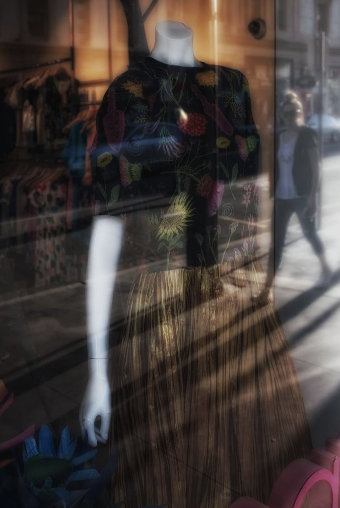
The first photo is all about the reflections and shadows. But this shot is also about the point of focus. A conventional approach might have had the point of focus on the lady at the right of the image, but she herself is intently focused on the dress in the window. So in my view, that is where the focus of the photo needs to be.
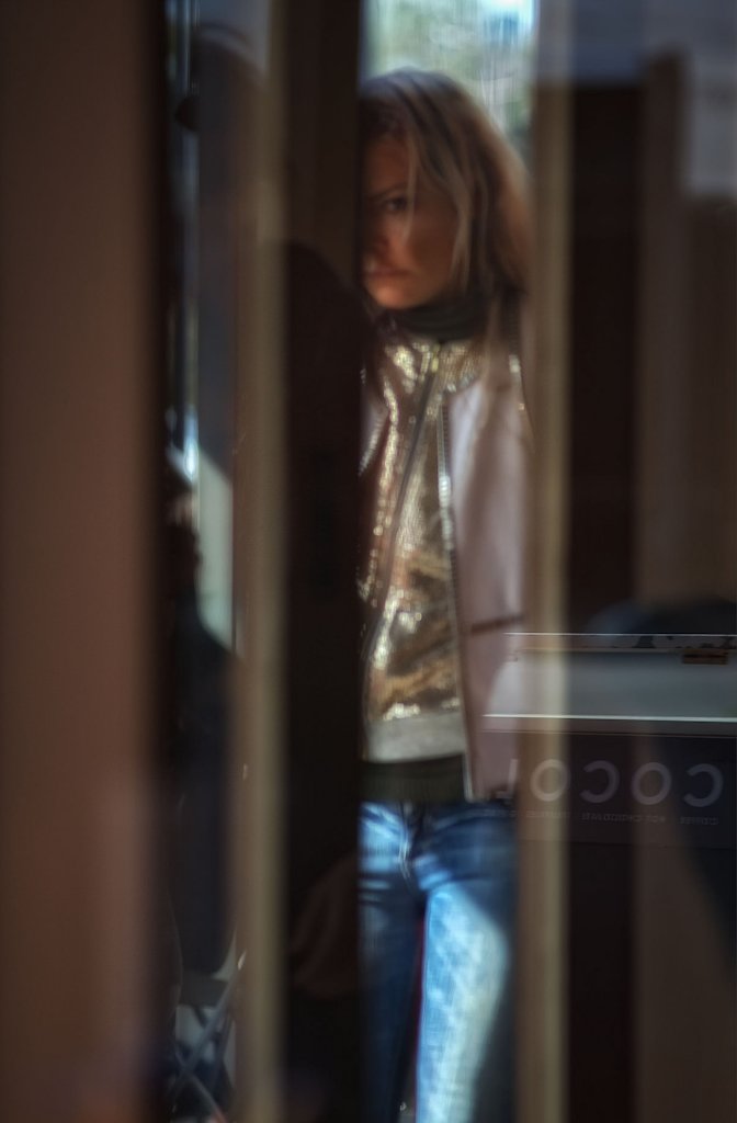
The following photo, I think, certainly owes something to Leiter’s style. The partial image of the subject, shot through a window and framed by it are typical of images he often made. I suspect this is one of the few shots where I consciously looked to emulate him (rather than it just turning out that way). At the time I was seated in a coffee shop and saw my chance when I realised I was sitting beside a window looking out onto a busy street. By the way, always carry a camera for moments like these. I love the look on her face. Intense? Introspective? I am not sure but there is certainly something there worth capturing.
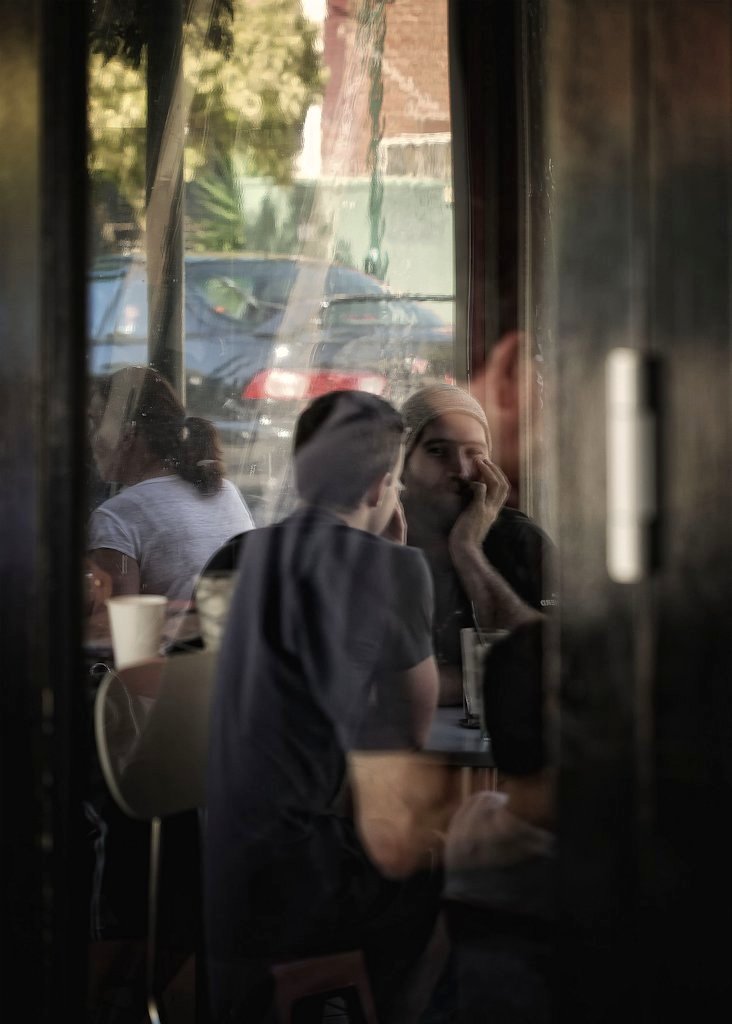
And in a sense the image of two guys chatting over coffee is a somewhat similar shot in terms of framing.
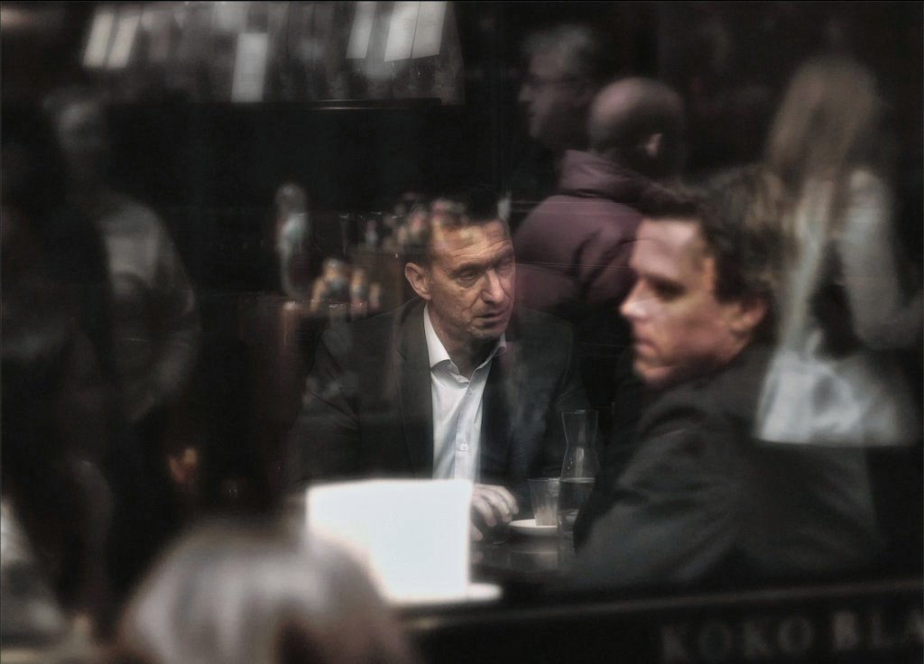
I have to be honest and say I do not know what to make of the following image. I wish it had turned out a bit better than it did but when making photos you are stuck with the image you have. And this is the one I had. I do not especially like the color (mixed lighting is always difficult) but I do like the way the main subject appears to be surrounded by the ghosts of others swirling around him, in reality the reflections of those sitting outside or walking by. I also like they subject’s somewhat tired and careworn face.
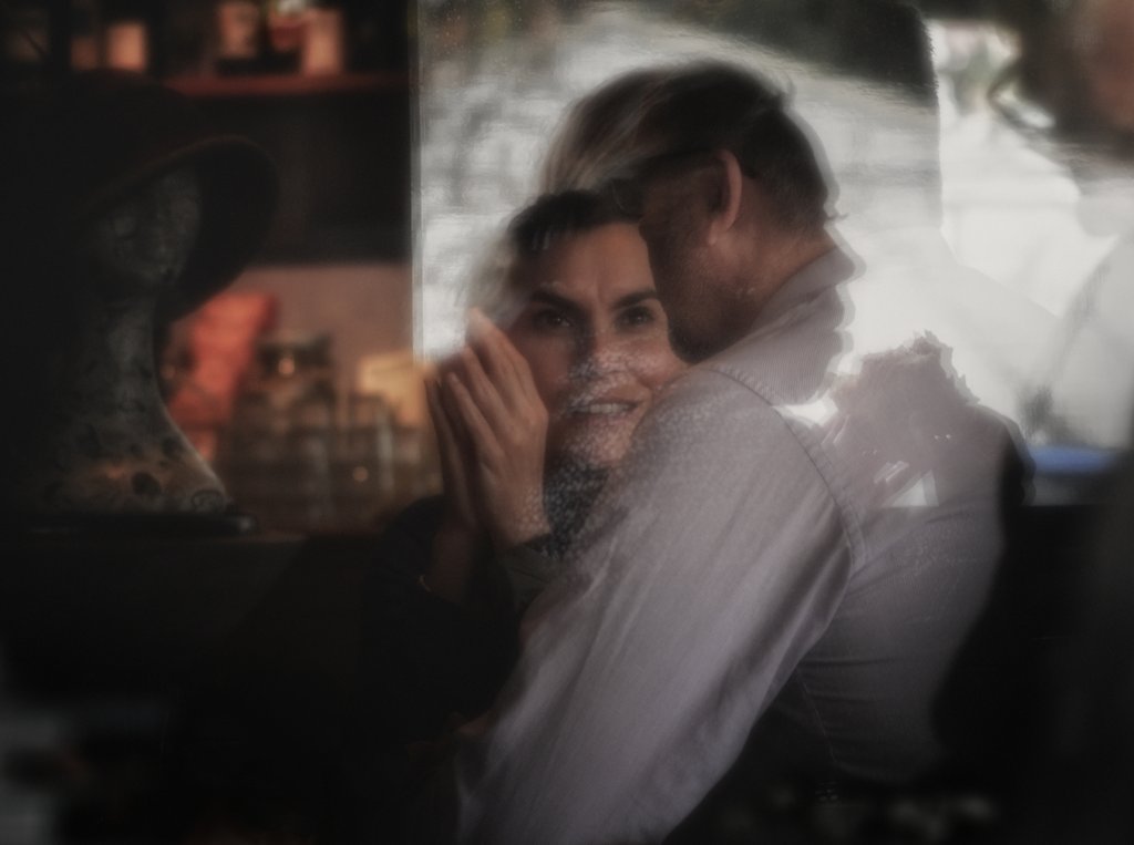
The following photo is more of a favourite of mine. This is also because of the look on the face of the female subject and because of the way the man’s face is framed by the shadow of another woman (not immediately visible until you see it.). This gives a distinctly dreamlike quality to the image. I also like the muted but strong colors on the left of the image. This is something Leiter did a lot – there would often be a strong color element in his shots which were not always a part of the main scene but often there in a way that still manage to add some extra interest to the image. Place the palm of your hand over the left half of the image and you will see what I mean.
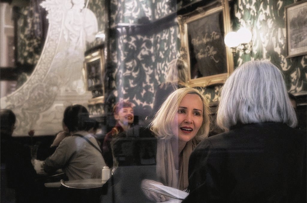
A small bit of serendipity that every photographer knows and pursues is apparent in the image below. It is not the attractive woman engaged in intense conversation in the foreground. It’s the equally attractive lady with startling red hair and lips in the back of the café. I am not sure I even registered her consciously when taking the shot but I am glad I got it as it definitely reminds me of a Leiter photo.
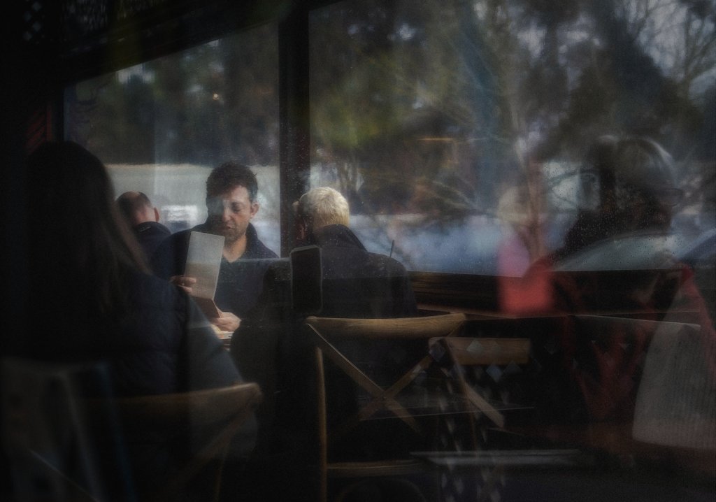
And this shot of a man in a cafe, is also something of a favourite. Perhaps he is checking the menu or the bill, perhaps reading a manuscript (who knows) and it’s that uncertainty that adds interest in my view. It also nicely illustrates a point I made above about how a splash of color (red is one of Leiter’s favourites as in this photo) can add a point of interest even when it’s not related to anything else in the image. It’s just there and draws the eye in.
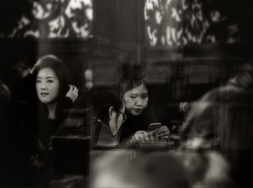
Leiter understood that some images work better in black and white and while he is principally known for his color work he also had a good body of monochrome work too. Of course we have the luxury that he did not, of shooting in color then easily converting it in digital post processing. For some reason this one just seems to work better in black and white which accentuates the layered effect of faces which are all at different distances from the camera.
In my view the following image also works well in black and white. It just suits the somber mood. This is an artistic choice the photographer has to make and by shooting in color then converting later it is a choice, happily we can make.
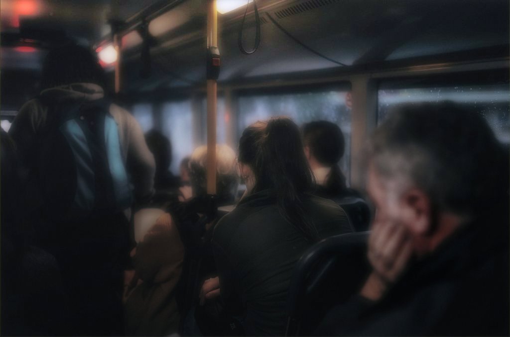
Finally, here is one where my style perhaps departs more from Leiter’s. I often keep my images deliberately dark. It is moody and intimate, it draws the viewer in and as in this photo it underlines the theme of the image which is about the tedium of a long ride home from work on the bus on a cold winter’s evening. Again a splash of red makes its appearance. Also note that there is not much about this image that is very sharp. Somehow that works, adding to the dreamlike quality of the shot.
None of these images are copies of Leiter’s work (and neither are they anywhere near as good as his) but perhaps you can see how some of them at least draw inspiration from the work of that great man.
An article I found in the New Yorker says of Leiter’s images:
“The content of Saul Leiter’s photographs arrives on a sort of delay: it takes a moment after the first glance to know what the picture is about. You don’t so much see the image as let it dissolve into your consciousness, like a tablet in a glass of water. One of the difficulties of photography is that it is much better at being explicit than at being reticent. Precisely how the hypnotic and dreamlike feeling is achieved in Leiter’s work is a mystery, even to their creator.”
Hypnotic and dreamlike. Yes, that’s exactly it, that’s what I am chasing!
So here is my take on this.
If you are into making artistic photographs of this sort do not necessarily worry too much about ultra-sharp, carefully focused images with lens aberrations that are under strict control. Shooting through dirty windows plays merry hell with strict image quality in any event. And that is not necessarily what meaningful imagery of this sort is about. If you doubt me on this, take a look at impressionist paintings and the precursors of impressionism (Such as the “nocturne” paintings of Whistler and more ethereal paintings of Turner) which are often dreamlike and almost mystical to the point where some images are hardly identifiable – but which make a strong emotional impression on the viewer.
Likewise, do not necessarily worry about blur, reflections and distortions showing up in the result. In fact if you look at Leiter’s work you will see that some of his images are full of them. He often used them deliberately to emphasize the painterly qualities of his work. The other characteristic which is noticeable in some of his photos, but which I tend to use more often than seemed to, is the use of shadows. Shadows are powerful and moody. They are mysterious and they can be used to nicely frame the subject to focus attention on them. And by the way here is another thing, they can be emphasized and enhanced during post processing (wink!) The use of vignetting to create a sense of drama and to fame a subject is an old technique and it is still around because it works.
And neither did Leiter necessarily concern himself with colour that accurately represented the real life image. Indeed, he is famous for his deliberate use of out of date film (usually Kodachrome I believe), no doubt partly because it was cheap, but also because it allowed an interesting edge to image making. The colour in his photos is one aspect of his work that I find to be most attractive. And to be honest it’s an aspect I still have not mastered to my own satisfaction. In part because I do not have access to out of date Kodachrome but must work in Photoshop to create something I like. By the way Saul Leiter had a successful career as a commercial photographer as well. My comments here only deal with his personal portfolio of art work.
My final word is this – aim to make images that speak directly to the viewer’s emotions. If you can do this you will make good, perhaps occasionally very good images.
There is a very nice portfolio of Saul Leiter images here. Well worth a look if you are not familiar with him https://au.pinterest.com/search/pins/?q=Saul%20Leiter
My earlier articles on Steve’s site are to be found here:
http://www.stevehuffphoto.com/2014/11/24/character-style-and-mood-in-photography-by-peter-maynard/


Peter. I always admire your work. Just love the way it “feels”.
Your articles here are just excellent.
very nice
Solid post. VERY cohesive work. Well done! You have a refined eye and a superbly consistent vision.
Sure, an important painter. He used often photographs for his early works. The last time I tried watching one of his anthologies the museum remained closed.
Nice work though I think the incessant use of a “haze filter” in PP adds unnecessary moodiness. Yes, Saul Leiter was a great photographer who invoked mood, but he wasn’t melodramatic.
Culture for pedestrians?
Anyone heard about Gerhard Richter?
Hey,
Thanks for introducing Leiter’s work.
You works are talking, to my understanding, about some sort of absurd dialogue we have often to deal with.
I think it’s good having a main figure like Leiter to go on with and also how knowing to get unattached from it.
Just guessing yours are digital worksn. That hasn’t much influence in the way you see, but at last it’s part of the whole thing.
Thanks. Nice article.
As a fan of Leiters work I think you have captured the essence of what made his photographs so wonderful, well done.
Most photographers admire and often style themselves like their heroes. This is natural. These images are more that that- they can stand on their own.
Love the first image and the Mono image.
Thank you very much for this post. There is an amazing intensity about your images at the same time as they verge on the intangible. I’ve done – by accident! – a few things like this with light and inanimate objects: you really whet my appetite to include people. Thank you too for reminding me of Saul Leiter: I saw a book of his work two years ago and intended to follow him up. Now I can!
By the way, do you always stick to this 3×2 format? I’m feeling that the third picture – the one you are a bit uncertain about – would be stronger if you reduced it to a square, cutting off the left hand side.
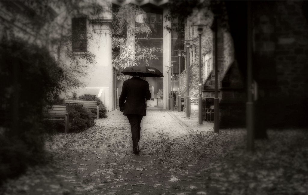
The B&W of the man with the umbrella is marvellously mysterious.
Really good post Peter! Love the ‘through the window/through the curtains apporach; makes for some wonderful images that one keeps looking at.
Grateful for not ‘flaunting’ the camera(s) these were made with, but I could have done without the lengthy reference to Leiter; your images stand very well on their own merit.