One Giant Polaroid
by Brad Nichol – His website is HERE
One of the key questions I pose to my photography students is “why do we take photographs”. It usually leads to great discussions where all sorts of reasons are proffered, commonly the answers centre around ideas such as recording events, serving as memory joggers and story telling.
All good valid reasons, but for me, photography is focused around two drivers. First I shoot to create photographic art that is in the main “pre-visualised”, normally in bed at 2.00 am. Secondly and of the most significance I take photographs because it heightens my visual senses and thus provides me with a benefit I carry with me 24 hours a day. Simply photography has allowed me to enjoy the visual world to a far greater degree and as I tell my students it matters not whether you shoot with a Leica or a Powershot, the visual appreciation benefit potential is the same.
I happily work with any camera, but acknowledge that each tool subtly changes the way I see and guides what I look for, some days are iPhone days, some NEX days, some Alpha days and there are even film days. I am not a camera buff as such, and certainly not dedicated to a particular brand but in the main I guess I am a mirrorless guy and the NEX series fills my general needs best at present because they are just so adaptable.
One the other hand I am a bit of a tech tragic, I rigorously test equipment, develop editing and shooting processes and modify gear to suit my needs. Perhaps later I will provide some posts on these issues. All this geeky fervour is not however for mere entertainment, it is in fact for the purposes of preparation and practice so that my vision and projects can be realized without compromise. I often find folk who want to believe they can create great work by just buying the right camera and lenses shooting on Auto, just letting the creativity flow. Let me just say, it’s pretty hard to be fully creative if your techniques and lack of planning are getting in the way of your vision and compromising your work. Some folk might jag the odd great shot but I’d rather not treat photography as a lottery, when I go off to shoot I fully intend to come home with the result I am after, so having full technical mastery is for me not just a nice additional option it is an intrinsic part of the process, hence perhaps my rather anal approach.
So here then is a story of a large 8 month project that I have just completed, perhaps it will inspire some of you, perhaps it will confirm that I have a certain streak of insanity.
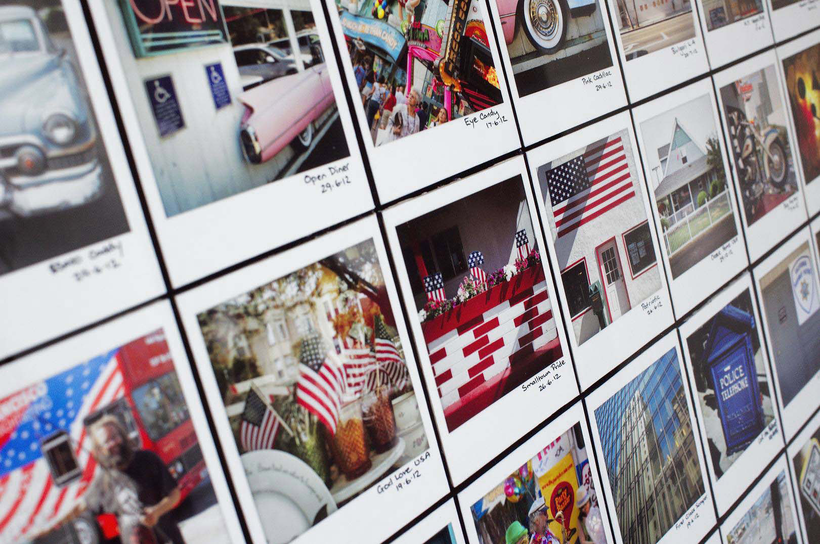
I love Polaroids, but in particular ways. I am not enamored with the often poor colour, unevenly processed edges and poor clarity. But I just love square composition, I am stylistically at one with the layout of the square beautifully placed within the white border with that extra space underneath for imprinting. I love that you can tag the image with title and date. There is something compelling also in the slight edge vignetting of the frame of a well-developed roid, and then there’s the feel of the images in your hand, just lovely. Most of all I love the subliminal message of the format, it says “hey, here is a moment captured in time and it is important to me”.
What I want however is roids without limitations, fauxlaroids in fact.
Lets backtrack a little, 8 months ago whilst my body and mind waged war against one another a 2.30 am on cool winters night I had an idea. My wife and I were about to fly to the US and Canada for a 6 week holiday and having just moved into our new home I was planning the new artworks for the walls, around 50 in total and at this stage I had planned about 20 of them.
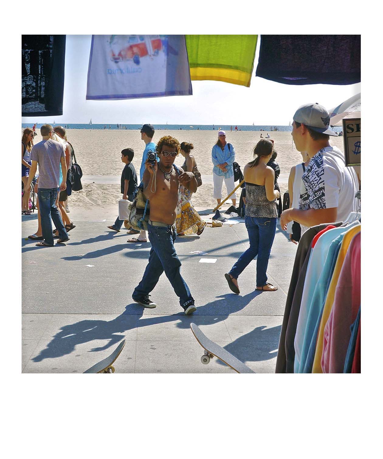
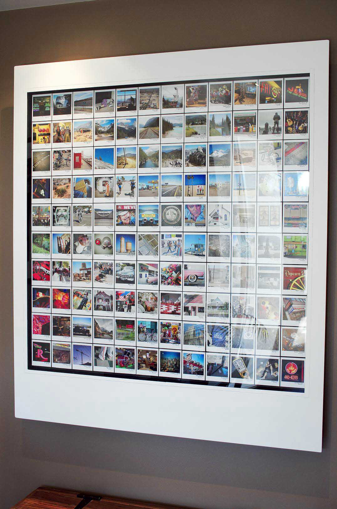
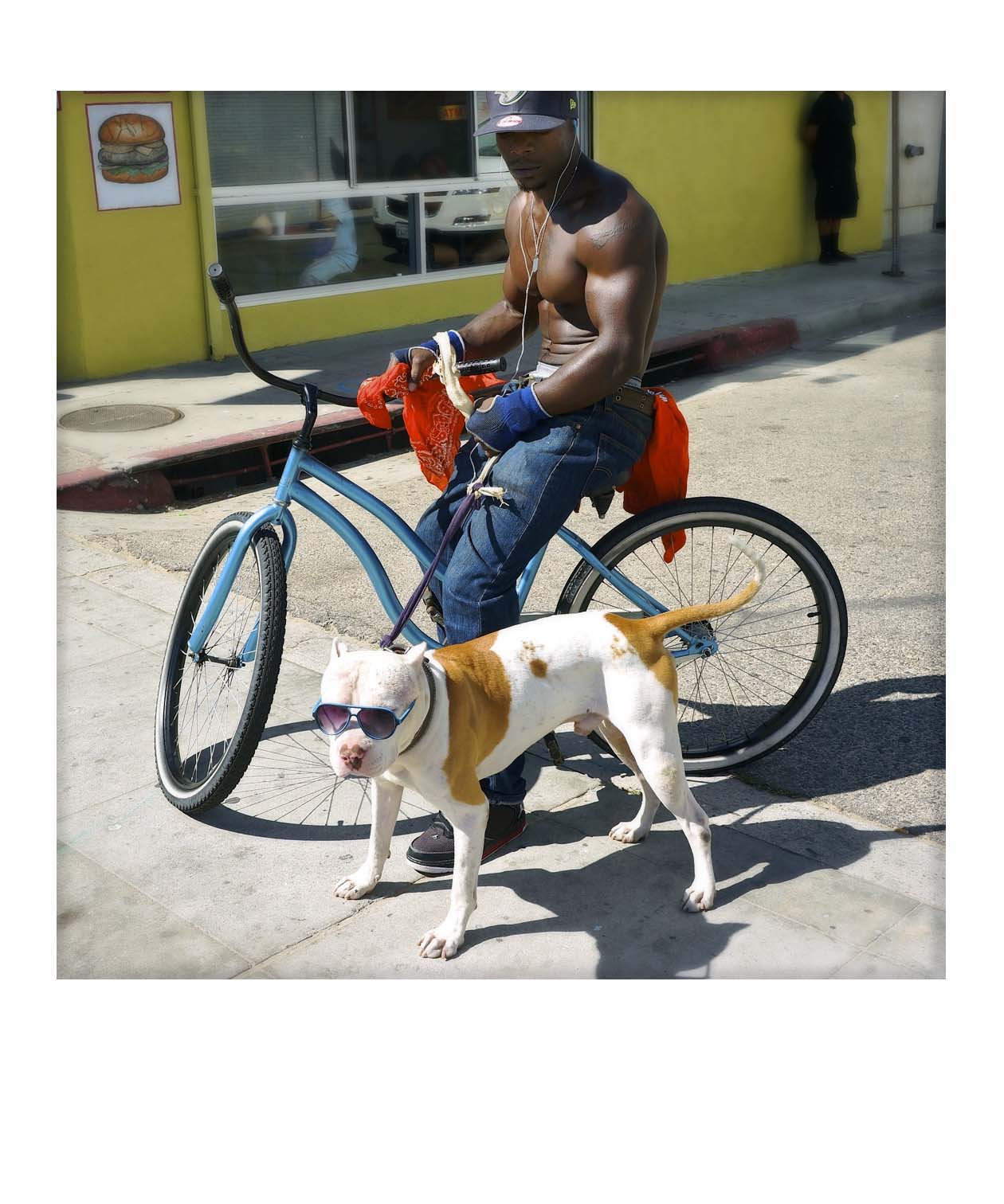
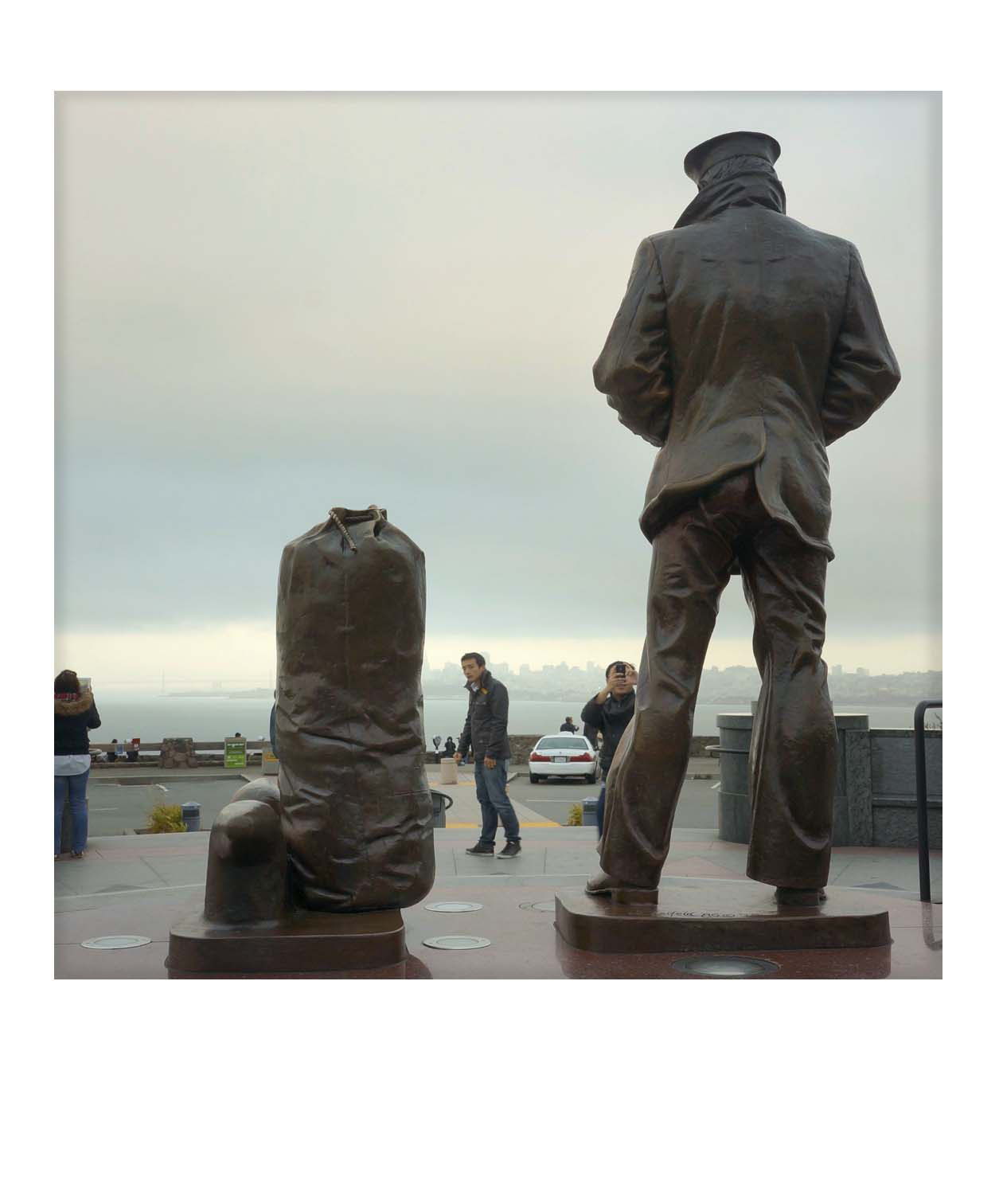
The hatched idea was as follows, shoot a set of 200 images that encapsulated what is different about North America. Distill these down to 120, edit them to look like Polaroids, print them so they look and feel like Polaroids then mount them in a giant Polaroid frame and hang it in our front entrance way.
The project involved several stages:
Planning what to shoot ( it needs noting that I shot a raft of projects over the 6 weeks, so I had to be careful and efficient with time, after all it was a holiday for both my wife and I.)
Cull and Edit the images.
Have the images custom printed and mounted.
Cut up, name and coat the images, which is far more involved than it might at first seem.
Install the lighting for the final artwork.
Build the Polaroid frame.
Determine the final layout within the frame.
Mount the final work, which again is not straightforward as it weighs about 50 kilograms.
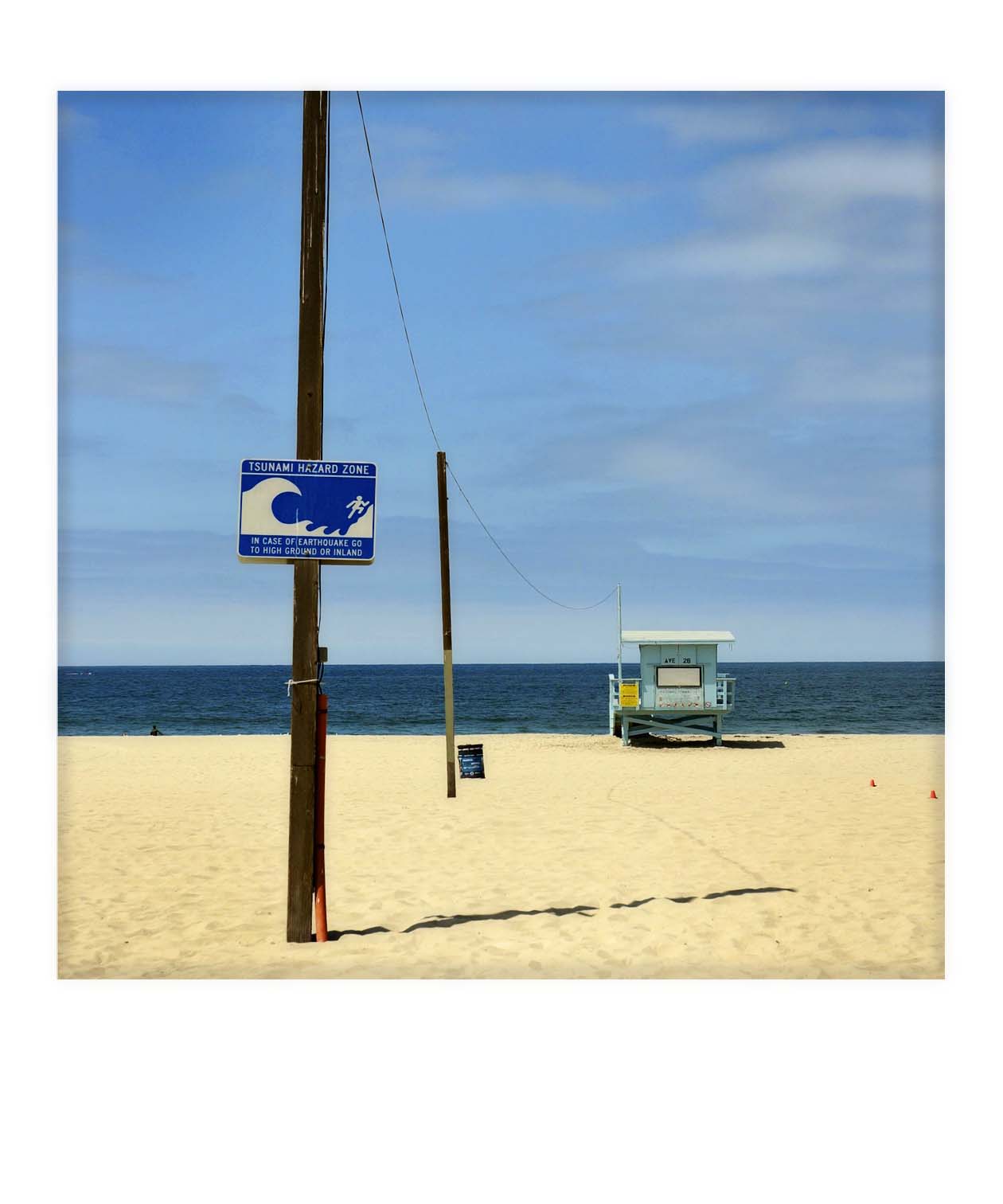
All of this was worked out before a shot was taken, (I told you I have a mental problem) and it pretty much went to plan, other than costing a little more than intended and being a bit heavier than estimated. The shots were taken on my iPhone 4S and my NEX 5n, and mainly shot at equivalent focal lengths in the 35-50mm range.
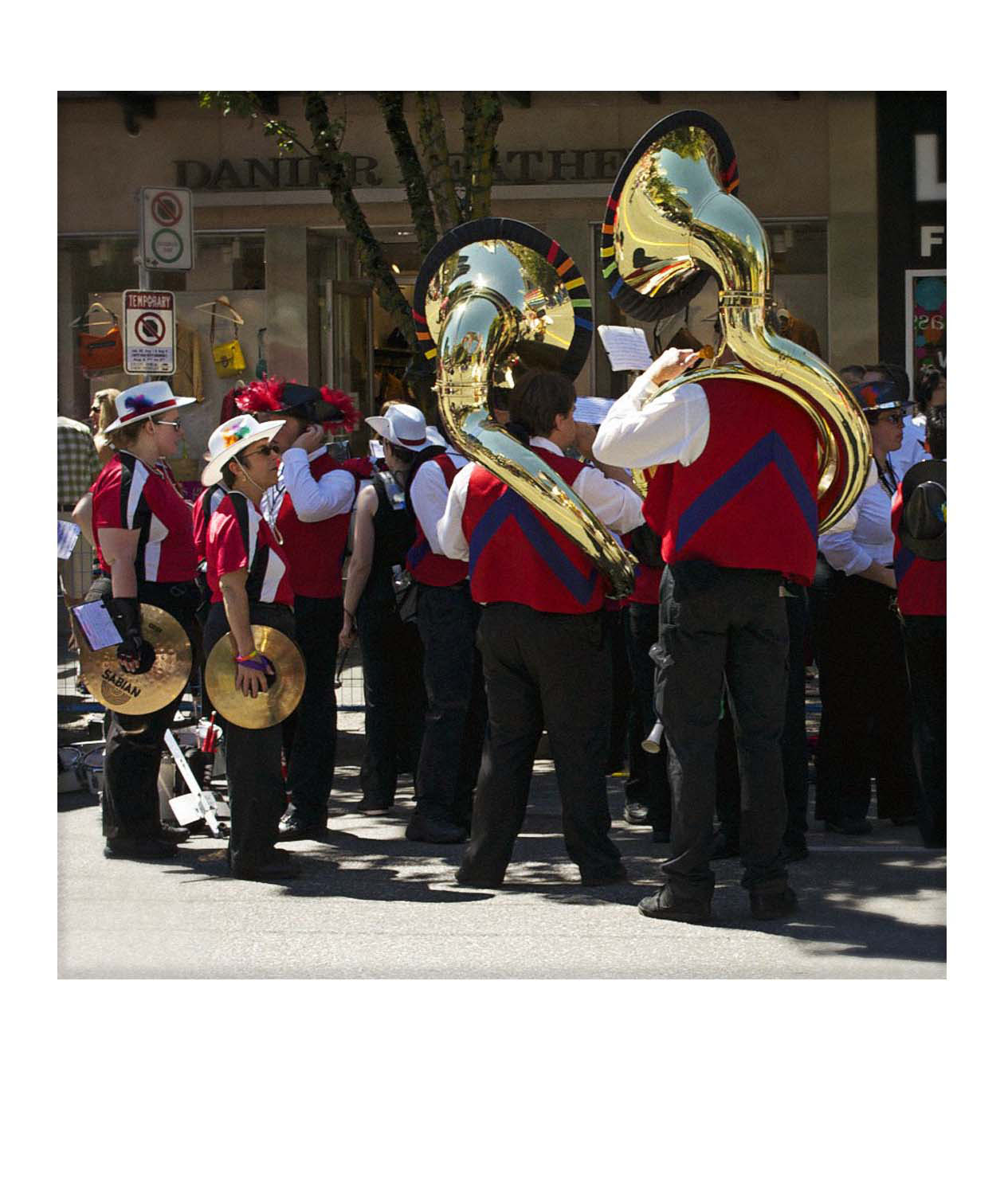
What I consider different between Australia and America may of course be very different to what you consider different, but remember I am an Aussie and this is a personal work. Of course we found many unplanned things to add to the collection along the way and often it was a case of finding the subject that best typified the breed. Unfortunately I missed a couple of subjects because I felt I would find a better example and failed to capture the “bird in the hand”.
Compositionally most images are quite parred down with strong simple elements, this was deliberate because when the final image is going to be only 10 by 10 cm or so and mixed in close proximity with others complexity will somewhat confuse the effect. Additionally all the images were intended to be colour so potential images that needed “monochromatic contrast punch” to work were not considered for the project donor set.
Editing involved colour grading, DOF simulation adjustments, 3D sharpening, etch sharpening, vignetting, careful cropping and some subtle non-constrained resizing to keep everything homogenous within the square frame format. I estimate around 30 hours of editing but it was probably more.
In colour terms I aimed for a subtle look, no chromacities are pushed beyond the others which meant in some cases reds needed to be held back. All non-specular whites are fully rendered and blacks show neutrality and just a touch of detail. Saturation levels are stronger around the middle tones but at no point do they get anywhere near MTV colour where it’s all turned up to 11. Printing was handled by a local art printing business called Arthead who handle all my printing and we tried several papers to find the right one, I am also a paper tragic, but lets not go there now.
Once printed the images were mounted to mat board, which had just the right thickness for the task. Once I had the images at home they were cut up with a knife and blade which was really straight forward as I had laid the images out on sheets of 40 with cutting guides added onto sheets. Once trimmed, the edges were blacked and then the images carefully tagged and dated with a very fine CD marking pen. Following on the next step involved etching into the edge of the image with a semi sharp knife to simulate the edge of the border paper on a Polaroid where it overlays the border of the image area. Finally the image areas were masked off and the perimeter matte sprayed twice, which makes the image area pop nicely and adds a subtle lift to the overall look.
The frame was quite involved as the images actually float on 32 mm thick blocks with the cavities between them being painted flat black. This makes the images pop better and gives a more 3D look but it meant cutting up 120 MDF blocks and perfectly spacing them out. The outer MDF frame is an exact match to SX 70 frame layout and proportions and has been thinned down on the edges with a router so that even when looked at in profile it looks quite thin and proportional. The frame surface is matte painted with several coats of water based white primer and ceiling paint, which have been sanded with very fine paper to give an eggshell like surface and then lightly Matt sprayed for protection.
So there it is, I am currently very happy with the result but time will tell, as I often tell my students I am never quite sure if my work is any good until I have had it hanging on the wall for a couple of years.
But at the moment I think it does sum up the North American differences that we saw and over the course of our sojourn this specific project focused my attention on the visual feast that was America.
Brad Nichol

Yes hanging it was a challenge, I devised a special bracket to do so, that allowed me to easily lift it back off the wall if needed and keep the work parallel to the wall.
Funny about the cheese, everywhere we went in the US, both on the trip for this work and the one we just got home from, we couldn’t get any cheese dishes that didn’t have that bright yellow cheese, we were not a fan of it…lets just say. But we love the US, an amazing country in so many ways and such warm friendly people.
Very inspiring!!! I learn so much from this article, thank you.
Fantastic execution! 50 kilos sounds like a bit of a feat to hang on the wall for sure. As an American that went to Australia, you know what (silly) difference I noticed? There was no yellow cheese to be found in Sidney!
Nice project and thanks for sharing. The attention to detail was impressive.
I love to see projects like these. Thanks
Interesting project, and the result is a beautiful piece of art, congratulations!!!
Stunning idea & piece of work Brad! Quite inspiring.
Thanks for the insight into the project and how it was realised too. End of the day photography is all about being printed & viewed. For me personally the very worst thing about the new world of digital photography and memory card storage is that so many images either stay on the card or stored on a hard drive and I am certainly as guilty as anyone in that respect.
I have a large backlog of images I want printed & framed, time to stop procrastinating and do something about it. If I print one image and buy one frame a week it is a start. Guess that’s my late new years resolution, thanks for the timely nudge! 🙂
Fantastic idea and execution, well done. It’s looks great on the wall. You have inspired me to finally move forward with a couple of things I been thinking about in terms of prints and wall mounts. Procrastination has killed me…up to now 🙂
Excellent stuff. Be nice to be able to see all the images on flickr or somewhere.
Wow, this is cool.
Thank you for sharing. I will come back to this one repeatedly.
Jan
I love to read about someone actually creating something physical with there work and not just keeping them stashed away in a hard drive.
Very intersting. Takes vision and a lot of dedication to be so methodical. The images shown here have just the right colour and composition to make strong visual statements.
A fascinating pre-visualised piece of work – thanks for sharing it and how you made it.