ATTN: THIS IS NOT A REVIEW! My full detailed review of this lens is NOW UP and you can get to that by CLICKING HERE!
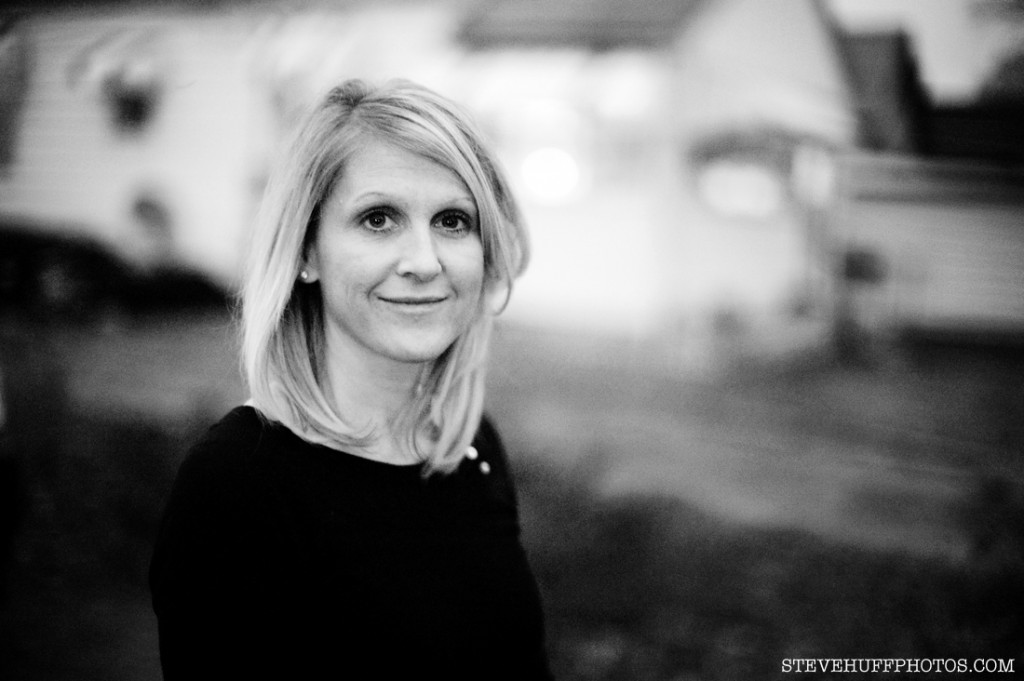
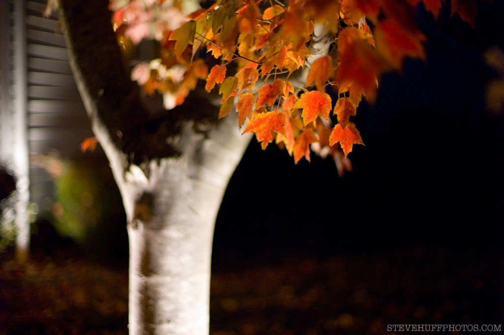
Guess what was delivered to me today? A sweet Voigtlander 50 Nokton 1.1 lens. The poor mans Leica Noctilux! I will have a review soon, but for now here are a couple of quick snaps I took outside in the dark! You may not realize it but it WAS dark! This lens brightened up the scene much like my old Noctilux did. Anyway, here are some 1st, ROUGH DRAFT samples with no processing. Click images for larger versions!
This was shot at ISO 1600 and F1.1 and it was DARK outside! The lens made it look like I had some light, but I did not!
I have more, but for now I am saving them for the review! Check back soon, full review should be up by MONDAY, November 16th!



hey steve the new web site looks better !
good work im waiting for this review is gonna be interesting
by the way which program did you use to build this wab site !??
cheers from mexico man 😉
Re: the comment about the low-res banner, I agree, the ‘Black’ M9 looks very grey in parts. Your pics are excellent and the banner is not fitting with the quality of the rest of the site, which is looking great !
Thanks guys! The review will be up tomorrow! Nicolas, the Nokton 1.1 is $1100.
Hi Steve, I really like the site and find it an improvement. Again content is equally great! By the way what is the price for this Nokton lense?
actually, i think it’s too white at the moment…
you could tone the white down just a little without it coming off as grey, you know. 🙂
good work, though.
i can’t wait for the nokton and zeiss biogon review. very exciting.
-m-
Rodolfo,
This site has very light colors (white/light grey) and could not really get any lighter than that. It has fairly large text and the pictures are 1500 pixels wide. My old site had 1100 pixels wide so the new images are bigger. You need to click on the images to see the larger versions. Reviews have full size original images. Blog posts will have images at 1500 pixels wide.
Thanks
Steve
The site would be better with lighter colors, bigger text fonts and larger pictures. But it is much better than you old site.
Thanks guys! Robin, I will try to get the review up ASAP but it may not be possible until Monday. Thanks!
Steve
Hi Steve
Is there any chance of getting the Nokton review up by the weekend? I need to decide and order this weekend to tie in with my friends trip to the states and I’m thinking this could be a lens to go for!
I’ve been a reader for a while, keep it up 🙂
Rob
The new Nokton 50mm 1.1 looks like a special lens. I am looking forward to your review. Best of luck with the new web site!
I like the new site Steve. I just got a 50 Summilux for my M9, traded a Summicron for it. I like the extra stop, and the 1.4 is sharper wide open the the F2. I wonder how the Nokton will compare, do let us know!
hey steve,
super site! glad to see it’s getting more and more popular. i’m about to commit to a used m8, and your review (as well as posts on dpreview) have been a superb help!
Hi Steve, the new site is looking great. Lots of work … but it’ll be worth it in the end.
I’ll be interested to see what you have to say about the Nokton. I’ve found it to be a good lens, but after you get used to the extra bit of micro contrast you get with the Noctilux and other Leica lenses, the images just seem flat to me. I really want to love the lens, but I know what the images from my Noctilux looked like before I stupidly sold it about a year ago. I’ve got some saving to do … but, the Nokton will tide me over until I scrimp and save for another Noctilux.
Kurt
Not too long ago I played with my friend’s pre-production Noctilux from 1975 and I was surprised how this lens was able to illuminate completely dark scenes wide open. It is good to see that the Nokton has this characteristic too. Just for a much better price in my opinion.
Good luck with your new website Steve.
I’d leave it like it is….no please send me that poor mans Leica Noctilux!
Hey guys, I appreciate the feedback. What do you think of the lighter color I just put up? I just want whatever is easier for everyone to read. Thanks
Lucy said it right, whatever works :p
It’s the articles that made and continue to make me go to your site, not the design. Whatever reflects / suits your personality 😉
Hello Steve.
I have just arrived at your new site, very good, easy to navigate, i do like it. I think, i may be wrong, what do i know, that the lighter background feels nicer to be around, the dark maybe a little heavy for me..what ever, i love your site.
Hey Vince,
This site is still a work in progress and I may just go to a light theme. With this site, I can press one button and have an all new color theme! With my last, I had to edit each and every single page and that was a pain!
When I changed to light on the old site, I had a few emails complaining about it so I decided to go with what I thought fit my personality, but again, it may change to a light theme in the next day or two.
Ha ha, the header image! I am working on a nice one now. The one that is there now was my 1st draft and will be replaced as soon as I am 100% on it. Thanks for looking and for the feedback!
Steve
Yes, a good improvement over the previous site but I am confused why you chose to go back to your previous black-dominated color scheme… since it does seem that there was an overall positive response to the new white color.
Also, a super minor gripe (largely because I am a graphic designer :p) The use of American Typewriter for your logotype is a bit dubious to me since it sends an odd message that you are either a newspaper man or an old-school American photographer who uses a film camera…
hey steve.
i’m excited about this review…gonna be interesting!
your new design is pretty cool, although i’m not crazy about the lo-res banner on the top.
-m-