
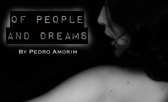
Of People and Dreams – Portraits
By Pedro Amorim
Hello all! My name is Pedro Amorim and I have been a photographer in Brazil for a few years now. I am a street photographer and portraitist (with some incursions in landscape, when needed), and only use manual lenses. My camera of choice is the first A7. I’ve been following Steve Huff since ever, and he has helped me in many ways.
Lens reviews helped me pinpoint new possible acquisitions, while many articles offered me new photographic insights I hold dear to this day (Thanks, Steve!). The idea of creating an area so other photographers would be able to share their experiences was also great, and the user report session became a must visit. It is one of the coolest things out there when it comes to exotic lenses, and I’m very excited to be part of that.
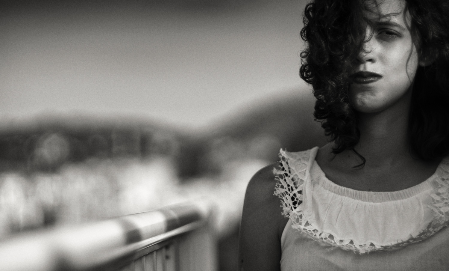
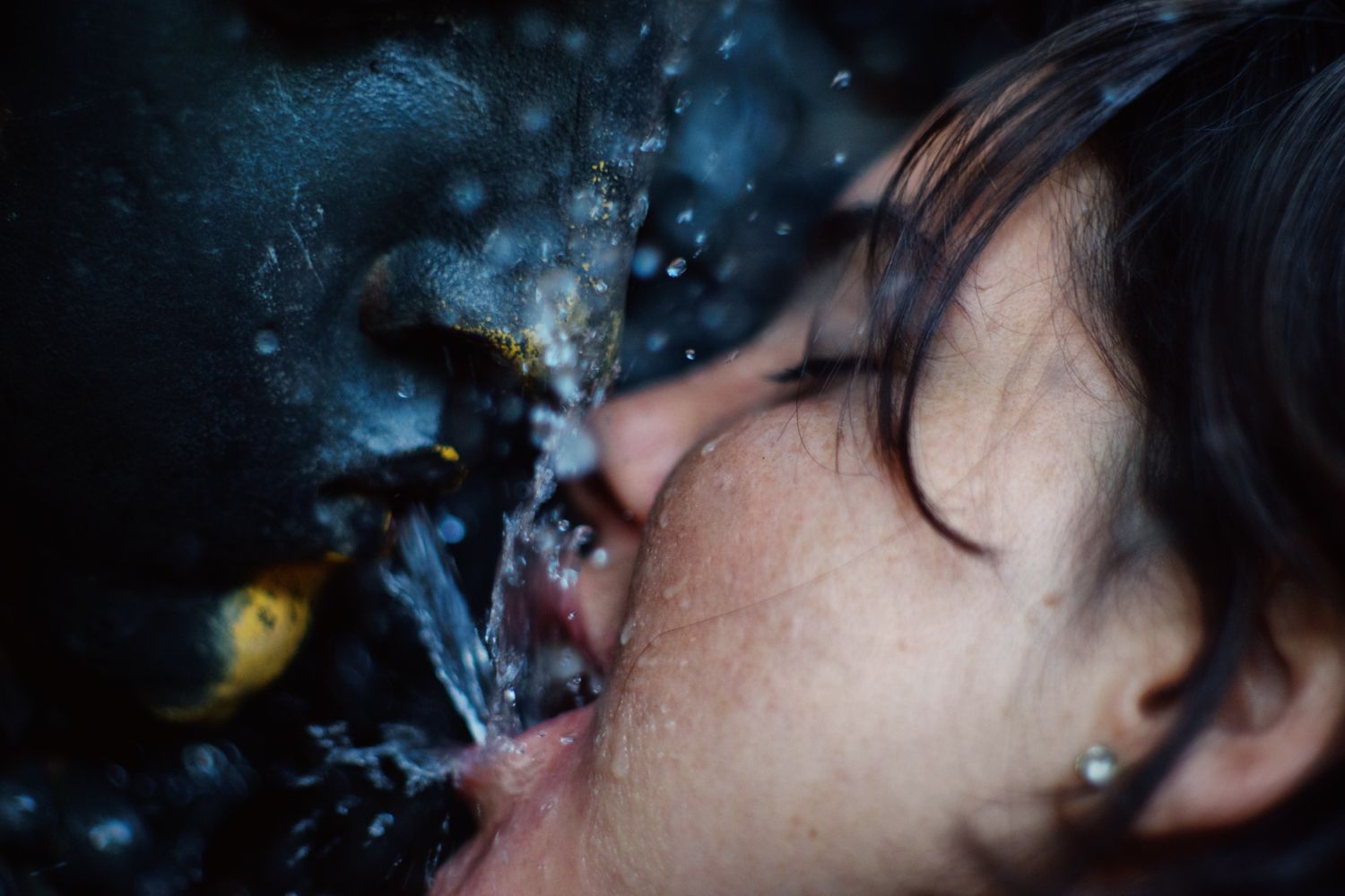
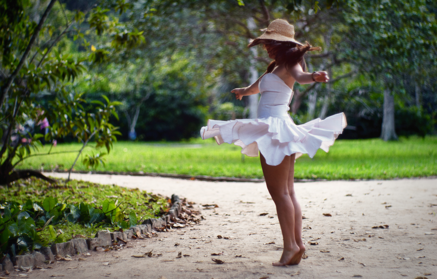
This time, I’ll talk about one of those manual lenses you come across once in a lifetime, the kinoptik Apochromat 100/2, and the reason I took it as my go-to portrait lens. The images I picked up to go with this article were shot in three different situations: in a daytime session at Rio de Janeiro’s Botanical Garden; in a balcony, by the afternoon; and against a simple black backdrop, with a single light source in front of the model. There are very different situations, and that was on purpose. Last things first, let me put my opinion in the simplest of terms: if you see one of those for a reasonable price, buy it. Oh, you can also order one brand new, since Kinoptik still produces the lens today and sells it through their website (it is a little known fact).
Now, let us talk about why
When I first started with portraits, I had in mind that the pictures I was going to produce didn’t have to be super sharp in that clinical way people praise nowadays. I was taking inspiration from the masters of old, so the lenses would have to be chosen accordingly.
I always wanted to bring that dreamlike atmosphere to my images. It is one of my aesthetical choices provenient of a bigger way of think. Looking at famous photographs by Dorothea Lange, Man Ray, Nan Goldin, Avedon and others, you’ll see that they are something else entirely. I am looking for this something else myself. So, the only rule is: no simple portraits. people are no objects to be simply exposed in full make-up and hard light. Every time someone poses for a camera, he or she brings within his or her history, feelings, ideas, social and emotional context and the will to express them somehow. As a photographer, I want to show these elements as well, as if saying “hey, this image is about someone. Look and feel”.

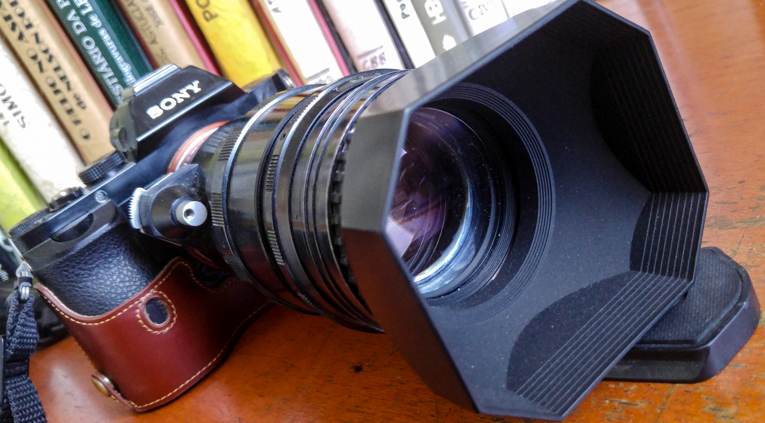
My choice for the job was the Kinoptik-Apochromat 100/2 in ALPA-reflex mount. Kinoptik is a French manufacturer specialized in high-end photography and cinema. Their lenses were used by many great directors, such as Kubrick, who used a 9.8 Tegea on both Clockwork Orange and The Shinning. It is also known that some of the nouvelle vague motion pictures were filmed with Kinoptik lenses. Their still photography objectives are rare nowadays, and became collectors’ items, hence the sky-high prices. But the images created with them are priceless. It has that cinematic feel you get while watching some of the 60’s and 70’s classics, and that’s something I love.
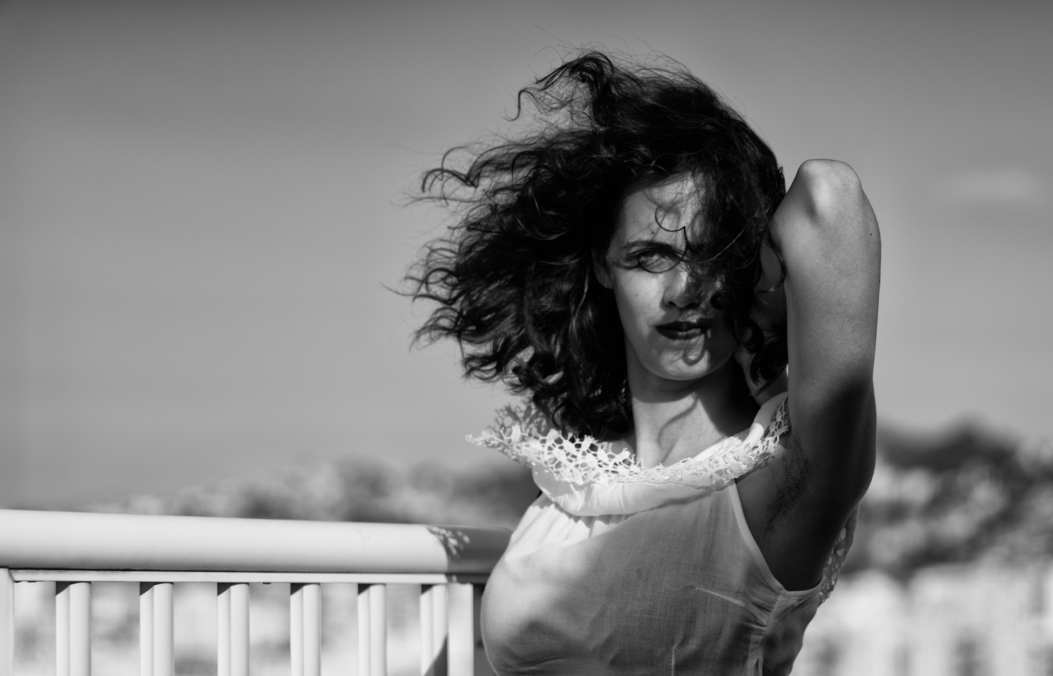
It’s easy to understand why the 100/2 is one of kinoptik’s most sought after relics. It is an all-around portrait lens, giving you total artistic control over the situation despite its portrait-specific focal distance. Its sharp-but-not-that-sharp rendering and suitableness for both color and monochrome photography, as well as a super-shallow depth-of-field with non-distracting out of focus areas results in a polyvalent glass, good enough for most shooting possibilities and styles. Wanna go all expressionist and work on some old-school solarisation?
Worry not, we got your back
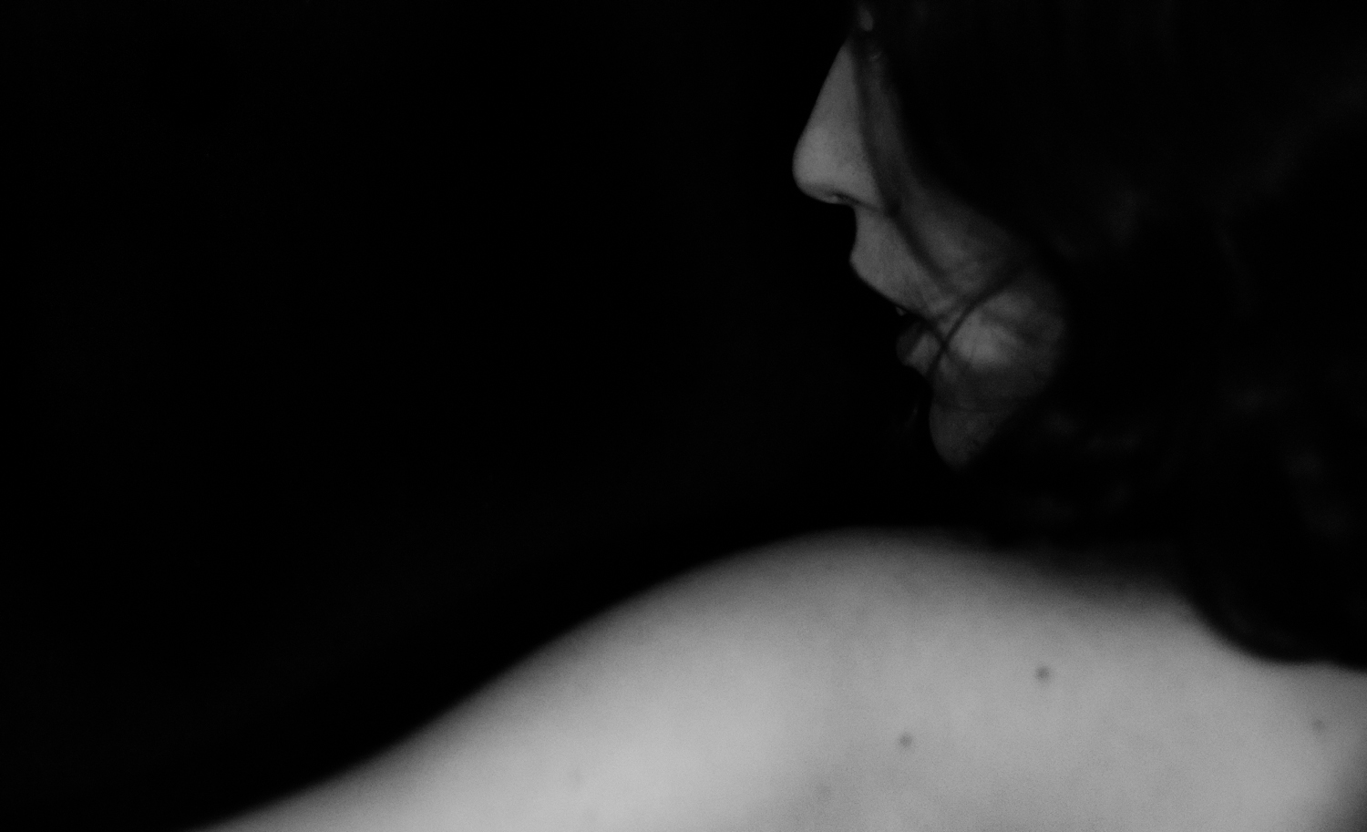
No? you’re more like a film-noir kinda guy? Well that’s also cool:
It is the perfect old lens. It has a classic 60’s optical design (6 elements, 4 groups; double gauss), is heavy, exaggerated, looks gargantuan on the tiny A7 and performs spectacularly wide open. It has a smashing black kinda-industrial-kinda-French-designed finish. If you imagine the design concept of a Summicron and turn it upside down, you’ll pretty much have this lens.
It renders one of the most pleasant bokehs I have ever seen, while being quite sharp at f2. However, this is secondary. Really.

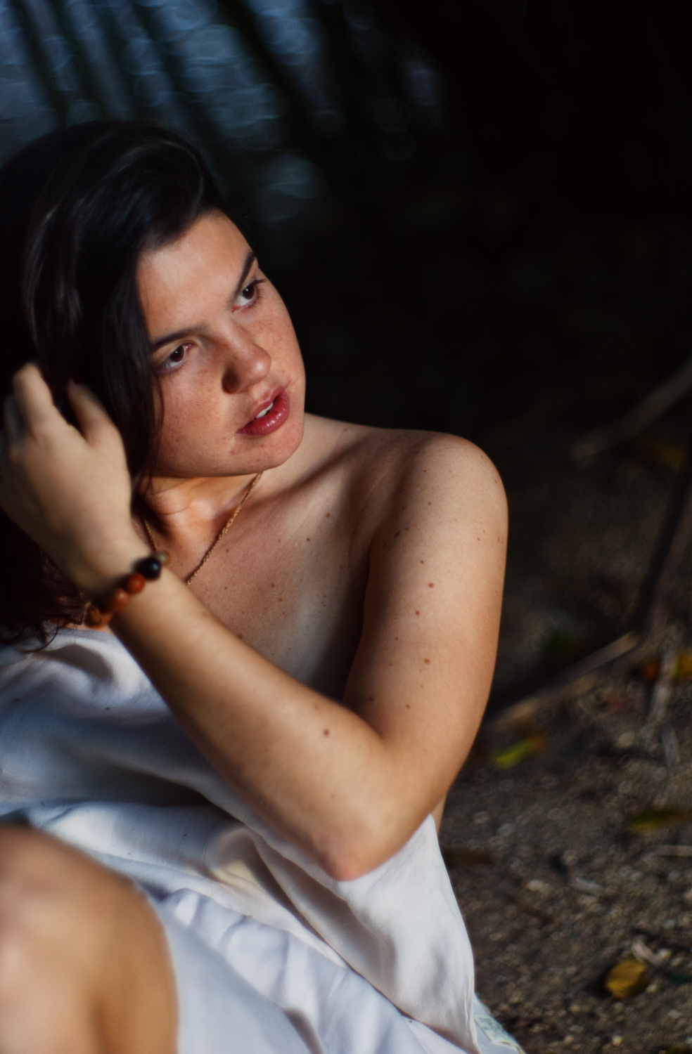
This is a superb portrait lens, with its watercolor-like bokeh contrasting with popping lifelike colors that result from the outstanding color correction. This lens does deserve the “apochromatic” in its name.
The skin tones are rendered in a natural way, and the images are contrasty but not aggressive. Shooting with only ambient illumination is a delight, and can deliver some very dramatic effects.
Truth be told, it is not a perfect lens. The 100/2 is a true practical nightmare. As an old lens, the Kinoptik has all those downsides a tele had back in the day. Times ten: It is heavy. And I mean HEAVY. You can shoot it handheld, but focusing wide open is hard. Handling is also clumsy, since it is not one of the most ergonomically correct lenses out there. So find yourself a tripod and be happy. It’s not like you will be using one for street photography anyway (really, don’t. if you are an M shooter or a mirrorless guy, go get a summicron or a summarit. Even the elmarit or the old elmar 90. There are countless lighter street tele lenses more suitable for the job).
It is also prone to flare. Some say it is a coating issue not addressed by kinoptik, but the fact remains that you’ll have to use a hood while shooting around light sources (which is pretty much all the time).
And find yourself a big carrying pouch, because this beauty is bigger than half of Nikon’s professional-grade zooms.
That being said, I believe the pros (image quality, artistic versatility) easily outweigh the cons. It has character and quality, being a precise and classy instrument (despite its user unfriendliness and clumsiness when handheld). It remains a legend in its own right, even after fifty years from its original debut.
Much like the right movie from decades past or the right portrait from the depression era, this lens is timeless.
Thanks a lot for the opportunity, Steve. You can see some more of my work by clicking on the links below.

Love the colour photos especially. It looks very much like the CineStill film. Deep colour and tonality, and soft / smooth while also being sharp but with a roundedness that doesn’t look typically digital. The compositions, too, are rather outstanding. Quite an achievement, since I have never liked Sony colours, and I wouldn’t have thought getting results like these are possible with a Sony camera. The B&W photos have a distinct personality as well, but the colour ones stand out for me in this series.
I absolutely love these images. I love the tonality, the texture and the colour. The models are beautiful, too. 😉 I think my favourite shot would have to be #6.
Your approach, and your imagination, along with the Kinoptik lens, have produced some very unusual, sensuous images. The lens reminds me a bit of the Petzval. But it’s quite different at the same time.
I checked on eBay how much this lens sells for. Ouch… The lens hood by itself costs as much as some cameras! But the results are worth it, I think.
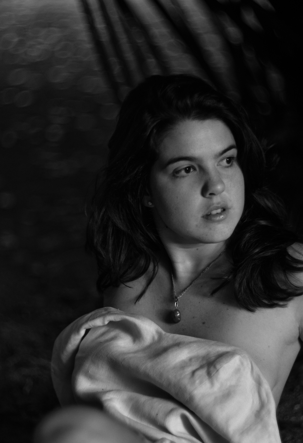
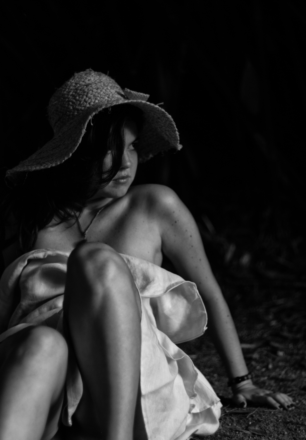
I think in image #10 (the last one), I would have liked to see a bit more light on the subject’s face. It’s a little bit too dark for my taste. It’s one of the nicest images in this collection, anyway, so don’t worry too much. 😉
I think if you’re shooting portraits, you don’t have to be technically perfect. Portraiture allows for all sorts of imperfections, and that allows the photographer to try almost anything.
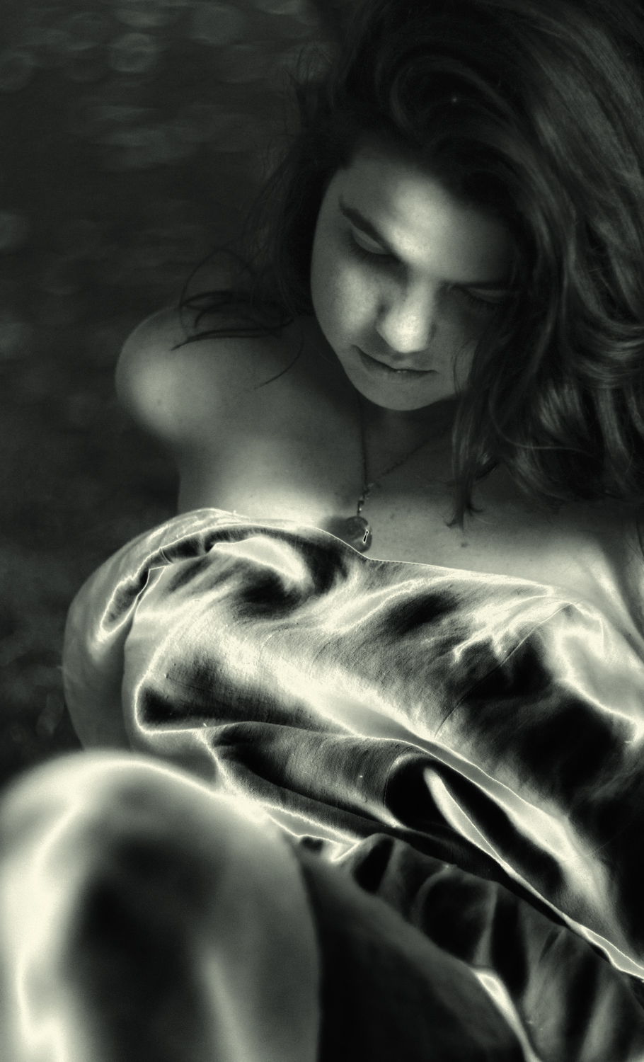
P.S. There is a strange artefact on the woman’s necklace in image #2. It looks like a blown highlight but it’s dark, not white. What caused that?
Hi, Karim! sorry for the late reply
Thanks very much for dedicating part of your time to look at my pictures and criticize them constructively.
#6 is also my fav. While all the others can relate to one school of photography or another, This one has an ethereal feel I love and don’t see that often.
Yes, it has a hint of petzval-like images, bokeh-wise. That is beautiful. It has a discrete, elegant swirl on the out-of-focus areas. And the circle of confusion it creates merges with the background in a very petzval way.
The lens is expensive, but I found mine in Brazil. The collector had already sold the ALPA camera it came with, so he had two lenses left and no one to buy them. ALPA cameras are ridiculously rare, so the lenses would have been stuck for a few years. So he sold it for a low price, and in reais [Back then, 01 Brazilian Real was worth 0,5 USD]. I use an adapted film camera hood that works fine, so I saved at least this much 🙂
Yes, #10 was a bit darker than the lot, In the beggining, it was a bit frustrating. I even considered cranking up the exposition or the highlights on Lightroom,
But I gave it a shot and learned to like it this way.
The sun was almost set by the time I took the picture, and I was using it as my only source of light. In the end, I went for a darker mood and it worked. The textures became more prominent and so did the mid-range and the darker shadows, creating a dramatic effect in which her eye stands out instead of her facial features as a whole. Actually, I later worked on a second, brighter version, but decided to go with the original anyway.
What happens in #2 is exactly what you said: it is indeed a higlight created by reflection on the necklace stone, but pitch black. It happens during the solarisation process.
When you solarise a picture, its tones became partially reversed, Dark areas appear light or light areas appear dark. It happens most visibly in highlights or darker shadows. So the blown highligt became a “blown dark highlight”. You can observe the opposite situation happening on her dress. Shadow areas created by the folding appear bright instead.
The dark higlight was not intentional, being an actual flaw of the image. But even in digital media, solarisation is a very hard process to master. It is quite difficult to create consistent, predictable outcomes of solarised images, because you never know exactly how each grade of color and light will behave when processed that way. It was even harder in the darkroom. Now it is just hard, not impossible.
I left it there because I didn’t want to spoil the authenticity of the image with hard alterations, and as you said – and I totally agree, portraiture photography allows many imperfections, and you can make them part of your artistic expression altogether.
[fixed]
Hi, Karim! sorry for the late reply
Thanks very much for dedicating part of your time to look at my pictures and criticize them constructively.
#6 is also my fav. While all the others can relate to one school of photography or another, This one has an ethereal feel I love and don’t see that often.
Yes, it has a hint of petzval-like images, bokeh-wise. That is beautiful. It has a discrete, elegant swirl on the out-of-focus areas. And the circle of confusion it creates merges with the background in a very petzval way.
The lens is expensive, but I found mine in Brazil. The collector had already sold the ALPA camera it came with, so he had two lenses left and no one to buy them. ALPA cameras are ridiculously rare, so the lenses would have been stuck for a few years. So he sold it for a low price, and in reais [Back then, 01 Brazilian Real was worth 0,5 USD]. I use an adapted film camera hood that works fine, so I saved at least this much 🙂
Yes, #10 was a bit darker than the lot, In the beggining, it was a bit frustrating. I even considered cranking up the exposition or the highlights on Lightroom,
But I gave it a shot and learned to like it this way.
The sun was almost set by the time I took the picture, and I was using it as my only source of light. In the end, I went for a darker mood and it worked. The textures became more prominent and so did the mid-range and the darker shadows, creating a dramatic effect in which her eye stands out instead of her facial features as a whole. Actually, I later worked on a second, brighter version, but decided to go with the original anyway.
What happens in #2 is exactly what you said: it is indeed a higlight created by reflection on the necklace stone, but pitch black. It happens during the solarisation process.
When you solarise a picture, its tones became partially reversed, Dark areas appear light or light areas appear dark. It happens most visibly in highlights or darker shadows. So the blown highligt became a “blown dark highlight”. You can observe the opposite situation happening on her dress. Shadow areas created by the folding appear bright instead.
The dark higlight was not intentional, being an actual flaw of the image. But even in digital media, solarisation is a very hard process to master. It is quite difficult to create consistent, predictable outcomes of solarised images, because you never know exactly how each grade of color and light will behave when processed that way. It was even harder in the darkroom. Now it is just hard, not impossible.
I left it there because I didn’t want to spoil the authenticity of the image with hard alterations, and as you said – and I totally agree, portraiture photography allows many imperfections, and you can make them part of your artistic expression altogether.
Fantastic
Great photos. Thank you for sharing.
Thank you all, folks. It is amazing to see all these comments from people who liked both my writing and my images. I wasn’t really expecting such a positive reception, so it totally blew my mind. I’m so thrilled you guys enjoyed it.
I enjoyed you photos. When I grow up I want to be as good as you.
Fantastic portraits and a marvellous “philosophy” of what you’re about. Very enriching. Thank you.
Very inspiring, great pictures and text, thanks a lot.
That was something magical. Thanks.
Great shots and Yup this lens has a great vibe to it very retro filmic looking love it thanks for sharing
It’s classic photography and set up, good stuff.
The use of a cinelens is interesting. I use a Angenieux zoom on my M240.
Hi, Paul. I also use an old angenieux, though mine is a fixed c-mount. It gave me great images back when I had it as my main portrait lens. Angenieux is an amazing manufacturer and their lenses, both for cinema and still, have some unique character you will rarely find somewhere else. When taliking about still lenses, i have the 28/3.5 for alpa mount and the 135/4,5 for m39.
Very lovely stuff…
That’s what we should call painting with light and poetry…
Congratulations Pedro! Impressionante, adorei o experimentalismo e a atitude. Grande abraço!
This is the best post in years and the photographs…ohhh… Classic!!!
Amazing!
What photography should be in my opinion!
What “should [photography] be”, noiret? What do you mean by “amazing”?
Photography should be amazing; provenient of a bigger way of think
EM, as enlightening as a clear crystal stream…
James!
Not everyone can be as articulate as (presumably) you, James.
A+
+1