
Psychedelic Fifty. The Pentax SMC-F 50mm F1.7 lens
By Aivaras Sidla
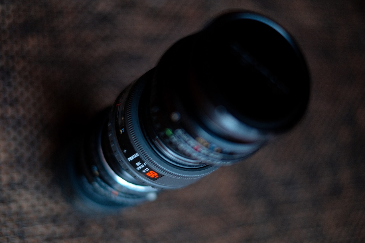
In the beginning of this year I acquired Pentax SMC-F 50mm F1.7 lens. I had an intention to have cheap and expandable 50mm alternative for dangerous (for lenses) activities and places – skiing, rafting, beach etc.
Surprisingly, as I started to use it and saw results, it started to grow on me and became most used lens this year (used more that 40 36exp films with it).
I’ll not bother you with specifications, physical qualities, history of this lens, all this information could be easily found on pentaxforums lens database.
What I wand to share with you is very special look, that can be achieved with this lens – its psychedelic, its painterly, its surreal. I like it very much, this look draws me to forget other alternatives for some time, as I cant recreate similar look with other ±50mm lenses I use (50mm FA 1.4, 43mm FA 1.9).
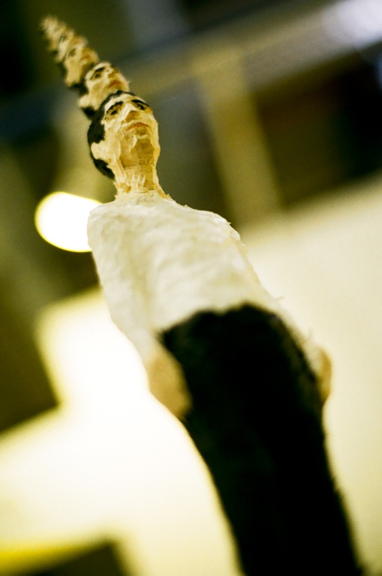
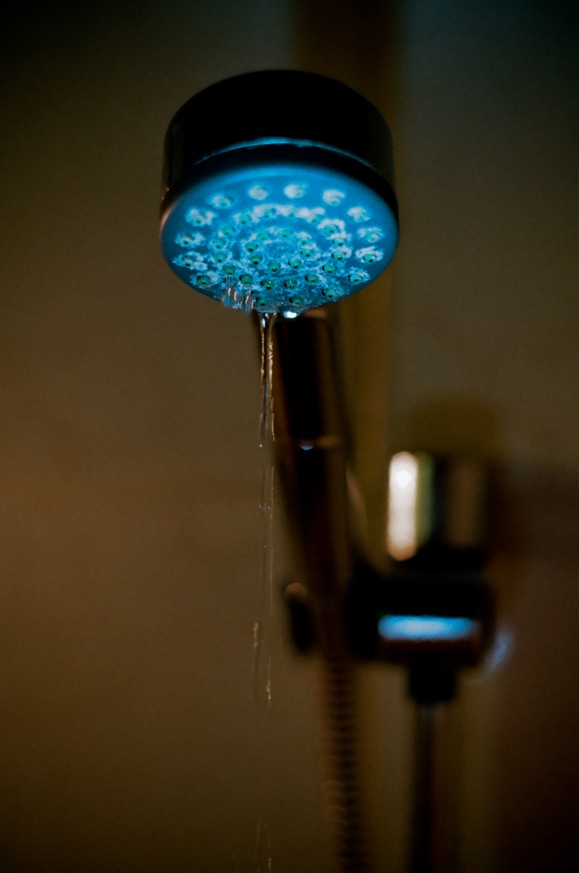
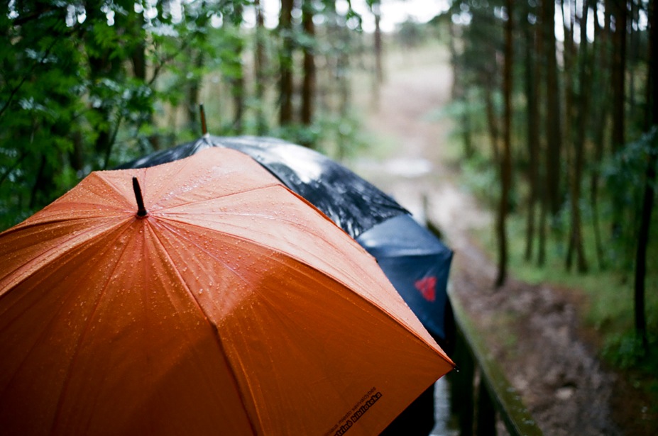
I’ll share several pictures that should illustrate point. All taken on film with Pentax MZ-3 camera.
By the way – you, know, preferences are subjective, some may not like the look this lens gives, it has flaws and is very far from being perfect. Be warned. 🙂
Picture2 – kodak portra 400
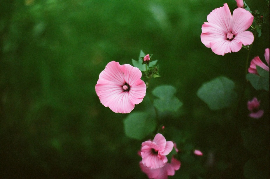
Picture3 – kodak ektar 100

Picture4 – fujifilm superia 200
Picture5 – fujifilm superia 200

Picture6 – kodak portra 400

Picture7 – fujifilm superia 200
Picture8 – fujifilm superia 200

Picture9 – fujifilm superia 200
More could be found in flickr: https://www.flickr.com/photos/aiwalit/
Thanks.
Aivaras
Just picked up this lens on the end of an immaculate K1000 for £5 in a charity shop. So pleased!
Nice. I don’t deal with the autofocus models myself, but Pentax makes my favorite lenses and these definitely have that same great look.
Great eye for detail. Following you on flickr!
These are very, very nice images. Thank you for posting.
Thanks for good words everyone.
Jh – superia 200 was my favourite film, but now I moved more to Kodak portra. I experience two problems with superia 200: a) it messes with skin tones – faces are red b) It tends to give nasty colour shifts in underexposed places. Portra eliminate these aspects, but has more muted colors. Would like to have portra skin tones and underexpose abilities of portra in superia 200 🙂
Superia for me is a film for landscape and still life, port is way more universal.
lennshacker – highlights has tendency to be a bit swirly in out of focus areas and this gives charm to pictures, but for me its more about how this lens melts background, what dark colours it gives.
Nice! Thanks for sharing these photos
Very nice photographs. The bokeh- looks like it picks up some “Swirlies”, ie out-of-focus areas looking like footballs towards the edges of the images. One component of a Psychedelic look maybe? Many olf the older Leica lenses are known for this- “Summarit Swirlies”.
Fuji superior 200 very underrated film love the bright colors it brings out not everyone’s cup of tea but definitely has its own unique look. I personally think this set of photos shows why I think Fuji is better for color film and Kodak better for bw
A beautiful series of photos. Among the best that I’ve seen on this site. Beautifully saturated colors and thoughtful exposures. Thanks for sharing.
Oh yes, the magic comes over very clear! Lovely images. Thanks.
Really like this set of photographs, especially #6.
Well done