

Best of the best: The Phase One IQ3-100MP Trichromatic compared to the original IQ3-100MP
By Andrew Paquette – See his website HERE
I recently had an opportunity to test Phase One’s new IQ3-100 Trichromatic back, hereafter called “trichromatic”. It is a terrific digital back, but how different is it from the original IQ3-100? Both are excellent backs and have excellent color. A couple of recent reviews contain photos that have stunning color. One from Luminous Landscape is worth a look if you want to understand in what way the colors are different in the trichromatic. Based on these reviews, I looked into what it would cost to upgrade from the IQ3-100 to the trichromatic. The prices may vary depending on what region you are in, but suffice to say that I could have bought a small but new car for the upgrade price. With that in mind, I wanted to have a test to see if it would be worth it to me. Having said that, the trichromatic is substantially better in many ways that any other medium format digital back available. The question for me was, how much better than the next closest digital back, the IQ3-100?
I would have preferred to do the test outside with some models, but thanks to enforced convalescence after a recent operation, I had to do the test in my living room with some simple still lifes. I don’t do these very much, so I haven’t put together a proper product photography stage yet. All this means is that instead of a proper seamless background, I used colored construction paper for backgrounds. The main thing I wanted to test was color fidelity and smooth gradients, so that was enough for my purposes, even if it wasn’t optimal.
I used a Phase One XF camera body and a Schneider-Kreuznach LS 120 mm blue ring lens for all of the shots. For lighting, I had natural light coming in from a window on the left, and fill light bounced off the ceiling from a ProFoto B1 with an octobox. All of the shots used the same lighting, but the settings changed as the light shifted outside. This is most obvious in the shot with a green background. The shoot was done with a tether, so all images were available for review as soon as they were shot. Also, most are focus stacks. The reason is that when I shoot macro, I almost always use focus stacking. The settings varied within a narrow range. All images are shot at ISO 50, f-stop ranged from 4 to 4.5, and shutter speed varied between .8s and 1.3s, depending on available light.
All of the photos used the same elements, but the compositions are not identical. This is because I only had the trichromatic for a couple of hours, so all of the IQ3-100 shots were done before the trichromatic back arrived, meaning there were a number of changes made to the various elements to get the shots, and then due to limited time, similar but not identical compositions were made with the trichromatic.
There are two batches of images presented here. The first batch are color comparisons, the others are final edits. The color comparison images have had one post-processing edit applied to them: all have had highlights restored by adjusting the highlight recovery slider in Capture One. Apart from that, these are straight out of the camera. The second group of images have had too many edits applied to describe in a reasonable amount of space.
My impression during the shoot, as I saw the images appear in Capture One, was that the color from the trichromatic was more accurate than the IQ3-100. This was expected, primarily because of the article in Luminous Landscape. The areas of greatest difference were greens, which were noticeably different and more accurate, without much squinting or side-by-side comparison. Yellows were also quite different, though it was easier to see this if the images were close together. Blues were different, but unfortunately, I can’t show that here because I forgot to shoot the blue background with the IQ3-100. In all cases, the trichromatic colors were cleaner than the IQ3-100. With reds, color differentiation was improved to the point that image clarity was enhanced in addition to having more accurate color. These differences should not be taken to mean that the IQ3-100 produced weak color. To the contrary, it produces stunning color also, particularly in comparison to every other camera made, from Hasselblad, to Sony, Nikon, Leica, Canon, and others. However, even among the best of the best, there are differences.
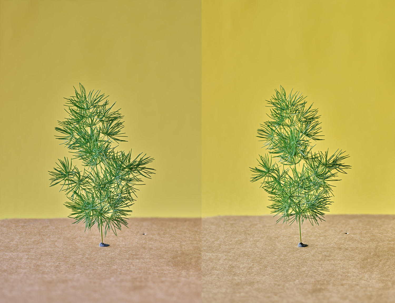
Color comparisons (IQ3-100 on left, Trichromatic on right)
Figure 1Yellow and green comparison, trichromatic on right
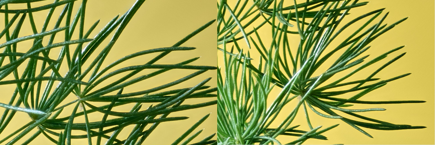
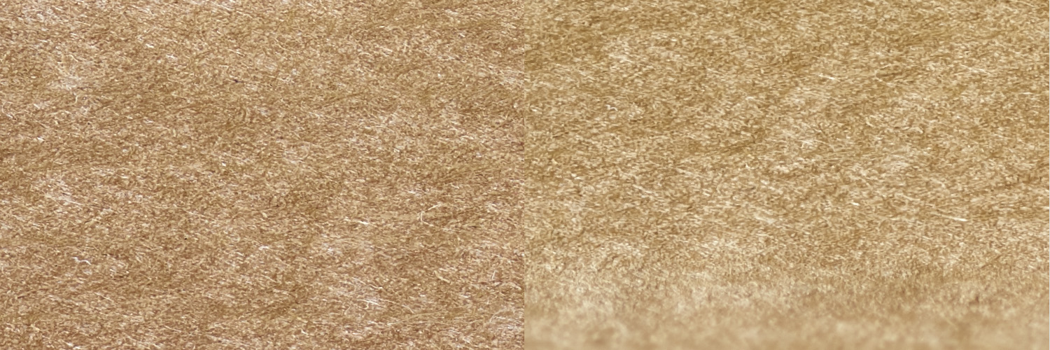
Full-size crops
–
Figure 2 yellow paper, trichromatic on right

–
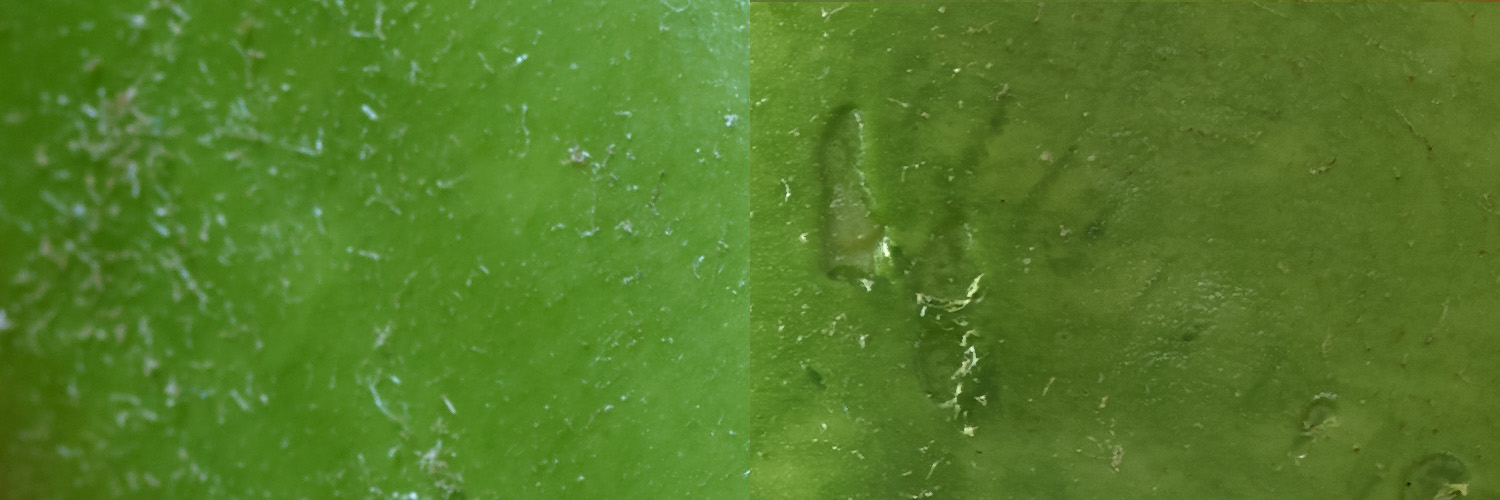
Figure 3 green needles, trichromatic on right
–
Figure 4 cardboard, trichromatic on right
In all of the comparisons, yellows tended to be more red from the IQ3-100 than the trichromatic, as can be seen here. Of perhaps greater importance, a visual inspection of the subject with the photo beside it on a monitor, shows that the trichromatic is more accurate. That is, the extra red seen in the IQ3-100 did not belong. This conforms with the color model described in the Luminous Landscape article, that shows how certain colors have a tendency to bleed together on non trichromatic sensors.
–
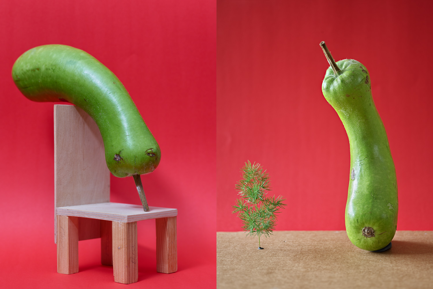
Figure 5 Red green comparison, trichromatic on right
Full-size crops

–
Figure 6 red paper, trichromatic on right

–
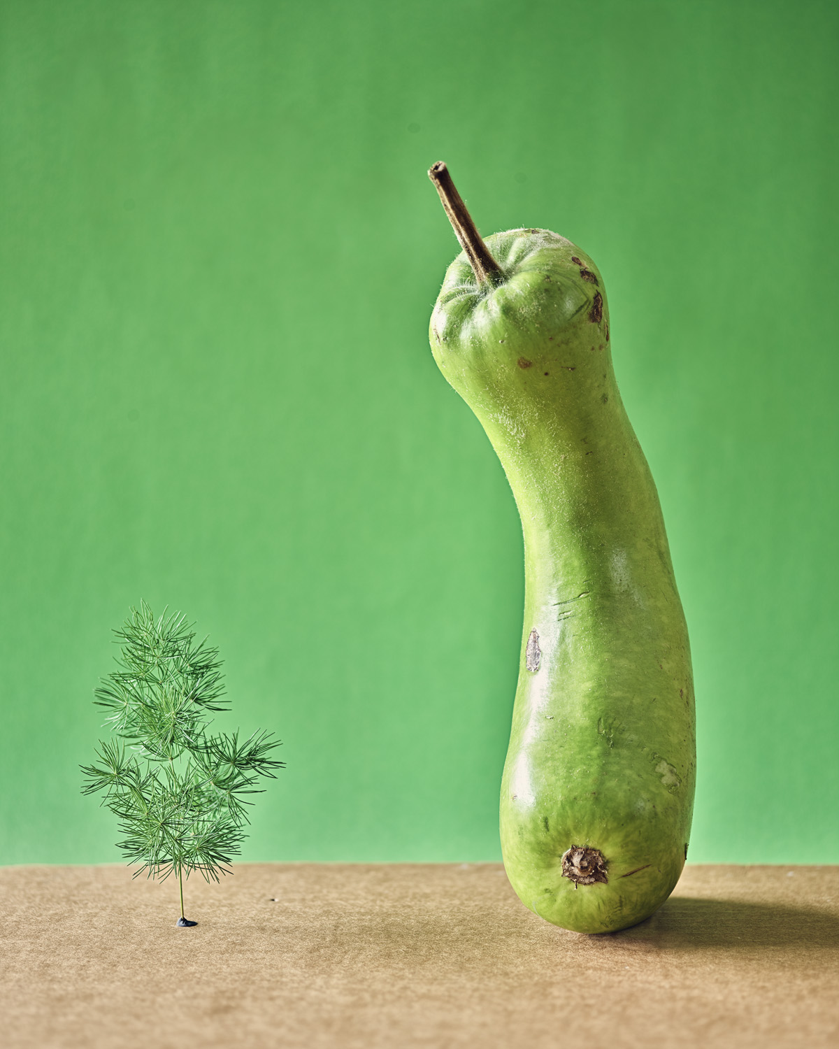
Figure 7 green gourd, trichromatic on right
In this example, greens are noticeably bluer from the IQ3-100 than the trichromatic. One might argue that the trichromatic has red reflected into the green from the backdrop, but if that was the reason, it would happen with the IQ3-100 also, which uses the same backdrop.
–
Figure 8 Pink and yellow comparison, trichromatic on right
Full-size crops
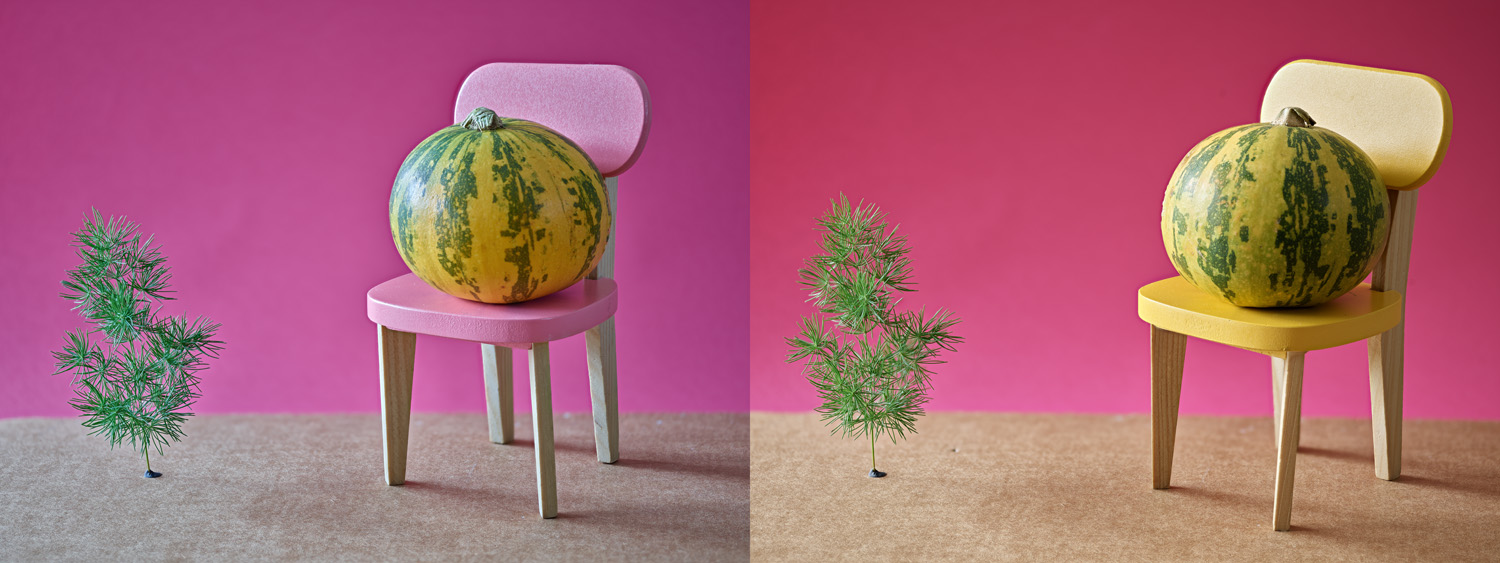

Figure 9 pink paper, trichromatic on right

Figure 10 yellow green squash, trichromatic on right
This shot highlights one of the reasons a photographer might want to upgrade to the trichromatic. In the background, the pink is noticeably bluer than on the right, but the yellow of the squash is redder on the left. A simple color temperature adjustment won’t fix this. This shows up in other photos as well, where certain colors have highly specific differences that are not carried through the rest of the image, because of the way specific wavelengths are treated in the CFA profile. The trichromatic has less overlap of wavelengths than in a standard CFA, which results in cleaner colors. Also, from looking at the subject, I can verify that the trichromatic was very accurate in comparison to the IQ3-100. Another point is that the additional clarity also increased the apparent sharpness of the image.
Both backs have the same resolution and bit depth, so the major factors where a difference is visible have already been covered. There are other differences though, but they aren’t relevant to the kind of shooting I do. For instance, the ISO range starts at 35 instead of 50, and at high ISO, color noise is diminished. I did do a few shots at ISO 35, but these are very difficult to distinguish from ISO 50, so they aren’t presented. I don’t like to shoot above ISO 800 with the IQ3-100, but have gone as high as ISO 1600 with acceptable results. It can go much higher than that (ISO 12,800), but whenever I have shot at 3,200 and above, I’ve tossed the photos. There have been times when I needed to get more light in the camera but I didn’t have the option of bringing lights to the shoot. When that happens, I prefer to pull out my Nikon with an Otus or some other lens that has a max aperture of 1.4 or so.
Final images
For fun, here are a few of the final shots. These have all been edited, so they aren’t very good for making comparisons.
Figure 11 green gourd having a drink, IQ3-100
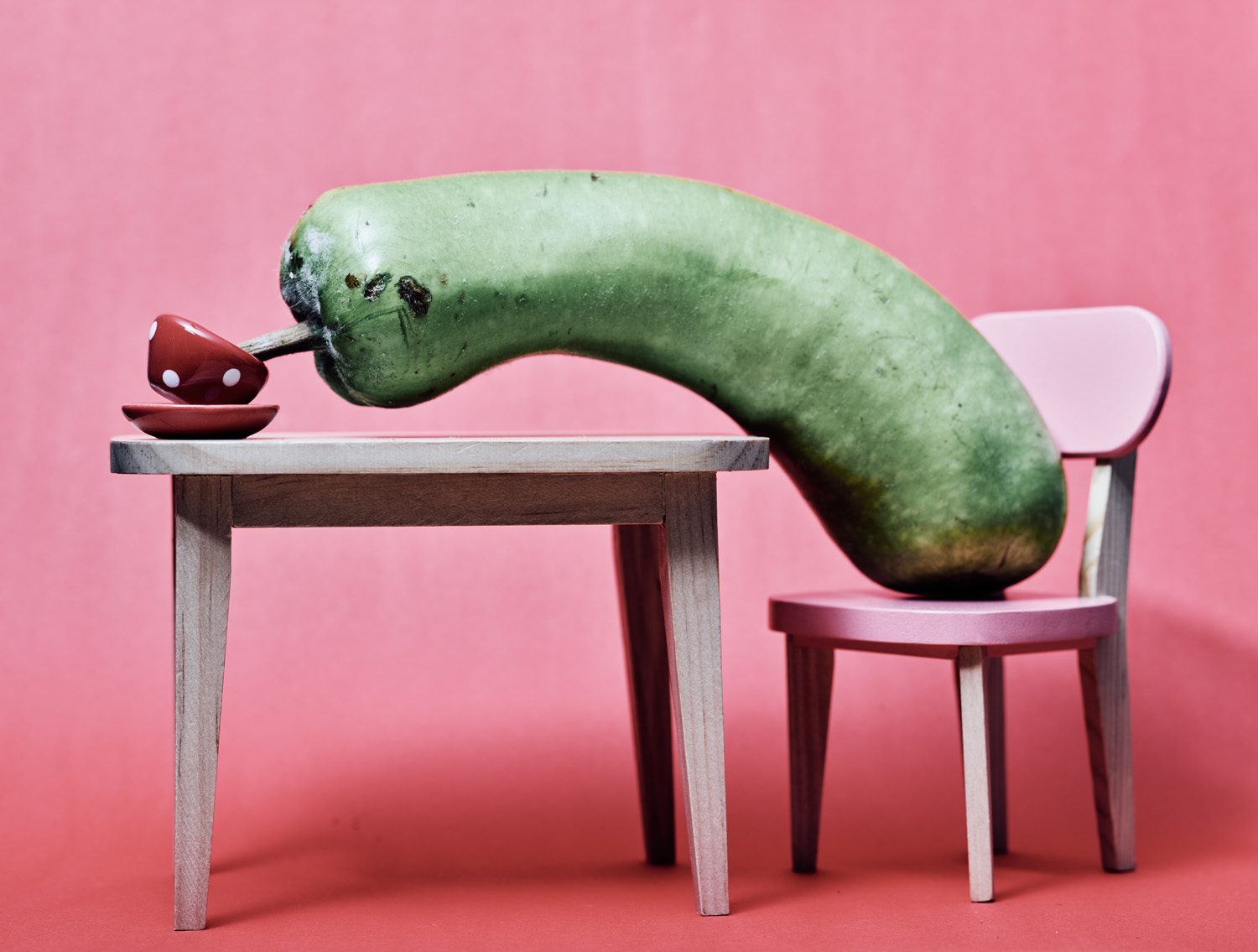
Figure 12 Desert mushroom, IQ3-100
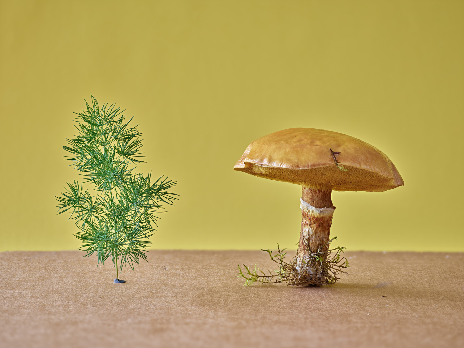
Figure 13 Poltergeist chairs and pumpkin, IQ3-100
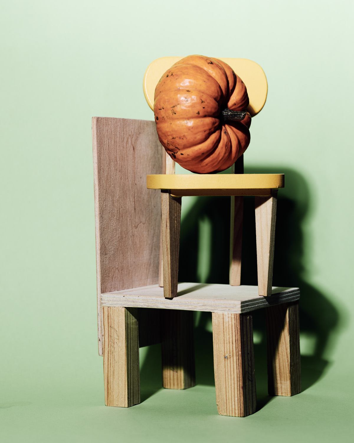
Figure 14 Grandpa squash, IQ3-100
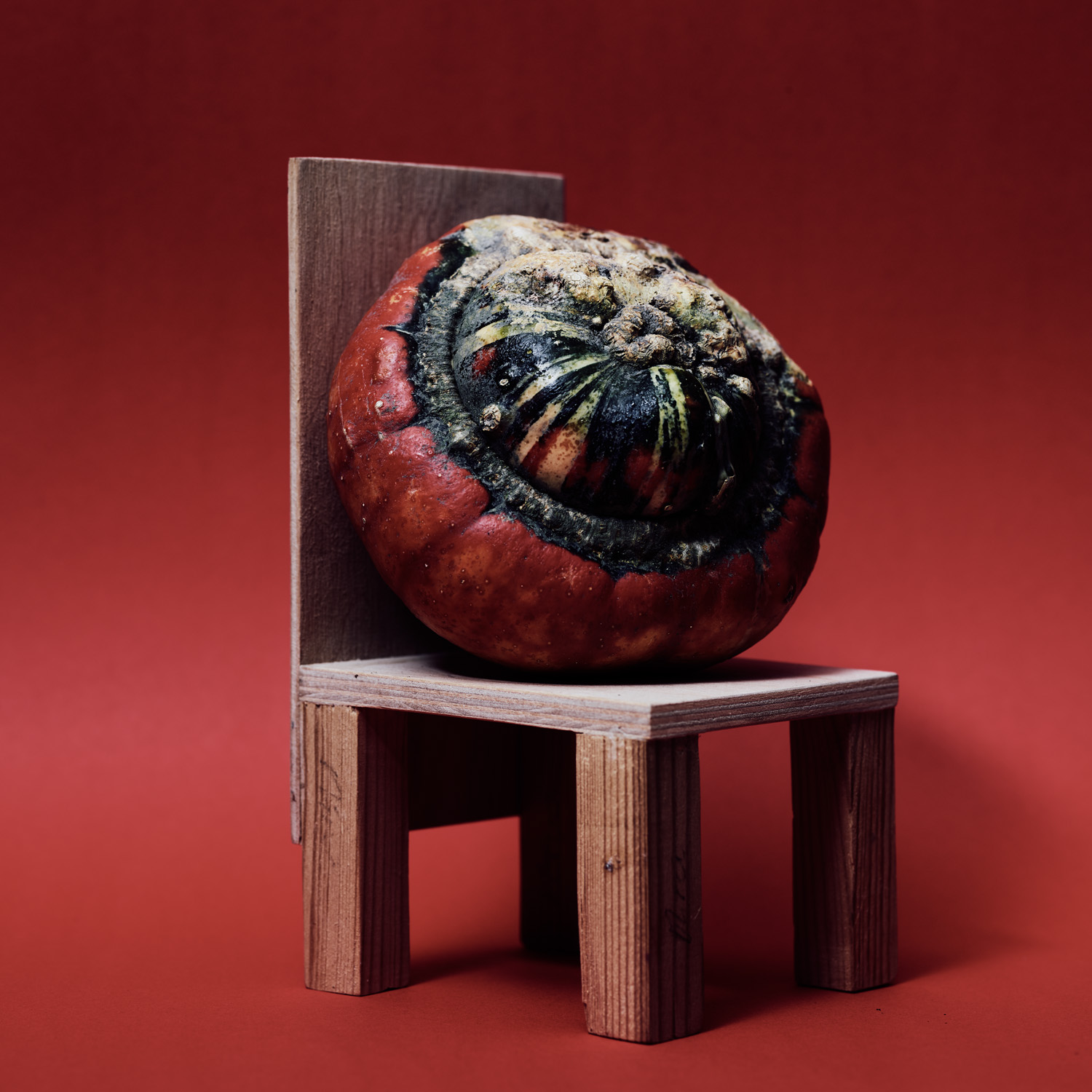
Figure 15 Squash at the beach, trichromatic
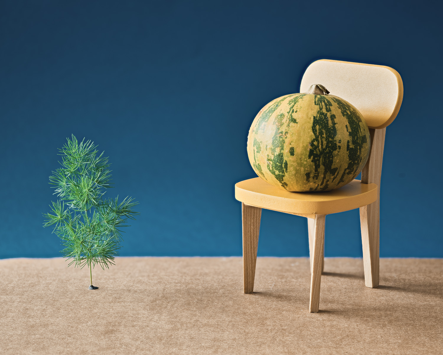
Figure 16 Forest gourd, trichromatic


Now it is, see my latest article for the results!
Keep in mind that, as noted in the article, the images seen first are unedited, but at the end, under “final images” they have been edited. The haloing and pale color are from the editing process, not the raw output. I noticed this after posting, and made a new series that eliminate the issue.
It seems to me that if we judge “real” based on what looks right to us, even if we see things differently, we will be making the same adjustments to match the subject, which is the same regardless how we see it. But on the other issue, adjusting the image after the fact to make it more pleasing, there can be a wide variety of options there. The more I work with Capture One, the more I realize it is very unlikely that a “finished” image will be created completely in camera. Even when a good, publishable, image is created in camera, it can almost always be improved with some creative editing.
Because of this realization, I no longer look at the camera as the device most responsible for the final image. Instead, it collects the raw information needed to make the final image. This is why I switched to MF: it collects more information. When I have used DSLR files, I am always disappointed by how limited their range is, thus limiting the flexibility of my editing options.
I like the fact that the Trichromatic color appears to be more accurate than the 3-100, and I know the 3-100 is more accurate than my DSLRs, but it isn’t different enough for me to be comfortable spending the upgrade price (15k/euro). Maybe when they release a 180MP DB I’ll consider it. When I took these shots, the greater accuracy of the Trichromatic was unmistakable. The subjects were sitting right in front of me, and my tethered computer was sitting right beside them. There is no doubt in my mind at all that the Trichromatic is better in the sense that it is more accurate, but for the cost difference, I’ll go with “good enough” for now.
“Babysitting” the kit is, indeed, an issue. I did a two week shoot in Thailand a couple of years ago. As part of the trip, I had a few social nights out with a friend of mine. However, I was so paranoid about something happening to my gear, that I carried it everywhere. It was a huge pain, I felt silly doing it, yet I couldn’t bring myself to leave it in the hotel, though it was probably perfectly safe there.
If I had done the same thing with my Nikon or Sony, it wouldn’t have been an issue because in both cases, they don’t take up much space and aren’t that obtrusive. Although if it had been those cameras, I would have been willing to leave them in the hotel.
No, I don’t miss the phase kit, at least for now. I’ve shot some few around the house flowers and portraits for now, but am heading to the South island NZ in Dec. That will be the true test of the kit. Incidentally, I first used the IQ280 in the same place. so it’ll be an interesting comparison. The Phase kit is HEAVY by D850 standards, and fwiw, I think it is family-unfriendly. You just cannot not babysit a 70K kit when out and about. The output is magnificient no doubt, but not 10 times as much as the D850+zeiss. But hey, if you have no better use of the money, go for it.
@Saty Bhat How does the D850 compare with your IQ3100 & IQ280? I’d imagine they are quite different in working but curious how the final output compares? Do you ever wish you had the Phase One back badly?
I’ve used an IQ3100 for a year (2016) and before that the IQ280. I liquidated the whole kit because it was time to upgrade our house and cars (that is not a joke, btw). FWIW, the systems will give an incredible eye-popping output that was until late 2017, unrivalled by any other systems.
Recently I have acquired the D850 with a zeiss Milvus kit (21, 50, 100) and am thinking of giving up the 21 lux to consider the 25 milvus. But I digress.
This thing about the tri-chromatic being better in fidelity compared to the 3-100 just sounds like another marketing gimmick. Logically and scientifically speaking, the argument doesn’t make sense. Are the viewers also presented with spectrophotometer readings alongside the images? Would Phase offer a free upgrade from the 3-100 back to a 3-100 Trichromatic back considering that the previous back didn’t show ‘true colours’?
Well, maybe the answer is obvious but I really would like to see trichromatic vs D850 colour difference.
First, thank goodness for Steve Huff! An amazing blog that always has interesting “things”.
The images shown here look like the color film, i found, 16 years out of date, processed by a lab, with expired chemicals.. Sorry but maybe my monitor is out of ‘Phase”.
The great thing for me, no longer a pro, have no need for expensive(Ransom) and happily shoot toy digital, with great JPEG and BW film, lots!
Being a ‘techie’ type, I went to the Phase One website to try and understand what is special about their ‘trichromatic’ sensor. It seems that they have worked with Sony to improve the filters that are used to separate the colours in a Bayer array. the aim of the work was to eliminate spurious responses in each filter.
For example, the filters in most cameras respond to infra-red, which can easily be demonstrated by taking a photo of a TV remote-controller, while it is being operated. The invisible infra-red beam from the LED in the controller appears as a bright light on most digital cameras. Since many plants reflect lots of infra-red light, then this spurious response must corrupt the colour fidelity of our cameras.
Similarly, blue filters often have a spurious response in the red part of the spectrum, and so on. I have little doubt that other manufacturers will adopt sensors with better Bayer filters, now that the basic research has been carried out by Sony..
Your post is firmly rooted in the stratosphere, in which most of us will never be able to set foot. Watching photographers work with phase One equipment is like looking in on a $5000 a plate dinner, which we will never taste in our lifetimes. This doesn’t mean that you shouldn’t revel in the opportunity. But it does leave most of us with our mouths watering.
Just a word on color fidelity. This may mean something mathematically, but may have little relevance for the individual, who views color and color palette according to a personal preference evolving from brain function in which the cortex is only a part of the mix. I experience this myself, preferring the Fuji Velvia color palette above almost all others. My landscape photo post processing almost always ends up with color adjustments to suit my taste. I have discussed this with an architectural photographer relative who tells me that he wants his interior color reproduction to be as close to ‘real’ as possible. When I ask him what’s real, he scratches his head and tells me he guesses that it’s the way he sees it. A trick, he also says, is to so construct the color palette of the photographic image so as to attract the prospective purchaser, but allow him on a real visit to the property to exclaim that reality looks better than the picture.
$55,000 and haloing like a point-and-shoot from 15 years ago. Also are these color calibrated in factory? Or is Phase One using the Fujifilm presets? Do they need to go full Ken Rockwell on their newest camera instead of having faithful tones?
You are certainly right about the greens – that’s a significant difference. These new Phase One systems are amazing. Too big for my taste, never mind the price, but just amazing in every way.
I have a suspicion that a lot of commercial photographers use MFD cameras, but claim that they use DSLRs. It’s a sneaky way to protect your trade secrets, if you know what I mean.
Amazing shots. That’s a very interesting take on scale and perspective. The trichromatic color is just unbelievable. That must be the best sensor ever.
A genuinely interesting article, thanks. It made me wonder – how does colour fidelity compare to the systems that Olympus and Pentax use, in which they shift the sensor to combine full colour information from each pixel location? Have you ever tried that?
Also, without wanting to be one of those tedious internet nit-pickers, is it my imagination or is the Trichromatic clipping highlights more?
Andrew, there is something so weirdly cool about these still life portraits. I love them! Was it for a specific project you are working on?
Best regards
Huss