The B&W Photo Contest Top 10! Vote for YOUR favorite NOW!
OK! Here you go! After over 1000 entries to the Wotancraft City Explorer bag contest which was simply “your best B&W photo” I have finally narrowed those 1000 down to MY favorite 10. For this contest there was no assignment, no theme..just your best B&W shot. There were so many excellent submissions I had a hard time and two days of deciding which to put into the top 10. Now it is up to you, the readers! Take a look at each image below and vote for your favorite using the poll at the bottom of the page.
This contest was basically created due to the excitement over the upcoming Leica Monochrom camera.
The photo/person with the most votes by July 1st will win the Wotancraft bag so take your time, look over the images and vote! Enjoy!
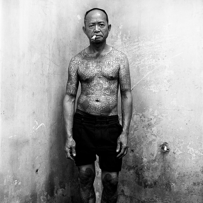
Photo #1 – Ekapong Kow – Thailand
–
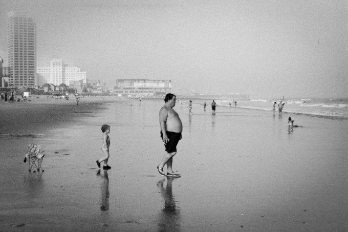
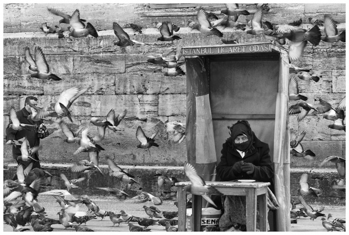
Photo #2 – Bastian Staude – Germany
–
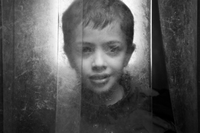
Photo #3 – Jeremy Simmons – Dublin, Ireland
–
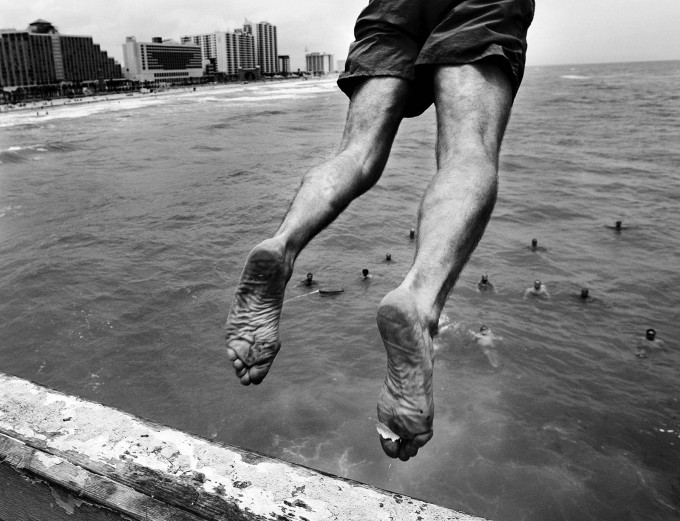
Photo #4 – Craig Litten – Bradenton, FL
–
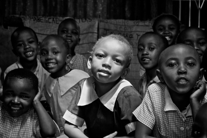
Photo #5 – Chris Scrivens – Chester, NJ
–
Photo #6 – Aad Berkhout – the Netherlands
–
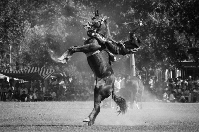
Photo #7 – Martin Lux – Germany
–
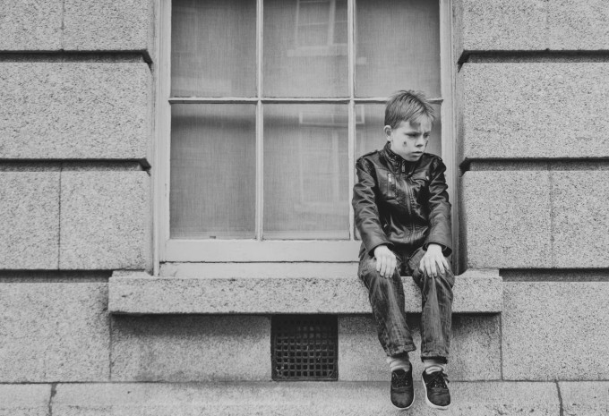
Photo #8 – Natalie S – Hong Kong
–
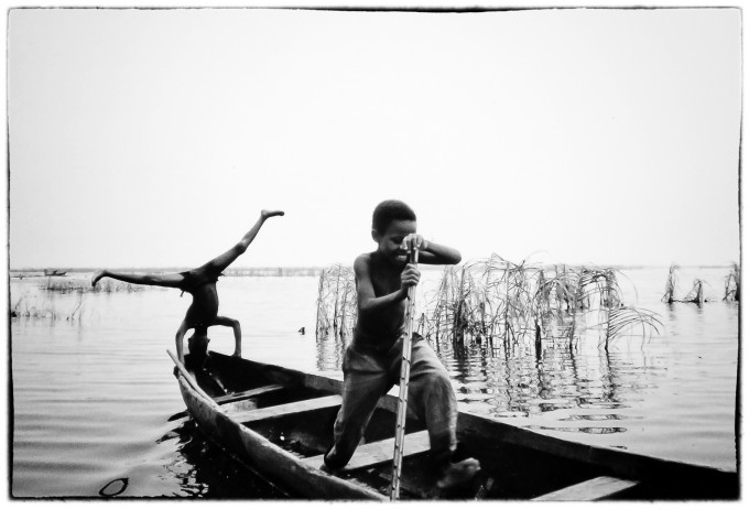
Photo #9 – Kris Ysebaert – Belgium
–
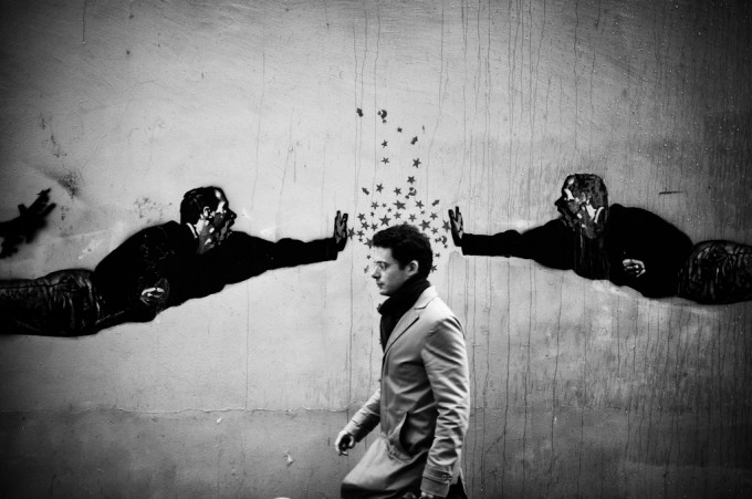
Photo #10 – Gabriel Lattanzio – Paris France
[polldaddy poll=6331181]



Well perception is a funny thing isn’t it? The original poster replied to her post (above) and he felt she was being particularly rude. Let me say this here or now..I never …I NEVER say a bad word about anyones work in these online forums. I only compliment, encourage, defend people from Internet a**holes or say nothing at all. I feel like photography is hard enough without being picked apart by the masses before one has come into their own in terms of style and substance. I didn’t feel like Nicola was being funny at all but at the same time I wasn’t trying to be a d *ck, just stand up for freedom of expression in all forms. I don’t care If Nicola is a guy or girl that has no bearing in this . Lastly I didn’t submit a nude, just a picture of my girlfriend that I had no expectations would be chosen therefore was not upset or surprised it wasn’t. I know what good photography is though.
That’s what artists (photographers) do… They think in terms of what each of them would like to see in a photograph and they may not like the current voting results, which is reflected it in their comments. What IS important? Steve has allowed all of us to participate in the VOTING process, which will not determine who wins, final decision is Steve’s. Is even your criticism of others criticism worthy? Yes and should only someone who graduated a distinguished photography college (paid tuition fees in excess of $59,000) be allowed to comment here or is this a web-site where amateurs, enthusiast and self taught professionals value each person’s artistic capabilities?
The ethereal light and halo effect in #3 really make it stand out for me, strong collection of photos though, congratulations to all who made the grade.
There is ZERO dodging and burning on Photo No. 4. Zero! It’s the way the light and the stirring of the ocean below that makes it look as there is a halo. I went back and looked at the original color image. I don’t do much to any photo I shoot. It’s not allowed in the world of photojournalism.
CL,
Your’s is a wonderful photo. I think all the selections Steve has put forth are each in their own way quite interesting. Unfortunately, yours is (partly anyway) of a style I just don’t favor. Your image was then the leader. As such, since I could not very well take 1000 words to discuss every image, it became the foil for my argument that the underdog deserved more love than it was getting.
My focus was really on that other photo and I did not try to offer any full or careful assessment of yours. I likened it to Gary Winogrand’s work which I object to on philosophical grounds as a perversion of the Kertesz/HCB tradition of finding quintessentially human moments on the streets. However, if I were to try to more completely assess it relative to Winogrand, I’d note it is markedly different from most of his body of work (on average, not image by image because there’s considerable variation there).
Your image is of a novel, action event which mostly he didn’t shoot. The similarities are that it partakes (to a degree) of his announced intent to convey no meaning. He avowed he was simply shooting things to see what they looked like in a photo just as if they were animals in a zoo.
In fact your image has more intent, I think, than that but it doesn’t let the viewer know any of the actors (I presume the folks in the water did just what this guy is doing). It’s hard to care for people you don’t have any clue about. To that extent it is, for me, mostly meaningless, although the risk taking or perhaps lemmingish behavior depicted may actually have a bit of a cultural or societal content. I suspect, now knowing the image was published in the paper, that either the story or other images gave it greater context. As part of a larger article I expect it was wonderful.
As a stand alone, I thought it, though technically impressive, well timed, and framed, was not 7 times better than the quieter more thoughtful image I spent 80% of the post trying to laude.
Anyway, I doubt I convinced anybody or influenced any future votes, but I surely intended no insult to you with my comment.
Dexter,
I’m looking at a book of Avedon photographs right now (..or one can use Google Images, and just type “Avedon”..) and they’re all famous faces: Andy Warhol, Francis Bacon, William Burroughs, Robert Frank, etc (..no-o; there’s one that’s unknown to me: Boyd Fortin “rattlesnake skinner”).
So one looks – I look – at Avedon’s portraits ..Marilyn, Mitchum, Liz Taylor, Obama.. to see if they reveal more about a well-known person that I previously knew. He seems to have specialised, in his published pictures, in showing someone already well-known, so that an observer scrutinises the picture to see if it reveals ANYTHING ELSE, anything NEW, beyond what the observer ALREADY KNOWS. Like David Bailey’s celebrity portraits ..though those don’t seem to reveal anything much to me: they seem to ‘celebrate’ those people some more.
You mention “..all that “mind’s eye” mumbo-jumbo..” as if picturing something in one’s mind’s eye BEFORE it’s shot is somehow drivel and nonsense. But then you say “..Why is that worth more than . . . envisions, sets up, captures, and develops – all with a pre-conceived scheme?..” Surely that’s just what I meant? I think that a photographer seeing something in their “mind’s eye” is just the same as “envisioning . . . all with a pre-conceived scheme”. Isn’t it? Or have I got something terribly wrong?
“..it behoves us to UNDERSTAND what is involved in creating them before condemning them..” ..I’m not condemning anything, nor anyone, nor anyone’s photos. I was asking, not condemning, what was the photographer’s involvement in creating each picture – apart from their simply being there to squeeze the button.
If the man in No.1 were a Thai movie star who’s usually seen in a smart suit and polished shoes, and here he is in a corner with his shirt off, showing his tattoos and chewing a stogie, then THAT, I think, would be an Avedon portrait.
“..Characterizing Photo #1 as something that occurred without the photographer’s involvement is not only an injustice – it’s just silly.” Yes, of course – the photographer, Ekapong Kow, must have been there (..for all I know, this may be a self-portrait by Ekapong Kow..) ..unless it was shot on a self-timer and the photographer had already gone away.
But I don’t know what the photographer’s involvement was, apart from squeezing the button. Whereas I think I know that for No.10 the photographer (I would say) has “enhanced” a pre-existing artwork, by choosing to “add” the passer-by. That’s the photographer’s contribution. And I think it’s witty.
And I find that wit “uplifting”, it makes me smile, it makes my day more joyful. And that pleases me. There’s physical dexterity involved, too – as with the other photos which also rely on split-second timing and squeezing the shutter button at exactly the right moment.
I’ll try to pacify everyone by saying that ALL these photos deserve praise ..my own entry didn’t make it to Steve’s Top Ten, and so mine was obviously inferior to all of these, and I’m glad that these photos HAVE made it to Steve’s Top Ten. Mine, I must say, didn’t have much contribution from the photographer (me), either. So that’s why I’m praising, especially, those which I think DO have involvement and participation from the photographer ..of which I’d say – not knowing the background of any of these photos – that No.10 has exactly those aspects which you mention yourself: the photographer “..approaches, envisions, sets up, captures, and develops – all with a pre-conceived scheme”.
And I think it’s been done with élan, joviality, wit and panache. So how appropriate that it was shot in Paris!
I think many of the others, upon further observation, are quite average.
What’s you problem Nicola? Why are you so rude?
My initial post was just an observation, that there doesn’t seem to be any variety in this series. No landscape, city scape, abstract, out and out portraiture, still life, or the many other themes out there, yes, including nudes.
Steve may prefer street photo’s, but he didn’t give a competition theme entitled “Your best B&W street photo”.
Personally, I think these days every Tom Dikc n Harry wants to be a street photographer armed with a Leica (shot wide open), and most are average. YAWN!
Is that you Chris????!!!!!!
John – I believe Nicola was referring to the fact that out of the 10 finalists chosen for this competition there are 4 photos where the subjects are only wearing shorts! and by asking if the OP was looking for something more titillating, well I think that’s called a sense of humor. I laughed when I read it anyway.
Also I’m assuming Nicola is a woman by my reading of her hilarious follow up comment above and I didn’t get a sense of anyone not liking nude photography or being ashamed of anything. I’d love to more camera geek girls on here, as would most of us I’m sure. So I for one would appreciate it if you refrained from being so rude and confrontational.
If you submitted a nude photo to the contest and didn’t make the grade it might be worth considering what makes a winning image, it’s just as hard to get a ‘nude photo’ that transcends it’s genre, as it is hard to get a ‘street shot’, a ‘child portrait’ or a ‘defining moment’ that elevates itself above its genre.
#1 something about it, the bottom look like hes in a corner from the shadow angles but the top like hes against a flat wall.
#4 has a halo around the jumper
but #7 is the more difficult shot for timing.
I can’t believe what I’m reading here !
To all : Who do you think you are to criticize those who dared sending their photos while you did NOTHING except spitting your bitterness criticizing because you CAN’T do better ???
Did you EVER got your photos published on covers ?
Do you think you’re international experts ?
Only the people who have sent something should be allowed to comment, not all the “blah-blah-Leica-look-blah-blah-I-think-I’m-a-good-photographer-because-I-shoot-Leica”.
So, a big bravo to all the contestants for their great work and the so-called-photographers should keep their mouth shut… or send their photos instead of stiring air as usual.
Well said CX, and that is precisely why I voted No1 over No10. Both good photographs I grant you but No10 is manufactured. I mean no disrespect whatsoever to the photographer, I take such shots often myself, but such a shot is taken by standing in position and waiting for the right subject to appear. You may be lucky and wait only 5 minutes to get the shot or it may take longer but in a busy location and the right timing the shot will always come.
@Next5guy:
Ditto what I said to Wim.
And another one bites the dust.
Shame.
Sure. And, that fellow Richard Avedon never “brought” anything to any of his photographs either.
Those images you cited… somehow you value “found” imagery over “created” imagery. The photographer in those instances just ‘happened’ to be in front of something ‘interesting.’ Those photographs are a matter of happenstance. I’m not diminishing their worth, at all – just noting that while Babsky credits those photographers for “bringing something” and all that “mind’s eye” mumbo-jumbo, the contrarian argument might suggest that those are merely ‘incidental moments.’ Someone with a camera IS somewhere, and something happened in front of him. Why is that worth more than an instance in which a photographer travels, approaches, envisions, sets up, captures, and develops – all with a pre-conceived scheme?
Point is, there are different kinds of work on display here, and it behoves us to UNDERSTAND what is involved in creating them before condemning them. Characterizing Photo #1 as something that occurred without the photographer’s involvement is not only an injustice – it’s just silly.
David, the number 1 photo, the photographer has managed to photograph that particular guy, warts and all, in his ‘pose’, and I really like it. That’s good enough for me
Mitch,
That’s an interesting approach. I would hang any of them in my home with the exception of #3 – unless he was my kid.
I evaluate the quality of an artistic photograph based on whether I would put the picture in my home.
This makes it easy for me to rate a picture.
Picture #4 was the only photo that I would be willing to hang up on my wall.
e.g. many of the B&W pictures that are hanging in my home are from Chris Honeysett.
Just because 4 out of 10 (highly questionable number but lest go with it) photos have semi-nude/nude people doesn’t mean 4 out of 10 photos are good. Which makes the great ones even greater and yes they are very important to photography. I love it if nude photography gets you riled up though, I get a kick out of people who are offended by their own naked bodies.
I think Steve chose the photos he like best and didn’t check off any boxes. If he has a disposition to any one form then he’s just like the rest of us but I’m sure he tried to be evenly keeled as possible.
You added imaginary context to the first photo so I don’t think thats quite fair, but I can see your points in regards to the other photos.
I think it’s a beautifully produced portrait, with creamy tones and contrasting natural textures, there’s a quiet depth to it that separates it from the other entries. I can see why it’s ahead, but I can also see why some people mightn’t understand why.
No I’m not suggesting anything nefarious. Maybe a bloc of votes coming in but theres nothing wrong with that.
Wow. Just wow. Did Ken steal your prom date or something? Lighten up a little. I read Ken’s page as often as I read Steve’s. I don’t agree with everything he says, but he does offer some great points, both in terms of practical gear selection and improving one’s photography.
If I was buying Leica, Nikon, or Canon glass, his site would be my #1 source. In addition to having pretty exhaustive reviews of lenses, he offers some very practical advice for finding older comparable lenses for far less cost.
And for advice about snapping kids, he’s offered some good points that have certainly improved my keeper rate when it comes to my constantly-moving 2 year old.
I find his site useful, fun, and generally interesting – even if I don’t always agree with him.
I don’t always agree with Steve, either.
This is a serious request: #3 seems to be leading the race at the moment. Can someone explain why? Not that it’s a bad child portrait, for a child portrait, but it is my least favorite of the ten.
I voted for # 5 as well. Maybe the boy in the center struck you b/c he is actually a little girl when you check out the photo data. 🙂
I love the exposure too. How they captured all those different shafts of light on the children’s faces.
I agree with your Great choice!
Don’t get me wrong. Out of the top ten there isn’t a single image I could say I dislike. All are very nice. Some are great. But I am in the camp that finds it just a little peculiar that all ten were street type people photos. Out of over a thousand entries not a single scenic in the top ten? Peculiar.
photo 3……
It’s beautiful.
All the entries are excellent with a lot of strong well timed images but for me number 3 takes it.
Great work and good luck Jeremy.
Your photo has been chosen but your commentary has not, I should think that those who have read the comments before voting will not have warmed to you.
Re: 7 Personally, I have seen one award winning horse racing photo were the photographer captured four horses with all four hoofs off the ground at the same time using single shot manual mode only (most so-called professional photographers use ‘Continuous Shooting’ hoping to capture just one award winning photo).
Re: 6 Intriguing… because of the BOOTH in which the lady sits is not part of the building, which gives the male walking to the left depth, pigeons were flying mainly behind the booth which didn’t frame the lady in this shot.
The composition on #4 is easily the best here, but it’s been overly dodged and burned, there’s a beautiful tonality to #3 the young boys portrait that really adds to the depth, it looks both contemporary and classic at the same time, #10 is very strong image too, the heavy vignette suits the content and the timing is perfect!
My apology, I didn’t know that was your father.
“And some idiot jumping off an old pier with paint stuck to his foot is getting 7 times as many votes? OK, the jumper is maybe novel. But who cares about anything that’s happening there? It is impersonal. It’s mindless. It is a neo Winogrand piece of “shoot the animals” meaninglessness. But that’s just me. I hate that.”
Your right, you were just using your well honed critical assessment skills that you honed so very sharply throughout the weeks of your photography career. I should have know. If i would had read the above passage more carefully I would have seen the nuances you were getting at when debating the two pieces.
Oh by the way number #3 is in the lead now so maybe you want to get on critiquing that one vs. your girlfriends piece next.
I know I will get flamed for it(!), but here is my critic on all the photos:
1) The strenght of this portrait is the very apparent full body tattoo, the rough expression in the face with a big cigar(?) in mouth and the flaking walls of his house/neighbourhood(?). But take out that cigar (or big cigarrette?) and put a shirt and long trousers on him and it would be just a man standing in a corner.
2) I really like the triangle the man, boy and chair(?) in a way creates. However nice capture I don’t feel i quite works for me as my eyes get drawn to the background, especially the big houses on the left. Perhaps it could have been better if it had been photographed from a lower standpoint a bit to the left, not having the man smack in the middle of the image lika a typical snapshot.
3) A very sweet portrait of a young boy and clever idea using those plastic stripes (I have seen such drapes in factories and warehouses where trucks can go through without waiting for a door or port to open) as a diffuser. Still I don’t think it is enough in a general contest. (But when checking apparently others disagree!) Had it been a contest for portraits it would have been a strong contender. I also think it would have been better shot in portrait format(!) or cropped on both sides.
4) This is the photo standing out from the rest. It immedeatly draws your attention and give you the feeling being there. The flake of paint on the foot is a nice detail adding realism. This was also the photo that caught my attention the most and the one I picked without first checking the result.
5) The boy in middle looking so much brighter (because of sitting in a spot of sun?) than the other kids is what makes this photo. That is however all about it, otherwise it is just a bunch of smiling kids. Nice but nothing special.
6) Very interesting how the birds seem to frame the subject. What a pity the main subject is such non interesting. Although some may think this is an unique picture I’d say it is very possible to make photos with the same idea in places with a lot of pigeon.
7) Here the photograper really managed to capture dramtic action at its peak. One really wonder what happened in the next second; Did the horse fall backwards with most surely terrible consequences for the rider or regain balance and land on all four feet? As an illustration for a horse show this is a great photograph. But in a way I feel anybody being prepared with a decent camera in the same place could have taken the same photo. A show like this is where one could expect to find some action, so it is really not that hard to find compared to wildlife. Therefore it is possible to choose both lenses and position that will make the subject stand out more against a less cluttered background.
8) This is a good composition, but except for that I think it is screaming for a context. It could be good as part of a series of pictures telling a story or as an illustration of a text. On its own I don’t think it is enough.
9) This is a very nice moment the photographer preserved for the world and in my top three (3 and 4 being the other two) list of this selection. Unfotunately it fails on technical grounds. Although the photo has a very nice tonality the shadows are really a bit too dark, especially on the boy standing on his head which face is not visiable at all. Although I don’t know what the light really was at the time the general rule in B/W film photograpy is to expose for the shadows. Had the negative been given more rich exposure much more detail could have been retrived. Also it would have been nice if something had been done with all the spots of dust and hair. The most apparent and also most easy to correct flaw of the image is that it should have been heavily cropped to make it stand out much more. Instead of having the horizon in the middle of the picture like many snapshots the sky should only be one third of the photo. The boat in the left background is distracting and should be cut off. To the right a big part should also be cut off to balance the composition. Now what is left is a perfect composition with both boys in the “golden cut”, or each about one third into the photo from the border.
10) This is a classical idea! Find an interesting background and wait for somone to step into it! Well executed! But I get even more question marks than in the photo. What is it supposed to say? Just to tie it all up my verdict is: Nice but no cigar! 🙂
As a side not; Is it just me or do others also get a deja vue feeling about several, in fact a majority of these photos?
The most of the photos seem to me be old “darlings” the photographer already displayed in other places where I have seen them before.
Wow interesting. My favorite #3 was at 8% yesterday – I think 4th or 5th place. Its now well ahead at 22%
Get your coat.
There’s plenty of photography sites that cater just fine for that demographic thank you very much!
Seriously though most of the work showcased on this site is by amateurs/hobbyists/enthusiasts/leica-fanboys etc. and in my opinion when enthusiast level photographers get stuck into the fine-art nudes it all too often looks like it came from a dodgy glamour shoot organised by the local camera club who’ve promised the lovely Janine a portfolio of almost professional quality photographs which will most likely set her off on a regional modelling career.
Not to dismiss the genre though, Mapplethorpe, Mann etc are outstanding, although I find stuff like Jeanloup Sieff, Helmut Newton etc. to be a little too cheesy.
#8 is an awesome photo. Composition, story, drama, technique are all there.
The other photos are cool, fun, capture action, or are just clever, but #8 is what the “decisive moment” is about — to me. Second and third would be #6 and #9.
I thought Bastian Staude means “fat bastard” in very rough english translation.
bastian = bastard
staude = fat / stout
Haha!
Anyone who thinks photo #10 has no taste. No disrespect to Gabriel Lattanzio.
@Wim:
You listen to Ken Rockwell’s “advice”? What a shame. He is considered nothing but a BIG JOKE. Just ask ANY RESPECTABLE photographer and you will confirm this.
In all actuality, the buildings make photo #4 work. It gives height and depth to the image. I feel sorry for you, first because you actually think Ken Rockwell knows something about photography. Second, because you actually referenced his “advice” to make this photo “better”.
Well. It DOES NOT.
My advice for you is: STOP. Look for another source of photo advice. Anywhere. Anyone. Just NOT Ken Rockwell.
I agree fully, JPinSC! My vote is for #5, too!
who says stevehuff is all about street and candids? I assure you it isn’t. And as for nudes, whether male or female they make superb bw fine art photographs
LOL!
Sorry to disappoint, but there was no post-processing done to this photo (#4) except to turn the Canon 1D photo into B&W and maybe add a bit of contrast. That’s it. It looks the way it looks maybe because it’s an old, first generation digital camera. Who knows. The light was soft that day but sun was filtering through. Unlike most Fla. days where it’s just bright.
Yes, I agree, a camera bag for a reward? I think most of us are here because we are a bit anal retentive about cameras. This probably extends to camera bags so a freebie camera bag doesn’t do much for me. The real honor is just being chosen for this list. This is its own reward. Unless, of course, Steve can manage to throw a Leica M9 Titanium into the camera bag. Now we’re talkin… ; )
My shot is nothing more than one of over 10,000 photos I’ve had published in the daily newspaper, magazines are around the world. It was not an attempt at art or to copy a master. It was simply a great moment captured during a very average photo assignment. What you don’t see is all the chaos around the shot and just how difficult a shot it was to get. Nothing more, nothing less. In 30 years of shooting, I can honestly say I’ve never copied anyone.
“..strong, hard,reality and dangerous..”
..But what has the photographer brought to No.1..? The photographer’s pointed a camera (..we don’t know which: there’s no EXIF data..) at a man standing in a corner. The man is tattooed ..but the photographer adds nothing to that ..just depicts the man smoking and staring at the camera. Perhaps he’s a “hard” man ..perhaps he’s a delicate man who likes artistic tattoos.
Now look at No.10 ..the photographer has ADDED something to the original artwork, the stencils on the wall: the photographer has seen an extra image in his mind’s eye, and has possibly waited ..has certainly chosen the exact moment when the artwork can be wittily expanded into something else! The passerby isn’t standing, just waiting for his photo to be taken ..the photographer has actively contributed to this shot by being in that specific place, and has chosen that specific moment to shoot ..like in No.4 or No.7. It had to be THAT EXACT MOMENT to squeeze the button, otherwise the picture would have not happened.
Only that exact moment – of No.2, No.4, No.7, No.9 and No.10 – has made the picture ..a split second later, and the moment would have been gone..
That’s what The Photographer has brought to some of those pictures.. there’s wit and split-second reflexes in No.10 ..but what has the photographer brought to No.1..?
I went for #3, it wasn’t my first instinct but after looking at the larger image it’s a really strong portrait with great light/shadow, texture and tonal qualities. Well done to all that made the short list though you must have been up against some serious competition judging by the quality of these images.
Dude, you might try reading the comment carefully before you reply. I trashed no one’s photo. I stated an opinion that #4 was somewhat over-rated and #8 somewhat under-rated by the voters in this contest and offered some reasons why I thought that. I expressly stated an intent to denigrate neither the photo I did not favor nor those folks (like you apparently) that do favor it.
It is sad really that so many find it impossible to appreciate a critical assessment of an image without reading into it a criticism of the imagemaker and in reply seem unable defend a position without resort to ad hominum attacks or insults.
i agree
there were SO many AMAZING photos!
i had to really nit pick silly unimportant things in order to cut some out of the runnings for me
fantastic job by all!
i DID vote tho 😉
i went for the one that was most magical feeling… that usually wins for me 😉
Wow. Defending your own photo. And with such cutting wit to boot… Sorry if I tweeked your insecurities. I tried to avoid that by admitting a personal bias against the Winogrand wannabee style that’s so prevalent today and by declaring an intent to denigrate no one. Sorry you could not share that sensibility.
I like # 5. The photographer took a normal photograph of children and took it to another level with the pronounced light on the child in the middle. Also, their expressions tell a story with lovely B/W tonal range and sharpness.
brill images, congrats to the 10.
It was a difficult choice between 1, 4 and 9 but ultimately 1 has a documentary quality that stands out and is executed perfectly.
what are you suggesting,…….vote rigging?
Steve from stevehuffphoto.com is all about the street and candids, that’s why I’m here too. Why are you here? What do want to see portraits shot with soft boxes and all that hoo-ha? and Nudes! NUDES! Don’t even get me started on the nudes! 4 out of the 10 photos have people that are semi-clad, were you thinking a bit more T&A maybe?
be nice to see a real opinion from you Ashwin,nobodys going to bite .
I don’t understand why #3 have a lot of votes, for me , #4 is the best !
what nonsense
A truly international selection, there’s even a female representative!
why are all the choices street types and candids? No landscapes out and out portraits still life nudes or anything??
Very high standard for a competition to win a secondhand bag!!! I voted for #3 by Jeremy Simmons, out them all, it more than any other looks like it could have been shot with a Monochrom and seeing as that’s what inspired this competition it gets my vote 🙂
Couldn’t agree more! Anyone could get their Dad to strip down to his shorts, get out the magic marker, draw some patterns all over him, light up a big fat one and stick it in his gob, tell him to adopt an air of malice and malaise in equal parts and shoot off a frame or two before you go back to the serious work of documenting your cat.
A lot of very nice picture ! Very hard to choose one.
Congrats everybody
I am amazed that not all voted for #7 like I did. But that’s the beauty of photography
Very impressive selection, it’s a tough choice i keep changing my mind between #3 & #4 – both are very representative of classic fields of photography, the perfectly framed definitive moment vs the emotionally revealing portrait.
Hehehe. 😀
I think the “leica glow” comes from extensive burning/dodging (brightening/darkening) parts of the image (Bresson’s guy did that, as many photographers and darkroom fellas did, people do that with digital as well) — or perhaps the clarity slider in Lightroom pushed far right? It introduces a lot of micro-contrast, and the glow is the result. #4 is a powerful shot and this kind of editing (sloppy? extensive?) doesn’t change that, makes it more dramatic perhaps, but there’s nothing wrong with that, is there?
Many appologies!
I’ve seen similar halo’s a lot where people have not very carefully dodged or burned or selected an area with a magic wand or polygonal lasso and or tweaked levels or brightness/contrast etc there in.
It is a great shot as I said, as well the descisive moment you have captured, I love the framing.
Steve – due to the quality of the entries (a testament to the quality of your site) you should up the ante and throw in the camera after all!!!
Someone mentioned the “Leica glow” in #4. Is that what it is? I don’t like it. I’ve seen it in Cartier Bresson’s India images, and to me it just looks like heavy handed darkroom work – like an overdose of local contrast enhancement or the dodge and burn tool. The legs almost have a photoshopped in quality. Nothing wrong with the image, just needs a little more care in post.
For me it was #9. I liked the content and the treatment. #1 nearly won me over but I decided the decisive moment had been more expertly captured in #9.
If I was looking for the ‘Leica Glow’ in these ten images I’d say the portrait of the young boy (#3) has most of the properties I’d associate with that look.
Great photo but that halo effect around the legs is a result of post production, All of these images have had some degree of PP – there’s no point in saying it hasn’t.
Steve,
This is an excellent selection of images. In that 1000 entries, Im betting there were even more excellent shots. Could you post some of your honorable mentions?
Well, you seem to be right! Thank you Steve, you’ve chosen incredible 10 photographs. Very difficult to decide which one is the best. My personal winner is #7. Why? Every image inside this ten is an incredible work of art but I think the man in the horse might be just another one of those photographs you will recognize for years everywhere you might see it published. It is it’s simplicity and this perfect moment that was captured by the photographer and it’s pure documentary photography which makes you want to know what happened in the next frame. Awesome work!
Wonderfully taken photos… However, there are two photos (#6 & #7) that would be difficult to recreate, all the other photos can be shot anywhere with anyone with similar results. Birds and horses are unpredictable to shoot with people in the same scenes.
Wow #3 shot out front, thats pretty unheard of when a good sample has been taken at which point #4 had a sizable lead.
Wow #3 shot out front, thats pretty unheard of when a good sample has been taken at which point #4 had a good lead.
That is REALLY funny!
Male organ… hahahaha… Yeah, I think it’s his hand.
Thanks for comparing my work to Winogrand, there is not much higher compliment you can say. Oh, one other thing: “You can remove foot from mouth now, it must taste awful!”
I agree… I love that image. I only hope that it is a posed portrait. I hope it’s not due to someone in his household beating on him! I would like to know what happened to get him into that condition, rather than exploiting something more sinister.
Other than that, I dig the raring horse — I bet that didn’t end well. :-/
That’s NOT post production. The original looks just like that believe it or not. Shot with an old 4 MP 1D. I never do much post production at all, you are not allowed in photojournalism. This was first published in the newspaper.
What a great selection. Congratulations to everyone that have been chosen
What a doh head it’s really hot and polluted up here in Toronto I meant number 7 sorry 8 lol
Wow, I thought I had an award-winning entry … until I saw these. Humbling, and all incredible images.
The birds in Istanbul, the horse in Germany. Amazing. But the image that speaks to me, with great sadness is #8.
I don’t know that little boy’s story is, but the image is raw with emotion.
While I like most of these shots, I have to admit that only one *really* caught me. And that is #5. Funny that almost no one else seems to agree with me on this one 😉 … but I absolutely like it: The different shades of light on the boys faces and the way how the one boy in the middle stands out drew my attention.
I also do really like #3 and #1 but somehow these both leave me with a “I’ve seen that before” impression.
While it is true that #4 is an image that you haven’t seen before in the way that you have seen pictures like #3 and #1 already somewhere before, I just don’t care for the idea of #4, it does not say anything interesting to me, and also I don’t like the digitally processed look of it.
Then there is #10 which I do really like because of the idea behind it. But the composition has something to it that just doesn’t look right. So, after all, yes, it is #5 for me. Absolutely!
Thank you for this post. My eyes and mind feel a bit sharper after looking at these captivating photographs. Number Three by Jeremy Simmons is my final choice. When I first looked at the image, reality became very complex. What realm does the boy inhabit? … does he exist in the same world I do? … the same world the photographer does if there is a photographer? The image doesn’t look like it needs a photographer which means the artist must be very good. The boy looks completely at ease but seems to have the ability to absorb something that is outside his existence. Finally, I don’t think any other medium would provoke the same interest in me … it seems to demand black and white photography.
In number 2 that is just his other hand
I’ve got $10 riding on #4
Bravo! All great shots, but #10 did it for me. As a travelling street photo enthusiast myself, I can relate to how rare a good street art find can be, let alone to be able to time it in relation to a subject matter.
B&W pictures are all down to personal preference…
but
#4 has too much digital trace….
#2 focus too much on his male organ
#9 subject’s face was blocked (although good composition)
#1 has best advantage….. since it was the first photo and it has such strong impact…
#3 has the BEST overall B/W touch
And picture 8 is just a kid sitting on a window sill. You can make any picture standard fare if you look at it in the most literal sense. People like 4 because it’s in the moment action and very graphic. Are you her boyfriend because otherwise I’m not sure why you would actually be upset? 8 is a nice photo but it’s about where it should be. Don’t trash someone else’s photo because your nieces photo isn’t winning.
I concur! Numero Uno is outstanding. Then again I love portraiture so I’d be more biased towards a decent portrait regardless.
It’s not about disrespect, it’s the fact that people perhaps prefer some other photographs.
Some people vote for the photo which grabs their immediate attention, a photo that has instant IMPACT rather than one which needs to be studied.
I admit, the photo you voted for is excellent, but I still prefer number 1 🙂
All great photo’s, but Number 1, wow! That portrait has everything, impact, style, and perfectly composed and taken – captured the very soul and essence of the person. I’m so surprised it isn’t top voted here as I honestly think it stands head and shoulders above the other (excellent) photographs!
All pictures are so good.
The images are so nice that it doesn’t look like they’re competing for a bag. Otherwise it clearly shows the good audience of Steve’s site!
Congratulations!
I voted for 9 and was surprised to see how little votes it got. #4 has the Leica glow mentioned so often on this site and from the comments there is someone that feels #4 is the only photo worth looking at. I guess everyone has their own taste and preferences
Did you enter a photograph shvnanval?
Agreed, mostly all strong shots but this is portraiture par excellence. It makes you want to know so much more about the character portrayed. Leaves the viewer asking so many questions which is what a great portrait should do. Quality!
All good shots! But that portrait (no.3) is the most acomplished for me.
wow this is a tough one
Something tells me that that gentleman reached the point of no return …
good comment!
Micke,
There are way more qualified folks that follow this site that would provide a better explanation than me, but here’s mine.
Back in the (only) B&W film days and even today for those that continue to shoot that way, photographers often used color filters during exposure to obtain many of the same effects current digital post processing makes possible. Thus where today a raw shooter might tweek his image using the red channel of his develop module, with film he’d put a red filter on the front of his lens at exposure and get a very similar result.
They also tinted their images in the printing process with sepia toned chemicals or blue tinged selenium. Or in fact they might split tone them using two different chemicals. Platinum prints have a different cast (if you will) than other papers. So even with film there was a lot of tweeking that coluld be done to achieve a particular look. And that takes into account only panchromatic film. Before that films were sensative only to (or mostly to) blue light which had it’s imapact of the tone of the eventual print and how it needed to be or could be processed to achieve that tone.
So current digital post processing is a different process, but not necessarilly a different result than producing a classic B&W film image.
#6 is the most unusual shot and would have been the best but for the guy on the left who just spoils the purity. I like #1 and #9, but I think #10 has just got that magic – quite literally 🙂
most of these are magnificent. great work everyone.
Some wonderful images, so hard to chose a fav.
I would have voted number 4 as its a magnificent capture, however I am put off by the halo effect around the legs. Its really distracting for me when I can see the post production.
Great work guys, well done for making top 10!!! They should all win a little prize… A signed Steve Huff original print????
I am distressed at the apparant lack of repect being given to Natalie S’s image. 3%? Come on, you’ve got to be kidding me!
And some idiot jumping off an old pier with paint stuck to his foot is getting 7 times as many votes? OK, the jumper is maybe novel. But who cares about anything that’s happening there? It is impersonal. It’s mindless. It is a neo Winogrand piece of “shoot the animals” meaninglessness. But that’s just me. I hate that. Others may love it and that’s OK. I am not intent on denigrating the image or anyone who likes it. I’m distressed only at the comparative lack of respect given to a truely excellent, personal, strongly composed, and thought provoking image in #8.
First the compostition in Natalie’s image is wonderful. The backdrop is perfectly symmetric and unrelentingly sharp edged and unforgiving. The boy, with scrapes on his face, is offset and framed by the one window pane. He’s out of balance with his environment. It creates tension. He is a bruised and alienated bit of softness and vulnerability in an unrelenting hardscape.
One wonders then at the scrapes on his face. One wonders at his overly careful and tidy posture. His feet don’t touch the ground or rest on a ledge. His socks droop around his ankles at odds with that careful posture and zipped up jacket. His expression is hard to read. He could be worried, perplexed, scared, confused, or all of the above.
You begin to speculate about him, about his story. Is he trying perhaps to figure out how to explain to his Dad how he lost his lunch money and got beat up by the local toughs again? Is he hiding from whoever (a parent perhaps) that put the marks there and trying to understand what he did wrong? Or maybe all that is too dramatic and it’s something much simpler. But it’s something. You wonder what. You care what. It’s highly personal, it matters or it ought to matter.
It’s an image that calls for thought, for work, for involvement from the viewer. Despite its uncluttered composition, the image is not simple. It asks more than it answers. It deserves way more, in my opinion, than a mere 3 or 4% of votes.
I went with 3 as well. There’s just something haunting (in a good way) about it!
I don’t know why 4 has received so many votes? I could pose that shot in my own pool.
My faves were #1, #3, and #5. Voted for #5. I am not a big people photog but I liked those three.
Great set of images…Some really talented photogs want that Wotancraft bag 😉
agreed.
No 2 for sure. To see that shot shows imagination to capture the moment. Reminds of Robert Doisneau shooting in Paris.
They’re all quite good, but #4 is a standout.
All wonderful pictures! (no 2 is my favorite) A question from a novice regarding b/w processing. Shouldnt a real b/w picture be pure monochrome without and color-tweeks to be called b/w? Like they did 50 years back. The post processing should then be restricted to contrast? Often I read about processings on b/w that is so advanced that it makes my head spin. Yellow, red channels bla bla etc.
But then, is it really b/w photography?
All great shots, but number 3 is the standout for me.
All great shots. Can’t even pick a favorite.
Wow who would have thought number 8 is my clear winner or 1 or 4 as runners up I guess I appreciate the subtle contrast and DOF come on people take your time and look closely
To me #4 is a clear winner for that decisive moment the photographer managed to capture. Not to forget the wrinkled feet indicating an aged man (i assume) jumping off the bridge from high above gives me that scary and dangerous feeling. Well done !
Wow. These photographs are wonderful.
I went with #3 Jeremy Simmons but
Photo #10 – Gabriel Lattanzio is special too.
Some great work here.
Not much love for #2, but it was my favorite. It tells an interesting story without reliance on special backgrounds like #10 or action like #4 and #7.
Sorry but these 10 all had something that drew me to them. I did not go in saying “Ok, I need 3 people shots, 3 animal shots, 3 architecture shots, etc”. These 10 to me were my favorites out of the over 1000 submitted, and the rules clearly stated I would choose the top 10. Thanks for reading.
All 10 photos I consider to be quite strong images and most are great B&W images, too.
I voted for #4 because of it’s powerful use of strong blacks and whites which served to reinforce the composition for me while also achieving good use of middle tone values in the face of such strong highlight and shadow values.
For those lamenting all of these being people images I would gently remind folks that these are the 10 best images submitted as chosen by Steve and not by a competition committee ticking off best of selections in various categories to compete against one another. Also recall that Steve is no slouch as a Lndscape Photographer in his own right, just go through his early reviews especially on the old site.
I don’t envy him having to pick the best 1% of a thousand frippin photos.
I’d say he has chosen quite well.
Kudos,
Richard in Michigan
I liked 4 because of the energy and graphic nature, but also because my eye was involuntarily drawn to it immediately. It has a commanding lead right now and it will probably stay there, but I think it’s good feedback for ones own work.
I know its a personal choice (obviously), but why do so many people like #4 so much. I mean no disrespect to the photographer at all by the way.
I’m torn between #1, #2, #8, #10
Ahh, so tender. Thanks for the link.
Really hard choice. #1, #4 and #10 are all outstanding.
#4 because was the only one that causes a strong sensation
Jeeb… the negativity. I like them all actually a lot. Especially nr.6! 🙂 Oh well, being in this selection is already ‘winning’ enough. Thanks Steve for organizing this. Great choice of images.
#4: the wrinkled feet and the peeling paint intensify the monochrome photo. The “legs only” and the people watching him are enough to make you realize that he is diving. The photo would have been better without the buildings. Ken Rockwell’s Simplification and EXclusion!
I would have liked to see the other 990…perhaps one would have inspired a vote.
I think they are all great. I was torn between 1,4, and 7. Terrific work!
Absolutely no disrespect to the others photographers, but #4 was the only one that struck me. I liked #8 as well but ultimately went with #4.
Congrats are in order to all those that are selected to be in the top 10 though.
this was my entry.. http://www.flickr.com/photos/22710143@N03/6067426132/in/photostream
vote mine too. hahaha….
nothing special on #1 (IMO)… i voted #10. but i agree with you, John.
Not one non-people photo? lame.
I was torn between #2 and #8 – I felt both told a story quite effectively. Ended up with #8. The shut window is a pretty efficient symbolism for a possible backgrond to the concerned child.
Kind of surprised by the results so far.
Very high level !
This contest is to be redone twice a year.
But no reward like the bag, the reward is to be chosen in the top ten.
(I am not in the top ten, sigh!)
DS
Photo 7 makes you want to know what happens after!:)
Picture 1 ist strong, hard,reality and dangerous!
Wow, I am so exciting by this. This is perhaps the only photo contest I have ever seen in which I can not decide which photo to vote for. Each one is special in its own way and, as far as I’m concerned, there is no clear winner. So instead, I am electing NOT to vote. Nice job, Steve, and good luck to every entry here.
Lots of good photos to choose from and took me a while to decide between the top two I liked. Good work here.